Today, MicroStrategy released Geospatial Services, a new set of mapping capabilities powered by Mapbox and available across MicroStrategy’s 10.11 platform. MicroStrategy users can now use advanced geospatial analytics to explore their largest datasets and make better-informed business decisions.
With over 20 billion connected devices — growing to 75 billion by 2025 — more and more real-time location data is collected daily. Data from these devices lets retailers track store inventories and matching demand to weather trends, healthcare providers using seasonal flu data to create targeted awareness campaigns, and internet providers monitor their network coverage on a block-by-block basis.
It’s difficult to interpret this massive location data without fast, easy-to-use tools that give users proper context. For example, a global bank will want to see financial transactions grouped by country, then zoom into the billions of individual points for further analysis. MicroStrategy’s new Geospatial Services meet these needs with new capabilities like:
Vector maps, which improve performance and response times by 300% over traditional tiled maps, including for millions of records.
MicroStrategy CTO Tim Lang added that, “When thinking about location analytics, many businesses are looking for specific, actionable results like being able to identify new customers, improve marketing efforts and customer service, manage risks, and understand consumer data. The new integration with Mapbox empowers MicroStrategy 10.11 users to draw greater insights without compromising security.”
Let’s take a look at how the Mapbox capabilities inside Geospatial Services help address two common questions from MicroStrategy users.
Intelligent aggregation
A claims officer for an insurance company using MicroStrategy asks, “What is the risk that a particular house will be damaged by an earthquake?” Turning a USGS dataset of 52,000 earthquakes into a vector map rendered at 60 frames-per-second in MicroStrategy, an analyst can plot global earthquakes and their impact zones to assess risk premiums. The visualization below shows this risk analysis displayed in geographic context — country when zoomed out, provinces when zoomed in, all the way down to individual quakes––to help the claims officer spot trends at a glance without compromising the details.
Drilling-down
A sales leader for a national retail chain asks, “How well is my product doing at the state level? ”MicroStrategy now gives them full control over what data is displayed when, blending multiple datasets intelligently.
The map below shows multiple metrics combined in a single map, with markers, bubbles, and area charts to show revenues, profits, margins, and units sold by state.
Need more geospatial capabilities in MicroStrategy? Stay tuned for new roadmap announcements from the MicroStrategy team, or contact Mapbox to talk about a custom integration.
We’d love to see what you build with Mapbox in MicroStrategy— tweet @Mapbox or drop me a line at julie.munro@mapbox.com!
The Eviction Lab grew out of Professor Matthew Desmond’s work studying housing, poverty, and eviction in 2008, living and working alongside poor tenants and their landlords in Milwaukee, WI. He realized the need to collect national data on eviction to address fundamental questions about residential instability, forced moves, and poverty in America. Until now, publicly available eviction data has been limited.
Professor Desmond and the research team at Princeton spent the past few years acquiring, cleaning, and validating tens of millions of eviction records.This is the first nationwide database on evictions at this level of detail, and they created an interactive site for people to explore and use this data.
Click through the image to view the full-screen map.
What do you hope an interactive map like this will accomplish?
At a high level, we’re hoping to change the narrative about residential instability in America by illustrating the prevalence of evictions nationwide and providing policymakers, researchers, journalists, and citizens with accurate information. Beyond that, we aim to depict “hotspots” where the problem is concentrated and allow for easy comparisons between areas, from states down to census block groups.
One fundamental question driving this work is, how is this problem spatially (as well as temporally) distributed and concentrated? A map is the most useful visualization we could employ to depict that. Allowing people to search for their locations helps drive home the idea that this is a national issue, even if it is concentrated in certain parts of the country.
Why did you use our tools to build the map?
Your platform was an easy choice for us after discovering vector tiles and the Mapbox GL library. It would have been difficult to manage an interactive visualization with as much data as we have without using vector tiles and your web API, Mapbox GL JS. We’re expecting a lot of traffic, so we also needed a reliable solution.
What were some of the technical problems you had to solve?
Balancing accuracy of feature shapes, amount of data loaded at once, and showing layers at low zooms was a challenge for us. It quickly became apparent that displaying eviction data all the way down to the census block group level would require huge, unmanageable GeoJSON files. Luckily, we came across your open-source command line tool, Tippecanoe, which allowed us to automate data injection and optimize our geometries. Compressing the data as well as geography into vector tiles with Tippecanoe meant we could load it all from pre-built static files rather than needing to build an API.
How about challenges related to geocoding and search?
We had planned to use Mapzen for geocoding because we had more experience with it, but when Mapzen closed, we found moving to Mapbox geocoding to be relatively painless. The two APIs are pretty similar; the only pain point was that your geocoder doesn’t return counties, but we just added our own small subset of data for counties in case someone searches by county.
How did you approach the design and map styling?
The first major challenge from a design perspective — since we were tasked with displaying not just eviction rates, but also a variety of census data — was finding a way to elegantly display two variables at once atop an already-complex visualization. We had great help early on from our technical consultant, Chris Groskopf, in developing a bivariate mapping strategy using the standard choropleths for census data, plus “danger color” red bubbles for evictions. Since that strategy was adopted, a major focus of our work has been keeping all these elements on the map — choropleths, bubbles, place names, boundaries, streets — in balance, so the user can find their desired location, as well as the data they’re seeking.
We also wondered how to depict null data to give users an honest picture, rather than showing nothing, which could be misinterpreted as no evictions. We decided on a few visual indicators that would be explained in the map legend. For example, we use white bubbles with a grey outline instead of red to indicate missing data.
You also used our tools to control the presentation of map data at each zoom.
We needed to figure out how to show just enough geographic detail and associated labels so users can orient themselves and browse through unfamiliar geography. We opted to confine the most detailed geographic features (major roads and highways, towns, and villages) to the highest levels of zoom, maintaining only larger place names throughout most other levels of zoom. We also added a hover tooltip at high zoom levels that tells you where you are to help improve user navigation.
Click through image to view the full-screen map.
This is a really inspiring project and now an impressive map. What’s next for your team?
One feature we definitely plan to implement is a Top Evictors ranking tool that lists the landlords who evict the most in a given area, with the aim of redressing the information asymmetry between eviction defendants and plaintiffs. We came together as a web development team for the first time on this project, and we’ve garnered a good deal of hard-won expertise, especially with regard to the map tool. We’d love to devote that expertise to future mapping and data visualization projects. We’re interested in digging more into Expressions in GL JS, as well as some of the other features like heatmaps and extrusions.
The entire evictions data set is publicly available at evictionlab.org, view the full map. Use our data viz tools to create interactive maps and tell complex stories with your data. Learn more about how our Community team is supporting positive impact projects across the world.
KIND-Automatic, by Katz Industries, lets commercial real-estate developers, construction companies, and architects create and interact with fully rendered 3D models on their phones. Using our Maps SDK for Mobile and our Geocoding API, the developers added geographic context to the models so they are easy to explore on a map and referenced to real-world coordinate positions.
With the VR-powered app, you can walk through a building before it’s constructed — click a point on the map to step into the model:
Once “inside” the model, you can get creative. Walk around and experiment with the room’s design by swapping out existing furniture (is this corner better for a statue, or a painting?). Add in comments to show what’s changed:
KIND-Automatic makes it easy to collaborate as a team, too. Teams can use the markup view to add notes and drawings that instantly sync back to your preferred modeling tool or building information management system. Here’s a shot of an internal dashboard:
For a more immersive experience, the app can also take an entire team on a guided tour of a project with Samsung VR headsets.
Mapbox makes it super easy for people without a technical background to walk around projects. The real world geographic context and coordinate positions [from our Geocoding API] grant the opportunity to move from position to position in model space. This is not AR — everything is rendered 3D content. -Katz Industries founder, Joshua Katz
To hit the ground running with Katz Industries’ tools, give them a shout atinfo@kind-automatic.com.
If you’re already using our platform in your architectural workflow with AutoCAD, 3D Studio Max, Sketchup, or Revit, we’d love to hear about it — tweet us @Mapboxor chatwith our sales team.
Nick Cordella is an engineer on the telemetry team at Mapbox, where he builds valuable products like traffic predictions from large location datasets. Prior to Mapbox he was a senior data scientist at a startup that built lane-level maps of autonomous vehicle trajectories.
7:00 am
Did I just hear a squeak in the next room or no? I peer at my 5 month-old Charlie’s crib and try to discern if he’s stirring. He seems to be snoozing, but I’m awake now with little chance of falling back asleep. I sure would love to stay for some morning snuggles but it would only make leaving harder, so I grab a piece of fruit and head out the door while my wife, Meghan, and the baby are just rousing. Big shout out to Meghan for handling the morning routine before our nanny arrives!
7:30 am
Like many Oaklanders, I have the commute down to a science. Give me a time of day and I’ll tell you whether your best bet is to take BART, bus, ferry, or casual carpool into and out of the city (San Francisco). Under ideal conditions, I’m leaving the house now or earlier, and the casual carpool line around the corner isn’t too long. This means I’ll be able to have a seat for my commute from which I can fully dive into my laptop and get a start on work. Hopefully, I can zip through all my notifications from Slack and Github on the car ride over and walk into the office with “Inbox Zero”. As a bonus, I get to see a little sunlight and feel like a surface-dwelling human! On days when I’m strap-hanging on BART, I’ll often just listen to podcasts. My tastes range from highbrow (We The People LlVE) to lowbrow (Pardon My Take), but it’s never anything related to tech or maps.
8:30 am
Having gotten settled with a coffee and a couple hard-boiled eggs from our office kitchen, I dial into one of our twice-weekly Telemetry team scrums. There are 7 of us on the team, typically spread around the world in SF, DC, Paris, Bangalore, and Singapore. This is a good opportunity to see everyone’s smiling face and check if there are any blockers on certain projects or to discuss upcoming issues to tackle. We don’t dive too deep on this call but it’s very common we identify conversations that need to be continued by 2 or 3 people offline later that day.
9:00 am
If I haven’t completely reviewed my digital to-do list on the commute in, I take a look now with perhaps some new context from the scrum. I use WorkFlowy for this because of its beautifully simple design. Then I settle into the first big block of “real work” for the day.
Lately, I’ve been focused on building out a pipeline that loads our speed estimates into an easily query-able data warehouse. Most of the programming for this project is done in Node.js modules that run in Docker containers on AWS’s Elastic Container Service (ECS), with heavy use of AWS S3 and Kinesis services. This all is made possible by the brilliant internal tooling of our Data Engineering team and will allow for much easier quality assurance and richer predictive analysis.
Other projects can be much more analytical, like discerning highway lane additions from GPS trace distributions. I entered the tech world with a PhD in Statistical Mechanics and very little software development skills, but in addition to statistical modeling work, I enjoy the more traditional “software development” tasks as well. As long as I’m learning something, I’m happy — and that happens almost every day at Mapbox 😀.
11:30 am
I start thinking about lunch. If it’s Monday or Wednesday, that means peeking at the #sf office Slack channel for the imminent “lunch bell” announcement. If not, then there are usually some pretty appealing leftovers from earlier in the week. Or if I’m striking out on my own I try to beat the Financial District crowds by picking something up around 11:45 am. I don’t really have a favorite spot; there are so many options nearby I feel like I could try something new every time. If I’m not too busy, I’ll sit down with whomever else is eating in the common area and have some social time.
12:30 pm
OK back to work. Maybe I jump back into my morning task for the rest of the day. It’s often around this time that one of my colleagues or I have discovered a complication in one of our plans from the morning. Maybe there is some technical limitation that we need to work around. Someone might start a conversation on Slack, as we like to communicate asynchronously when possible. It may well escalate to a live discussion for those in the same office, or even an impromptu conference call when discussing complicated issues with decentralized colleagues. Any design decisions or thoughts worth remembering are always added to the appropriate issues on Github.
1:30 pm
Now that we’ve gotten the “talking” out of the way it’s time to settle in for more coding. I try to stay focused by minimizing Slack and email windows for blocks of time. It’s safe to assume that if someone has an important item to communicate to you, they’ll DM you. But eliminating distractions is still an art that I have yet to master — plus a dose of cuteness from our #kids or #puppies channel never killed anyone, right?
2:30 pm
I grab some mixed nuts and, if I’m dragging a bit, a small coffee from our kitchen. We actually have plenty of more fun snacks than that (chocolate coconut chips, anyone?), but I’ve been trying to eat healthy for once in my life so I can chase Charlie around the soccer field for a good long while. The next couple hours are more of the same style of coding, with occasional design/debugging chats.
4:30 pm
Around now I start getting excited about seeing my family and start planning my escape route. On a fairly productive day I can leave now, taking a detour through the Embarcadero Y for a quick sweat on the elliptical. If things are a bit busier, I’ll probably just stay at the office until 5:30 pm or so before BART-ing home.
6:00 pm
My favorite time of the day — Charlie time! My wife Meghan also works so she and I have to fight each other for baby snuggles in the evening. Depending on the night I may play him some guitar, do some tummy time, or even give him a bath. His latest trick is rolling over — though he is still in “log mode” and has yet to fully master going in both directions.
7:30 pm
I wind Charlie down for the night with a bedtime story and some lullabies. His literary tastes aren’t too particular yet and we try to mix things up, but my personal favorite book is probably Hug Time. Any parent knows just how complicated bedtime can be. If the subject of infant sleep interests you there are about 800 books on the subject so I won’t bore you here with all our strategies. While I do that, Meghan starts on dinner — tonight it was a delicious BBQ chicken and quinoa thing she got from a food blog👌. We also get takeout more than we probably should.
8:30 pm
Dinner with Meghan — a great chance to catch up on our days, make weekend plans or deliberate on the next baby thing we need to buy (so many things!). After dinner we might watch a show together — depending on our mood, either a comedy like Veep or PBS NewsHour. One or two nights a week I’ll have some loose ends from work to tie up while she watches Fixer Upper.
9:30 pm
Nothing like a sleeping infant to get you into bed at a reasonable hour! We try to wind down around now. One of my favorite routines, right before my own bedtime, is giving Charlie his “dream feed” to fill up his tummy for as long as possible. Basically, we pick him up out of the crib while he’s still sleeping and stick the bottle in his mouth, while the milk just disappears and he barely wakes up at all!
10:00 pm
I like reading in bed but as an under-slept parent, I barely make it more than three pages. My current book is the genius Douglas Adams’ Mostly Harmless. It has a reputation for not his finest work, but I gotta say, I’ve been really enjoying it. After a modest dose of literature, I go to bed thinking happy thoughts about long baby slumbers. If I’m lucky he might make it until the morning!
Interested in joining Nick at work? Take a look at our career pages.
With the launch of the new Mavic Air, DJI released a brand new version of DJI Go maps for Android powered by Mapbox. From the latest street and park data to high resolution aerial imagery, DJI Go users can now plan and review their flights on our fast maps that work great offline.
Drone enthusiasts around the world recognize DJI as the market leader when it comes to amazing drones, high definition cameras, and the latest autopilot technology for cinematic videos that can be captured with one tap.
We’re investing more than ever in great imagery in our satellite maps — stay tuned for more announcements in the coming months.
New maps for DJI Go users was originally published in Points of interest on Medium, where people are continuing the conversation by highlighting and responding to this story.
From defense and intelligence agencies to travel, businesses, and financial services, Geospark Analytics helps organizations make sense of vast amounts of location-based data. Location context is critical for users to derive insights from Geospark Analytics’s extensive, real-time data sources, which is why the company’s risk and threat intelligence solution, Hyperion, just upgraded to our maps and geocoder. John Goolgasian, COO, tells us about their switch from Leaflet.
Recently, we changed the name of our analytics-as-a-service platform from BlueGlass to Hyperion. That transition was more than a name change; it signified the evolution of the service from a research program to an enterprise solution for risk and threat intelligence. Our clients will benefit from this transition with next-generation features, including a more dynamic and powerful mapping engine — enter Mapbox GL.
We were pushing, if not exceeding, the upper limits of Leaflet’s capabilities, the open-source interactive map library that we adopted when BlueGlass was an R&D effort. As a mature application, Hyperion needed enhanced capabilities to achieve the performance and flexibility our clients expect. We needed to make a transition, and the Mapbox platform was the easy choice.
Our users will immediately see significant improvements in speed, enhanced geocoding capability, and soon we will implement the Directions API for routing services.
Does it really make a difference what mapping provider we use? Let the numbers speak for themselves — we have seen a 10x increase in rendering speed.
During a load test of over one million Tweets and news reports across the globe, the time it took for Hyperion to render the data improved from 34 seconds with Leaflet to less than 4 seconds with Mapbox; and we expect that to improve even more as we fine-tune our vector tiles. Users will now be able to take full advantage of the massive content sets that Hyperion provides.
In addition to the increased performance on the frontend, our backend services will see a significant improvement in performance and cost savings as we scale — savings we will pass along to our clients. Chad Dalton, GeoSpark Analytics GeoArchitect, explained it like this:
“…We can serve one customer or 100,000 customers using vector tiles with the same backend resources. The load on our servers will be constant, just enough to generate vector tiles, then customers access the tiles and never reach back to our datacenter. So basically, as we add new users we don’t have to scale our database cluster to service them.”
The ongoing integration of Mapbox as our spatial engine is the first major upgrade as we transition from BlueGlass to Hyperion. Our developers were able to adopt the API quickly, and over the coming weeks, we’ll add new data sources and proprietary machine learning models which forecast political, economic, and social stability in real-time globally.
Learn more about Hyperion by Geospark Analytics. Use our business intelligence tools to add fast vector maps to your analytics platform so your users can explore hundreds of millions of data points, visualize data in real-time, and interact with custom maps. Have questions? Reach out to our team, or catch up with us at GEOINT later this month.
Maps used in autonomous driving require entirely new levels of accuracy and latency. This is pushing the boundaries of AI and deep learning to the edge of the networks, and it’s changing how we think about maps for humans vs maps for machines. Humans have always been in between the map and the real world (or the“join” between the visual map and reality). As advances in AI and computer vision progress, humans are increasingly being removed from the equation.
At Locate, May 30–31, we’re bringing together thinkers and makers in the location space, and we’ll be exploring the challenges in creating maps for machines, especially in the context of mobility.
We can anticipate a shared future of multi-modal autonomous vehicles, from electric bicycles to smarter transportation, to self-driving ride-hailing services, all at varying levels of autonomy.
As drivers take the back seat, maps compliment cameras, LiDAR, and sensors, adding broad location context to navigate safely and efficiently. We expect autonomous vehicles to make instantaneous decisions based on real-time perception of the street side environment, traffic patterns, speed profiles, and safety data combined with navigation instructions stretching miles ahead.
“What we need is high-definition, lane-level data for the entire world, and what we’re seeing is a race to build maps live, as we use them.” -Alex Barth, VP of Business Development at Mapbox
Vectorized high definition centerline data — Learn more about millimeter precision HD vector tiles
Join us at Locate and learn about how we’re scaling a global network of embedded sensors that’s collecting 225 million miles of anonymized telemetry data each day. This “live” data feeds back into our maps and navigation, providing a real-time perspective of how people are moving around the world.
You’ll also hear from leaders in the space like Manik Gupta, VP of Product, Maps & Marketplace at Uber, Di-Ann Eisener, Director of Growth at Waze, Eran Shir, Co-founder and CEO of Nexar, and Asa Forsell, Customer Experience Manager at Rightware. They’ll share how they’re tackling issues in scalability and connectivity, real-time data collection, and the creation of new map interfaces that build on advances in front-facing cameras and augmented reality.
And if you’re up for some friendly (or not so friendly) competition, race your own autonomous Robocar at Locate. We just opened signups, and soon, we’ll launch our Donkeycar Maps SDK. More details here.
“What’s the point of DIY-ing autonomous cars if some of the smartest, biggest companies in the world are already working on this? The answer is that we can try things they can’t. Because we’re not carrying people, we can “move fast and break things” without much risk, and ideally innovate faster.” - Chris Anderson, CEO of DIY Robotics
We’re not going to make vehicles as good at driving as humans, we’re going to make them better. See you at Locate.
Mederic Morel is CEO and co-founder at Mapwize, the indoor mapping platform for smart buildings.
Mapwize is using Mapbox to bring navigation indoors. At Mapwize, we’ve spent years working on the digitization of building floor plans and knew it only made sense to make this a part of a continuous outdoor-to-indoor navigation experience through a seamless integration of both types of maps.
With the Mapwize Indoor Maps SDKs, built on Mapbox, we’re able to combine OpenStreetMap data with a unique set of features to customize maps. We chose to work with Mapbox because of the quality of their open SDKs, documentation and fast developer support response rate. To allow our customers to get the most out of Mapbox, we’ve designed our Indoor Maps SDKs as standard plug-ins. That way, developers can combine features of both our platforms easily.
We’re extending Mapbox’s outdoor capabilities by providing a unique set of indoor features including an Autocad file import component, a content management system (CMS), an indoor direction engine, APIs and an access management system. Our SDKs can be used to build mobile apps, web apps, and kiosk applications. We also provide a way to use any indoor positioning system to get user positions based on Wi-Fi, beacons, or li-fi. To do so, we’ve created an open source framework (www.indoorlocation.io) that allows developers to retrieve user positions easily with our ready-to-use connectors.
For developers wanting to use our tools, all you have to do is add the Mapwize plug-in to your projects to manage building floor plans. The maps are made available as soon as the zoom level enables the display. Once the map is visible, you can use a search engine to locate points-of-interest and a direction engine to compute the shortest way toward a destination.
If you’re already building with Mapbox, Mapwize is the perfect indoor companion. We provide free access to the platform as well as a ready-to-use open source mobile app for iOS and Android available on GitHub (https://github.com/mapwize).
Want to know more about adding Mapbox to your existing project? Drop us a line or take a look at our help page to get started
Indoor maps with Mapwize was originally published in Points of interest on Medium, where people are continuing the conversation by highlighting and responding to this story.
Our Maps SDK for Unity lets you generate a city using our rich location, building, and road data. Now, we’re adding a realistic style with reflections, high resolution textures, and physically-based rendering techniques. All of this combines to make beautiful, hyper-realistic cities.
To create these effects, we added support of Unity’s physically based rendering pipeline. This simulates how materials react to light in the real world. The new pipeline enables us to use albedo, metallic roughness, normal, and occlusion maps. With this, we can create a new set of high-resolution architectural textures that transform a city.
We can push the look even further through the use of use reflection probes, skyboxes, fog, screen-space ambient occlusion, anti-aliasing, and bloom.
Developers can easily extend this style and build their own. We’ll be shipping this and more in the next major release. Not building with our Maps SDK for Unity yet? Sign up for an account and get started.
Hold on to your butts. Space Invad-AR, our very own world scale AR game, is now available for download in the iOS app store; and it’s open source so you can use it as a starting point to build your own games. In it, you’re a UFO pilot racing through your city and searching for your lost alien buddies, all while trying your hardest not to destroy any buildings or landmarks.
This room-scale AR experience was a blast to create. We built this game in prep for GDC 2018 to showcase our Maps SDK for Unity, which allows developers to anchor their games with real-world vector data and points of interest (or POIs).
Building the game map
The city maps in Space Invad-AR are real. We pulled in our global map of vector data to produce maps for UFOs to traverse. We created a few different prototypes of game maps seen from different perspectives: one where you could play at street level, walking by buildings that tower over you, and another where you could play from a bird’s-eye view, flying high above a tiny cityscape below. We eventually landed on something in the middle — a scale that lets you fly by building tops while observing individual POIs on the ground. Players can also raise or lower their device to make minor altitude adjustments.
Incorporating points of interest
POI data allows developers to introduce unique game logic into the experience. We style our lost aliens differently depending on where they spawn. You might find an alien near a restaurant eating a hamburger, or one in a park relaxing on a bench. We also customized player feedback messages based on nearby POIs. If your UFO accidentally runs into Washington Square Park in New York City, you might get a message telling you “Oh no, you just destroyed Washington Square Park!” Players get similar messages about restaurants, monuments, museums, stores, and other POIs throughout the map.
An extraterrestrial outside of a bar holds a can of beer as it’s beamed up onto the mothership. | Right: A clumsy UFO pilot accidentally destroys a shoe store in Hong Kong.
Adding custom styles
After building the game map, it was time to layer in some style. You can use Studio to choose from some of our pre-packaged map styles or create your own custom-styled maps. To style the buildings, use our default building texture library. We assigned pastel colors to building features randomly — the bright colors stand out against the relatively subdued gray streets and green public parks below.
Top left: building texture facades. Top right: custom palettes allow for a wide variety of colorization options and themes. Bottom: the fully styled game map
Here comes Space Invad-AR was originally published in Points of interest on Medium, where people are continuing the conversation by highlighting and responding to this story.
At Locate, we’re bringing together thinkers and makers in the mapping space — people who are building new things and solving tough problems. We’re excited to have Eran Shir, Co-Founder and CEO of Nexar, to speak at the event. Nexar is using computer-vision and inter-vehicle networking (V2V) to make driving safer.
Reality is rich, complex, and ambiguous. There are so many nuances in navigating the world that we process instinctively as humans… Humans can interpret maps that are 90% accurate. For vehicles, 99.999% accuracy may not be enough. -Eran Shir
One of the themes at Locate we’ll be exploring with Eran is creating Maps for Machines. Humans have always been in between the map and the real world (or the“join” between the visual map and reality). But now, humans are increasingly being removed from the equation which changes the requirements for maps in terms of latency, accuracy, and connectivity.
As we gear up for a two-day party with all of the most interesting people and companies in the mapping space, Eran gave us a preview of what’s on his mind:
As AI-based systems progress, how do we make driving smarter and safer?
Driving will be safe when all drivers have advanced warnings of dangers on the road; a 10 second heads up about every potential collision. To get there, we need to know in real time the trajectory and state of every vehicle, every pedestrian, every traffic light, and generally all objects on the road.
There are three key pillars required to enable this: 1. AI-powered perception that allows us to actually detect all of these objects and understand their state. 2. Sensor fusion that allows us to localize all of these objects in the world with high accuracy, and 3. A massive live network that can bring all of this data from all of the different vehicles and nodes together and unify them to create a holistic view of the road.
What challenges are top of mind as we talk about engineering “maps for machines”?
The biggest issue is interpretation. Reality is rich, complex, and ambiguous. There are so many nuances in navigating the world that we process instinctively as humans. For machines to be able to replicate our abilities and navigate the world in a trusted way, we need to create maps with a deep level of detail that will remove the ambiguities. We also need to train our machines to develop intuition, instincts, and reflexes that we naturally possess. Humans can interpret maps that are 90% accurate. For vehicles, 99.999% accuracy may not be enough.
What are you personally most excited about exploring at Locate?
I’d love to explore the convergence of AI and live use cases. I’m asking myself, what kind of new products can we build in a world where we understand everything on the road in real time?
We’ll be announcing more speakers, demos, and code labs at Locate in the weeks to come. Register for early bird tickets now to save your spot. You can also sign up to race autonomous Robocars at the event. More details here.
Donor Network West (DNW), the third largest federally designated organ procurement organization and one of the largest tissue recovery organizations in the nation, is taking a look at the numbers behind organ and tissue donation in California and Nevada. In an effort to raise awareness of the need for organ donors in different communities and to celebrate Donate for Life Month, DNW has partnered with the Mapbox Narratives Desk to create an interactive map showing residents in its service area how donation and transplantation impacts their communities.
The maps are powered by data from UNOS, OPTN, Donate Life California, Donate Life Nevada, and population data from the U.S. Census Bureau 2016 American Community Survey. We looked specifically at the 13 million people in the 40 counties served by Donor Network West. Explore the map to understand the needs in your community:
Click through the image to see the full map.
What we found
While building the map, a few things stuck out to us. As of today, nearly 10,000 people in Northern California and Nevada are awaiting a life-saving organ transplant. The availability of donors and those waiting for transplant varies greatly by county. For example, Fresno is the county with the most people waiting for a transplant with 1.32 people waiting per 1000 inhabitants. The county with the lowest rate is Plumas with 0.12 people waiting per 1000 inhabitants.
Click through the image to see the full map.
Looking at the map, we also saw a high correlation between donor registration and race. The data shows that a county with a higher number of white residents has a higher percentage of registration. On the other hand, a county with higher numbers of Hispanic residents is likely to have a lower donor registration rate. Other accounted factors such as median income and education had an extremely low correlation with the proportion of registered donors.
While the high correlation suggests a relationship between the proportion of white residents and registered donors, we cannot conclude that registered donors are disproportionately white without data on the racial breakdowns of registered donors.
Andrew Chen brings an amazing mix of engineering depth and product vision and is someone I want around the table to help us build out the next phase of our product roadmap. As the Mapbox product expands into new industries, the backbone of our product — the map — continues to become ever more valuable. Both our maps and search will now be lead by Andrew Chen, our new Head of Product for Search and Maps.
Andrew joins Mapbox from Google Maps, where he spent the last five+ years as the Lead Product Manager for Local Search. In that role, Andrew’s team grew Google’s local search user base to over 1 billion users and launched offerings like “Popular Times,” which used anonymized telemetry data to determine hot spots in local neighborhoods and the best times to visit them.
“Having come from the Google Maps team, we know this opportunity is massive but its bigger than one company,” Andrew said. “It’s bigger than Google, bigger than Apple — it’s going to be at the core of every major mobile application. Mapbox is at the forefront of this change where maps are the new medium through which our digital and real-worlds begin to merge.”
At Mapbox, Andrew will manage our development priorities and roadmap aligned to market opportunities, customer needs, and our goal to be inside every app powering location across mobile devices, auto, and IoT.
“One difference versus Google is that Mapbox is building out a true platform for any developer to take their creativity and their wildest dreams and make it reality,” Andrew said.
“Google Maps desires more control and they’re in the space where it feels like a Google product at the end of the day. In their APIs, they don’t allow the level of creativity and control that developers really need. Mapbox is speaking to the need to break out of some of these restrictive parameters from other providers… Developers want a lot more control and customization on a platform that’s built for them.”
Finally, Andrew’s vision is in line with our core Mapbox values of transparency and trust when it comes to customers’ and consumers’ privacy. “It’s important to be really sensitive to user privacy and making sure that we’re really respectful, especially in the environment we’re in.”
Andrew’s experience fuses two key components of our building blocks, allowing us to build a unified customer experience and deliver our service holistically. Andrew, along with the Maps and Search product team — Karen E., Camilla, and Lily — and the Maps engineering division — while partnering with Emily C on the engineering side.
Prior to Google, Andrew was Director of Product at Simply Hired, where his background in job search platforms led to a successful run during a period of high growth for the company. Andrew has ten years of product and engineering experience with an MBA from Kellogg and a computer science degree from MIT.
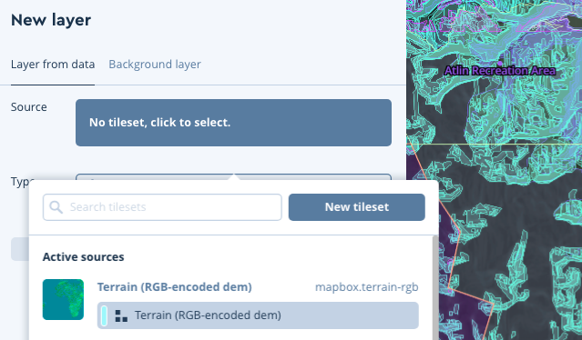
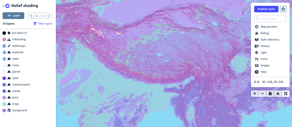
Recently, we released a new raster digital elevation model (DEM) source for styling terrain maps called Mapbox Terrain RGB. While styling any map in our cartography editor, Mapbox Studio, this data is available by adding the tileset as a new layer:
This guide specifically will use Tristen’s Relief style (← which you can add to your account from this link) as a canvas to build a custom styled terrain map. Let’s dig in!
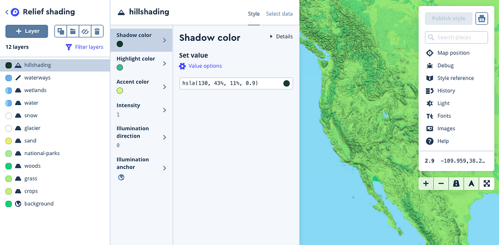
Adjust the colors & intensity of your hillshading layer
Take a second to orient yourself to the Studio interface. On your left is the layers list which details the types of data that make up your map. This style uses a short number of common land-use types which is ideal for a shaded relief map to really stand out.
Let’s start by choosing a color scheme to make this map your own:
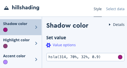
Select your hillshading layer from the layers list (as shown above)
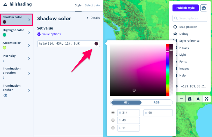
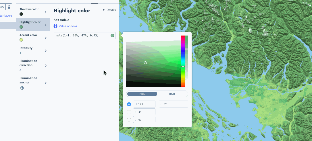
Click into each panel — shadow color, highlight color , and accent color — to experiment with complimentary colors of your choice
Note that accent color works well from a design perspective when the color opacity of the shadow and highlight properties are adjusted (using the right toggle in your color window):
For my style, I’ve chosen a festive, bright pink/purple/blue theme:
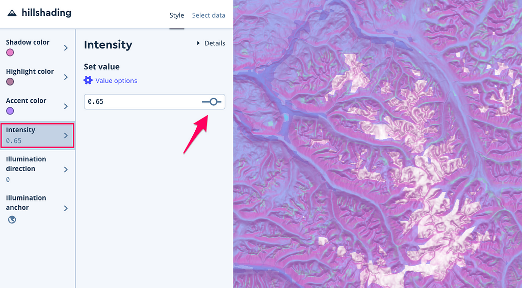
Another styling option is adjusting the Intensity of all the colors your layer uses — the intensity of this screenshot is set to .65 for a softer look, while the others below are a set to a full 1:
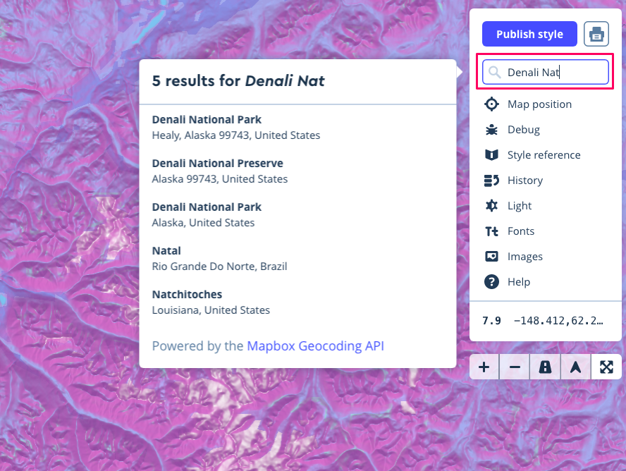
While you’re styling, you may find it helpful to use the search box to find mountainous territory — try Kathmandu, Nepal or Denali National Park, Alaska:
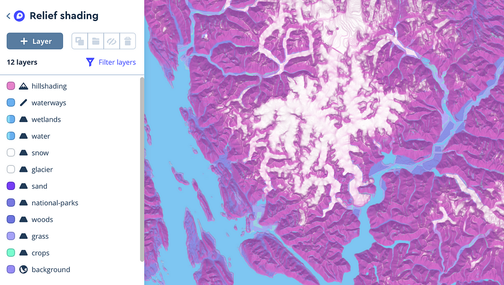
Continue styling color and intensity for all 12 layers
Click into each layer and choose colors that fit your theme as described above. My palette 🎨:
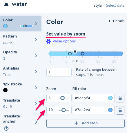
One interesting note about Tristen’s original map design — he uses the styling technique set value by zoom as described in the Studio Manual to create a better contrast between water and hillshading when shown at higher zoom levels.
Zoom in on the map yourself to see the water fade from turquoise → baby blue:
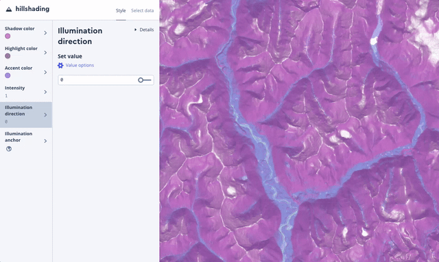
Styling illumination direction
Now that you’ve got the basics down, we can try to mirror Molly’s simulation of how the sun moves across terrain in her blog post Realistic Terrain With Custom Styling. For your hillshading layer, click into illumination direction and play around with the slider -
It’s worth noting that Molly accomplishes this effect in her post with the JavaScript library Mapbox GL JS. Check out the hillshade code example and the hillshade style spec to change any of these properties at runtime with JavaScript.
Share a screenshot or GIF on social 🎥
My favorite tool for Mac is Giphy Capture because you can edit your GIFs, but use whatever you’re comfortable with to grab a gnarly GIF zooming around your unique style. Share on Twitter with #mapwithmapbox to enter into the raffle for free Locate tickets, Mapbox swag, etc.
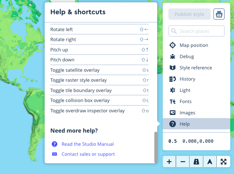
We’ll be on Twitter from this Thursday from 1–2 pm PST for #mappyhour answering questions. Send any questions taggin Mapbox and using #mappyhour and we’ll solve them with you, live. But don’t worry, we’d love to help you at any time on the chance you get incredibly stuck — reach out to us! While in the app — you can contact us from the Help panel on the right side of your screen -
Locate, is a two-day party with all of the coolest people and companies in the mapping space, including Di-Ann Eisnor, Director of Growth at Waze.
We’ve entered an era of living maps, where map data is collected in real time by millions of sensors — it’s like giving every user a pencil to draw the map as they use it. This is changing not just how we collect data, but how we plan cities, engage communities, and understand large-scale patterns in mobility.
The notion of a living map is already here. It’s becoming more about how we direct our insights. How do we use real-time data to improve infrastructure, reduce congestion, engage citizens, and plan better cities… I’m excited about rethinking the society I want to live in based on the potential for AI and live data to fundamentally change how we interpret the world around us. — Di-Ann Eisnor
Having started the US office for Waze in 2009, later acquired by Google in 2013, Di-Ann helped spearhead a key milestone in the evolution of maps. Waze was one of the first real-time feedback loops, where users directly influenced the performance and intelligence of the map. She shared what we can anticipate with living maps in the future, and what she’s most excited about exploring at Locate.
How has the “living map” evolved for Waze, and how is that data being used?
Nine years ago when I met the co-founders of Waze, I was so inspired by the idea you could form a community of people who actually wanted to help everyone as a whole figure out where to go. As we scaled from thousands to millions of users, it was fascinating to see the trends as the data became more saturated; so what happens when you have 10% of drivers in a city versus 20% or 30%. What does that tell us about new roads, incidents and emergencies, and live traffic? It very quickly became about okay, how do we apply this?
I started this program called the Connected Citizens program. It now has more than 600 cities and departments of transportation that can access a stream of that anonymous data. For example, 70% of crashes are reported in Waze before a 911 call, which means cities can optimize dispatching of first-responders. We’re getting reports that this can save 4–7 min, enough time to save a life. We’re seeing cities do things like figure out where to put new roads, or in the case of Rio during the 2016 Summer Olympics, figure out how to accommodate a million new people.
Real-time Waze data for Rio de Janeiro, Brazil
As cities, governments, and businesses rely more on real-time location data, what can we anticipate in the future?
We can anticipate the urgency. If congestion is a problem now, think about how it will compound 5–10 years from now. What I envision is we’ll have systems that allow us to use our roads and public spaces much more dynamically. The quantity of data we have combined with citizen engagement is a completely new opportunity to rethink our infrastructure. Imagine that a street is used for cars during commute hours, and then non-motorized transportation until 4pm, and then after 6pm it’s designated for recreational or collaborative space, whatever the local residents need.
One of the other really cool things that’s happening right now is modeling change using synthetic populations. With anonymized data of real-time and historical patterns, it’s possible to predict behavior of an entire population without collecting information about individuals. You can scale data collection and the resulting insights without infringing on people’s privacy.
Traffic in Jakarta, Indonesia
How are you thinking about making data more open and transparent so citizens can participate in how its used?
I’d say first, decentralization is really important. We need to leverage all of these new tools to make sure we aren’t creating giant honey pots of data that are vulnerable or inaccessible. As far as transparency, if someone wants to make a change in a city now, then the burden is on them to organize and to get involved in local government; it’s hard to do. Now imagine that every app on your phone allows you to share your input on key issues. How great would it be if cities could instantly aggregate this data and share results so decision-making is a seamless dialogue shared among everyone.
With so much happening in maps and location, what are you most excited about at Locate?
I’m excited about rethinking the society I want to live in based on the potential of AI to fundamentally change how we interpret the world around us. We have a chance to think about these existential technologies going hand-in-hand with ethics, transparency, and civic engagement. We can be conscious stewards of this tech. When you consider the violence, apathy, and inequality that exists today, we have a chance to build something a lot better.
We’ll be announcing more speakers, demos, and code labs at Locate in the weeks to come. Register for early bird tickets now to save your spot. You can also sign up to race autonomous Robocars at the event. More details here.
Patagonia just launched The Blue Heart of Europe storytelling map, part of their Dam Truth campaign to protect the rivers of the Balkans from hydroelectric damming. Patagonia’s digital team built this “scrollytelling” visualization using a custom-designed map (styled with Studio), and code examples from the GL JS library so readers fly to a location based on scroll position.
Click through the image to see the full map.
The Blue Heart story map is the type of visualization that makes you want to buy a bigger monitor. The map style itself is gorgeous — we’re loving the crisp look of the terrain hillshading combined with the data overlays representing existing, in-progress, and proposed dams. The map’s subdued design lets you focus on embedded drone footage — you get the bird’s eye view of the landscape and can tangibly connect to a region you may not know much about. Smooth transitions from geography-to-geography provide critical context to the nature photography and activist interviews captured by the Patagonia team.
For more background on the hydropower projects planned in the Balkan region, head to Patagonia’s blog, The Cleanest Line.
Geospock is building a data indexing engine to ingest, store, and retrieve geospatial and temporal data at petabyte scale. Their goal is to unlock the vast amounts of real-time data that companies collect, providing analytics software that makes it faster to derive insights, and therefore, more cost-efficient to manage data lakes. They’ve customized our maps and business intelligence tools so users can index and explore trillions of points of data.
David Brown, VP of Customer Success told us about upgrading their mapping engine using GL JS, our web API:
We needed maps with very high-rendering performance to take advantage of what we call extreme data — trillions of points or more. We also needed the flexibility to build our own custom visualisations with the same high-performance characteristics. GL JS was the only web-based mapping library that met those goals. — David Brown
Pedestrian-friendly supermarkets and banks in the Bay area
In mapping data at such a massive scale, can you describe the challenges you faced?
In illumin8, our interactive analytics product, we wanted a seamless navigation experience anywhere in the dataset, at any zoom level. We needed to load data in tiles, on-demand, using our back-end indexing to supply different detail levels and normalise the data being displayed on every frame so users can quickly explore the map.
This was a big challenge, particularly for a web app, because it requires sophisticated, and variable rendering, where we can control the detail at each zoom. It also needs to be fast enough to run interactively at a high frame rate, like in a modern 3D game engine. GL JS solved this problem for us, providing not just a high-performance map display, but in fact a highly extensible, GPU-accelerated rendering engine for web apps.
What were you able to build using GL JS?
We took the standard Mapbox point renderer and customised it to load GeoSpock data progressively on-demand. This gave us precise control of visual density frame-by-frame. Another example is our track rendering, where we visualise speed along the tracks by animating chevrons along them. Neither of these dynamic visualisations would be possible without the solid foundation GL JS offers.
illumin8 tracking flights out of ORD
So you customized our library to your use-case?
Yes, we integrated a customised version of the library into our web-based analytics product, illumin8. We are of course using the library and the Mapbox-hosted vector tiles to provide map rendering and navigation in our app. The real value to us is the first-class, GPU-accelerated rendering engine behind Mapbox GL. By extending the GL JS library with our own JavaScript and shader code, we’re able to build on the visualisations that are included (point, line, and polygon features) and render the sophisticated, dynamic, and real-time views of extreme-scale data that our customers need.
Ad spend by global market
How did the implementation go?
Since our primary use-case was building a JavaScript web app and integrating the GL JS library, our main interaction was with the library documentation, which is excellent. In particular, the large number of clearly-explained examples, with each example running live on the page, helped us get to grips with the features quickly.
Once we started customising GL JS, our attention shifted to the library code itself and extending it to add our custom visualisations and data handling. This turned out to be a delightful experience. GL JS is very well architected with carefully-designed internal interfaces, allowing us to add our extensions with minimal fuss, and in a nicely-encapsulated form. More broadly, we’ve benefitted from the strong commitment to helping developers as much as possible, things like open-sourcing useful utility libraries like Turf.js, maintaining active discussion forums, and hosting events where developers meet face-to-face. We’re looking forward to working together in the future.
Our Government Team is gearing up for another great week at GEOINT, the premier annual conference for all things GIS, kicking off next week in Tampa. This year, we’ve upgraded our footprint, with a new bigger booth to showcase all our demos including Mapbox GL JS, Studio, Maps SDK for Unity, AR, and Atlas.
Throughout the conference you can find, Rebecca, Kalimar, Siyu, and Kirk giving a series of lightning talks on our tools. Even better, there will be multiple external companies stopping by to share their stories on how they’ve successfully built Mapbox into their product.
Be sure to stop by our booth on the right side of the hall to chat with the team, explore our demos, and grab some swag. Want to set up a meeting ahead of time? Get in touch with us.
See you at GEOINT! was originally published in Points of interest on Medium, where people are continuing the conversation by highlighting and responding to this story.
We do a whooole lot of Earth-gazing on the satellite team. We each have our handful of favorite spots on the satellite layer—places we have personal connections to, or places we just like to look at. Today, we want to celebrate this beautiful ball of ecosystems we call home by sharing a few of those places.
Blood Falls, Antarctica
I enjoy browsing Antarctica on Landsat Live. The landscapes are amazing, and I like seeing the opposite season to what’s outside my own window. My favorite place is the tiny point of red at the center of this image: Blood Falls, one of the most Mars-like places on Earth — and one of the only dabs of bright color on the entire continent. — Charlie Loyd
The Isles of Scilly is an archipelago off the southwest corner of Cornwall, England. It is remote and is home to about 2,000 inhabitants. I like the scene because the water is clear in the harbor so that you can see the seaweed. The Scillonian [the archipelago’s famous passenger ferry] is in dock, so lots of people are starting their holidays as I did many years ago! — Norman Barker
Sutter Buttes is a round complex of extinct lava domes in the Sacramento Valley. Rising over 2000 feet, their undeveloped flanks contrast starkly with the surrounding agricultural landscape. — Damon Burgett
La Désirade is a French island in the Caribbean arc. Fun fact about the island: It’s the home of the Lesser Antillean iguana, an endangered species. — Vincent Sarago
We’re used to seeing Uluru in profile. From above we get to see new features. The fissures on top, filled with bright green vegetation, stand out against the folds of red sandstone. — Rachel Holm
I love this view of the recently glaciated Shawangunk Ridge in New York state, cutting diagonally to the Northeast — kind of amazing to be able to see it from above. Lake Minnewaska is the body of water to the west. I lived at the base of this cliff band in my early 20s and will never forget the views towards the Hudson Valley (to the east) from the top of the ridge. — Camilla Mahon
For the past two years, volunteers have worked together to map hundreds of thousands of square kilometers in the malaria affected world. Using open data and location analytics, the #VisualizeNoMalaria initiative, the Republic of Zambia Ministry of Health, PATH, and MACEPA are working towards a malaria free country. Collaborating with eight technology partners, the initiative is applying business intelligence tools and training to transform how Province and District Health Care Professionals report, visualize, and act on their data.
This year, we’re working alongside PATH and other technical partners to develop a prototype model to help predict and forecast malaria cases. The model considers factors like population density, topographical, hydrological, and epidemiological data allowing health and aid workers to better prepare for the number of malaria cases expected that year.
Community Health Workers in Southern Province, Zambia. Are they in or out of view of Cell Towers? Credit PATH/DatablickLeft: Alteryx workflow used to produce the Cell Tower Viewshed above (courtesy Alteryx for Good/PATH/Datablick) | Right: Tableau Dashboard using the Cell Tower Viewshed to calculate Community Health Workers in view (Tableau/PATH/Datablick)
In the model, there are layers based on population density, cell tower coverage, elevation data, and more. PATH will now be capable of answering questions like, “Are Community Health Workers in Southern Zambia in view (or not) of cell towers?” By plotting the positions of Community Health Workers and cell towers and using the elevation raster data, we’re able to get a picture of whether or not Community Health Workers can be seen by the cell towers.
With this information, we used Alteryx to blend the data with Malaria Case Reporting. Since Community Health Workers use SMS to report cases of malaria, it’s crucial to know where they can and cannot be seen by the cell towers. If they can be seen by the cell towers (called a “Viewshed”), then it’s likely that a successful, timely report can be sent. The aim here is to increase the fidelity of reporting of malaria cases.
Expanding the reach
It is estimated that 400,000 die from malaria each year. That’s why we’re proud to be a part of expanding our joint efforts to map and address malaria beyond Zambia, to the Elimination 8 countries.
“Access to better data has helped drive a 92 percent reduction in malaria-related deaths in Southern Province, Zambia, between 2014 and 2017. But malaria has no regard for borders. Collaboration between provinces and countries is key to making progress against this deadly disease.” (Courtesy PATH)
To support this expansion, we’ve processed over 50 gigabytes so far of open data to create data layers for population density, elevation, cell tower visibility, and landcover. These layers are input variables for situation awareness dashboards and forecasting model. Users can also use our custom background maps integrated with Tableau to show features like roads, waterways, and structures when working with their malaria case data.
The predictive model is still a proof of concept. We are now working with our #VisualizeNoMalaria partners to build it into a robust tool for making data driven public health decisions in Zambia and across the Elimination 8 countries. Take a look at what we’ve built so far:
We then uploaded our tiles and styled the layer in Studio, using equal interval breaks for color, and extrude heights using the population field.
Elevation layer
To build out the Elevation visualization we downloaded tiles from CGIAR STRM 90m Digital Elevation Database in geoTIFF format, and merged them using QGIS (Menu → Processing → GDAL Miscellaneous → Merge). We then clipped the raster geoTIFF with a mask (outline) of the E8 Countries in geojson format as we did previously for Population Density.
We then needed to polygonize the clipped geoTIFF by following: Menu → Processing → GDAL Conversion → Polygonize (Raster to Vector) and tippecanoe our resulting geojson:
Next, we uploaded our tiles and again styled the layer in Studio, using equal interval breaks for color, and extruded heights using the elevation field.
Like before, we uploaded our tiles and styled the layer in Studio, using equal interval breaks for color, and extrude heights using the visibility field.
Then we uploaded our tiles and styled the layer in Studio, using categorical values from the landcover field, matching them to the RGB values in the meta data legend.
To give the users this capability, we used JQuery to select the layer with a drop down, and then conditionally show or hide the relevant legend.
HTML
JQuery/Javascript
Using the Mapbox Layers in Tableau
All of the layers we created above can be used as background maps with Tableau by copying the style’s integration URL:
Then paste the URL in Tableau by following the path Menu → Map → Background Maps → Map Services → Add → Mapbox Services. The background map can also be used for additional context for further analysis.
Have your own project you want to work on? Reach out to our Community team to let us know how we can partner with you, or create a free account to start building your own data visualizations.