It’s yet another example of how Mapbox GL is at the core of the best map experiences on the web — and a great example of how the benefits of open source can spread beyond a single project.
You don’t have to wait for GL JS features to land in downstream projects to unlock that power for yourself. Sign up for a Mapbox account today and start building with the latest release of Mapbox GL JS and the full power of Mapbox Studio.
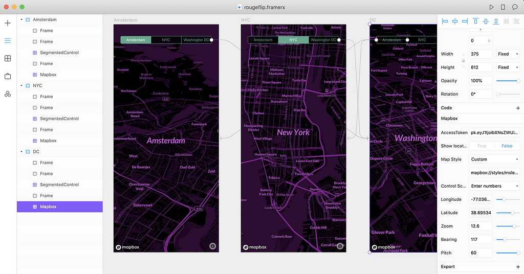
I’ve been playing around with Framer X. A lot. The Mapbox Framer component lets designers build out mapping concepts as quickly as they can sketch them. Bring in live, interactive, and custom maps to quickly prototype for products, projects, or clients. Prototypes in Framer X show engineers precisely what designers are imagining and can be built with code components that mirror precisely what’s possible in production.
While leading out the updates to the Mapbox component, I’m building some pretty sweet demos and wanted to share this map magic. Here’s what’s possible:
Cool map in 45 minutes ✅
Interactive prototype in 30 ✅
QR share code to wow friends ✅
Want to learn how to build the demo above? Read on below.
Building the map in Studio
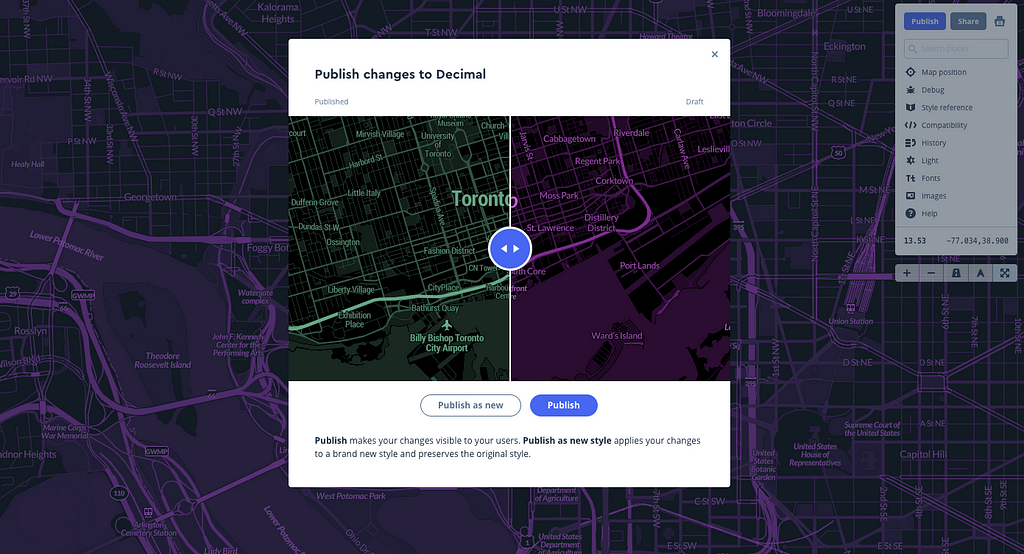
The Decimal designer map style was a great starting point. With the filter tool in Studio, I re-colored the entire map in just 20 minutes. I just flipped the Emerald Green to a smooth Raspberry Rouge. For more legibility, I picked an open source font that could get BOLD and CHUNKY, Lato. Then to level up the style, I added 3D buildings by converting the buildings layer to fill-extrusion and added a building height function. If you’re new to Mapbox, just watch this 4-minute video and you’ll be in 3D in no time.
From Framer X to Prototype
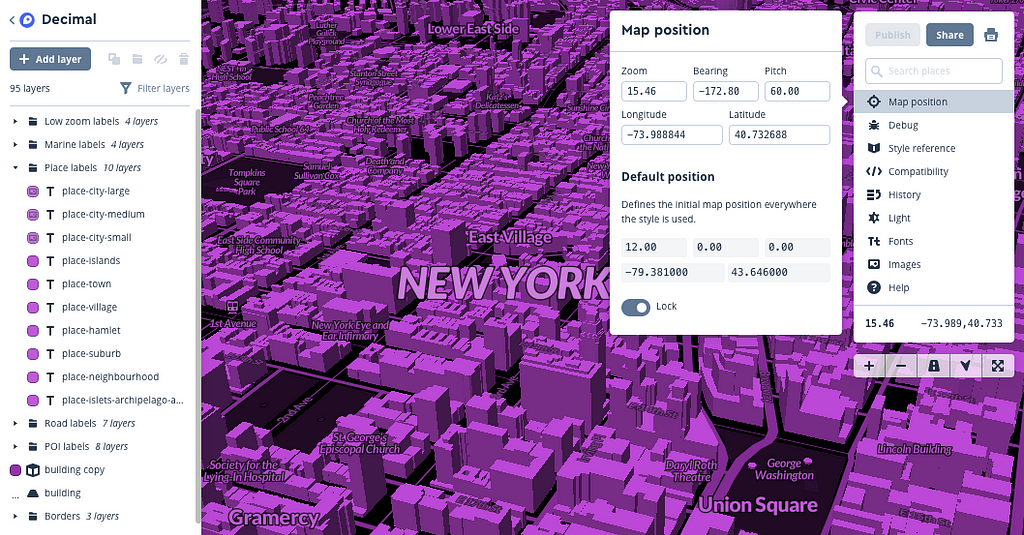
Once I had my map style, I dropped my accessToken into Framer to unlock my custom styles. Then I started building my prototype with Mapbox components from the Framer Store.
Pro tip: Want to figure out the longitude, latitude, zoom level and more quickly? Build your prototype in Framer X with Mapbox Studio open, move around the map, and grab the map positions directly.
We’re building more functionality into this component, the next release will include bearing, pitch, and fly.to animation quickly into your prototypes. I set my locations with slight bearing and pitch as they animate to show off my 3D buildings.
I then installed and restyled the Framer example component for the buttons and used their custom link transitions to bounce from frame to frame. My favorite part of this process was sending around the QR code to my coworkers. As long as Framer X is and running, you’re hosting it and can share your prototype with your team. It’s instant gratification and perfect for feedback.
Now it’s your turn
Don’t worry, these components updates and much more are coming soon to the Mapbox offering in Framer X. Can’t wait? Trying playing around with the 3D buildings layer (watch that video!), then pull your accessToken and map style ID into Framer X to start building.
When you’re done, share with me @amyleew on Twitter — I’d love to see you what you build.
We spend a significant portion of our lives monitoring the location of our things. Businesses monitor their fleets and shipments, governments monitor their movement of evidence, and individuals are constantly looking for lost keys or pets or wallets. We call this monitoring of moving items asset tracking.
In 2016, consumers generated nearly 2.5 exabytes of data per day, most of which comes from location-enabled devices. That’s the equivalent of 125 Library of Congresses-worth of data generated EVERY DAY! (The United States Library of Congress is estimated to hold ~3 petabytes of data.)
This growth makes it possible for any business to track their assets, in real time. However, companies are still using antiquated asset tracking technology, which is preventing them from maximizing the opportunity effectively.
In this new white paper, we discuss how Mapbox helps companies transition to a modern technology stack that provides global scale, functional flexibility, and end-to-end data ownership. This white paper covers both the strategy and execution recommendations for an asset tracking solution that can fit your unique business needs and delivers on the promise of modern location data.
Vivid Seats, North America’s largest independent marketplace for everything entertainment, is more than just a great experience. They’re also obsessedwith data. Their talented data team, gifted engineers, and skilled designers created a look at the most popular MLB teams in each state in this vivid visualization.
This project and others, like the October 2018 Most Popular Music Genre and Artist in Every New York City Neighborhood are perfect examples of how visualizations can tell a story. Through their unique buying and selling ecosystem, they learn a lot about their users — what they like, what they watch, what they’re interested in. But on a spreadsheet, it’s flat. Vivid Seats wanted to bring their user stories to life. With their proprietary data and Mapbox, Vivid Seats feels they’ve finally found their sweet spot with mapping data visualizations.
Most popular music genre for every New York City neighborhood
“Mapbox helped us breathe life into our data in an engaging, interactive way.” — Stephen Spiewak, Digital Content Marketing at Vivid Seats
The map explores America’s rooting interests by identifying the most popular MLB team in each county. It is based on Vivid Seats’ ticket data from 2018-present and excludes spring training and postseason ticket sales. They accomplished this by overlaying their data on top of our map and drilled down to state and postal code level boundary data. Then, they shaded in with the color corresponding with that county’s most popular team.
A lonely island of Braves fans in a sea of Cardinals fans.
Vivid Seats noticed a few key takeaways like:
With over 459 counties, the Braves can easily claim the most popular team in the US — possibly due to their television fame, or relative lack of competition in the South.
The Oakland A’s are the only team without at least one county on the map.
Whether it’s the Fenway Effect, or many former Massachusetts residents moving to a warmer climate, the Red Sox are the top team in two Florida counties: Levy & Bradford
For me, growing up in Northern Virginia before the Washington Nationals graced us with their presence, baseball meant trips out to Baltimore dressed in black and orange cheering on the Orioles and cleaning Boog’s Barbecue sauce off my fingers a picturesque Camden Yards. Those memories have made me forever an O’s fan, but fandom is not always static. As Vivid Seats put it, “Teams rise and fall in popularity, as they win, lose, relocate or as franchises are added.“
Vivid visualizations was originally published in Points of interest on Medium, where people are continuing the conversation by highlighting and responding to this story.
For the past three days, I’ve been in Amsterdam at the 2019 Geospatial World Forum discussing the future of location. On Wednesday I gave a presentation showcasing how Mapbox customers and partners like PATH are using location analytics to improve decision making. To see Visualize No Malaria recognized for the well-deserved honor of “exemplary innovations and practices in the global geospatial industry” is a testimony to the power of using location data to advance public health and other sustainable development goals.
How Visualize No Malaria uses data to guide the elimination of malaria
Despite improvements in disease surveillance and data collection tools, it is often still difficult for users of health intelligence systems to generate insights or provide actionable feedback to health workers on the ground. The government of Zambia and PATH started the Visualize No Malaria (VNM) initiative in 2015 to address these issues. Working with a coalition of private sector partners including the Tableau Foundation, Mapbox, Twillio.org, Alteryx, Exasol, Datablick, Slalom, and DigitalGlobe, VNM has created some of the most innovative, and user-focused tools for health data management, analysis, reporting, and decision-making.
The tools and data created for VNM give officials across all levels of the health system the flexibility to combine data from multiple sources, analyze it, and generate insights within user-friendly dashboards. These dashboards allow them to create data-informed decisions on where to deploy lifesaving resources — like ensuring mosquito nets reach the right places at the right time and that expensive medications don’t expire on the shelf.
Ministry of Health staff develop customized dashboards to analyze malaria data (Photo: Jonathan Drummey, PATH)
While PATH and technology partners provide regular in-person and virtual training, the health workers on the ground in Zambia are driving the development of these tools. PATH, in partnership with the Ministry of Health, has also trained over 3,200 community health workers who are the frontline of the national disease surveillance system. Already, improved collection and use of data has contributed to a 92 percent reduction in malaria deaths and an 88 percent reduction in malaria cases in Zambia’s Southern Province between 2014 and 2017.
Creating custom maps for use in Tableau (Photo: Marena Brinkhurst, Mapbox)
Congratulations to PATH, the Zambia Ministry of Health, and the entire VNM partnership for today’s award — let’s continue showing how collaborative, user-driven innovation can shape technology into tools to transform the lives of millions.
If you’re using location data for positive impact, our Community Team is here to support you.
We just released a new version of the mapbox-gl-geocoder plugin to add search to your web or mobile app. The latest release, version 4, allows you to completely customize how results are rendered, automatically detect the user’s language, set search proximity by default, and more.
Old (v3.2.x, left) vs. New (v4.0.x, right)
Custom styling
Add custom styling, icons, or text to the items in the dropdown using the plugin’s render function. The render function takes a GeoJSON feature in the search results and returns a string of HTML to render in the display. You can set the function when you create the plugin by setting options.render, or you can set it later using the setRenderFunction API.
Custom Maki icons in search results
For example: change the styling and add Maki icons to the dropdown menu to match the styling on your map or the rest of the content on the page. Create a custom render function that assigns a new CSS class to the dropdown elements and then sets the color property to match whatever color you want.
The new version of gl-geocoder improves the experience for users around the world by offering customization of language settings. By default, the gl-geocoder will inspect the user’s browser preferences and localize the plugin to the user’s default language (including setting the placeholder text in the search bar). You can also override the default placeholder and language settings by setting a language parameter.
The render function can also be used to improve the results returned to users. For example, you can set a render function that sets the place_name_de fields for your German-speaking users while setting the place_name_fr for those in France.
See this example of localizing the plugin’s language and placeholder.
Localization by default
In addition to improved customizability and localization, gl-geocoder now has new default behavior that improves the relevance of results. Version 4 automatically sets the proximity point for the request to the center of the user’s current map view and the language to the plugin’s language or the browser’s default language.
The plugin will also default to adding a marker to the location of the selected feature so that users will be aware of the exact location of the feature they’ve selected.
Because the plugin calls the Mapbox Search API, you still have full control over all the API options for complete customization.
Add mapbox-gl-geocoder to your map!
First, include the package’s JavaScript and CSS files from our CDN (also available on npm).
Warner Music France partnered with Mapbox and “Rock n’ Roll Cartographer” Lee Martin to create an interactive experience to promote one of the label’s biggest Hip Hop artists, Ninho. The progressive web app engaged fans to navigate the streets of Paris to recreate the artist’s logo on a Mapbox map for the chance to win a gold record and concert tickets.
To build this experience, the Innovation and New Usages Team at Warner Music needed to find a set of streets in Paris to match the letters “N” and “I” — the Ninho logo. Once they identified the location, they converted the data into a GeoJSON for Lee to use.
Early Prototype of the “N” and “I” path using the streets of Paris
The app itself is a progressive web app, which offers the flexibility of a web browser with the experience of a native application — without requiring a download! It enabled the team to quickly go from pitching the idea to the label to development and release in less than three weeks. All the fans needed to do was visit https://www.ninhodestin.com/ to participate.
Using the browser’s native HTML5 Geolocation to get the user’s location, Lee developed a native-like experience. When the users opened the app, they were prompted to share their location and walk to the starting point.
The user has to reach the first checkpoint in order to start the journey. “Your destiny is in your hands, good luck!”
Once the journey starts, the fans followed directions powered by the Directions API, supplemented by custom prompts from the Warner team. After users reached each checkpoint, the next path segment appeared, leading them closer to their final destination. At the end, fans could register their arrival by sharing the image of the artist’s logo on social networks. The team then welcomed the winners with prizes.
Once complete, the paths form the logo of the artist.
The night before the event, Ninho teased his followers with the announcement on social media. The morning of the event, the artist and his label shared all the information the fans needed to participate.
“Get ready to walk to win a golden record and concert tickets at the Zenith in Paris”
Fans gathered at Louvre-Rivoli in Paris and cruised the streets to meet with the label team and claim their prize, then shared the final design on Twitter and Instagram with the hashtag #ninhoparis.
Want to collaborate with Mapbox and integrate maps and location in your marketing campaigns? Reach out to me at lo@mapbox.com.
I miss you, Carrie Fisher! Happy Star Wars day! Here’s a preview of some of my favorite maps so far. Check back later, I’ll be updating this post as people tweet their maps 😉
#MayTheFourthBeWithYou was originally published in Points of interest on Medium, where people are continuing the conversation by highlighting and responding to this story.
We’re pretty amped for the final season of Game of Thrones. Since we love GOT and love making maps, we thought we’d combine the two and play around with a cool Game of Thrones-inspired map style. Check it out:
Want to make your own GOT-inspired map? Add this map style to your Mapbox Studio account and start designing your own, or build from scratch with the files here.
You can add detail to the cities, build those 3D castles, place the family banners, mark the character routes, map the GoT world as it would look based on who rules the Iron Throne at the end — we want to see all the GOT-inspired designs you can come up with.
Share your maps with us on twitter @Mapbox #builtwithmapbox. We’re excited to see what you come up with.
We are thrilled to welcome Nico Belmonte as a General Manager for Maps, owning maps service and map design at Mapbox. Nico’s vision defined how Mapbox tools were used at the core of Uber’s live location strategy, with a focus on autonomous maps.
When Nico was 11 years old, he thought he was going to buy his first computer. It turned out he was going to build it. He recalls the story in detail.
“I didn’t know anything about computers and my stepdad told me, ‘I’m going to buy you your first computer.’ This was maybe 11 years old. And so I was really excited. So I went to this place, and when I got there on the table were all the computer parts but they were not assembled, they were all laid out on the table. Then my stepdad taught me what each part of the computer was and how it worked while we assembled it together. I really appreciated that.”
Nico is a world-class leader and design visionary. At Uber Nico managed a 50-person team of designers, engineers, and visualization specialists. As the team lead, Nico launched Kepler.gl. His Mapbox collaborations include Kepler.gl, deck.gl, and the Custom Layers API.
As GM of Maps, Nico will lead a team charged with continuing to evolve the living map at the core of the Mapbox platform.
The quotes below are from an interview, vignettes of Nico’s talent and interests — a builder at heart, possessed of a world-class ability to develop both the whole product and its building block-parts with equal skill.
On the Uber ❤️ Mapbox history
“I started playing around with the idea of having overlays on top of Mapbox’s base map that would also leverage this technology called WebGL, which MapboxGL used under the hood. This was the start of a suite of visualization products we built on top of Mapbox (deck.gl, kepler.gl, avs.auto). We had a really interesting set of challenges at Uber related to data. Our core data is geospatial and location data, and it’s also real time. The volume is huge. Uber operates in about 500–600 plus cities at this point. We capture the positions for every moving vehicle, so it’s a lot of data to manage. We had very different use cases for mapping. We had systems for real-time visualization of vehicles’ positions, we had aggregated data to understand supply and demand, we had historical data throughout trips at different moments like morning and evening to understand commute patterns, etc. We also used Mapbox for troubleshooting dispatching and routing algorithms. Also we ended up using Mapbox for a lot of the self-driving car visualization. I think that Mapbox was a great foundation for a lot of the other building blocks we put together with it. It worked seamlessly with other components that we were developing. Mapbox was very developer friendly and was really state of the art when we discovered it. So we ended up choosing Mapbox.”
On live location
“At Uber live location was fundamental. Elastic trip pricing was based of in-the-moment supply-demand states. Live location is also an instant feedback loop for decision making based on your current scenario. For autonomous driving this meant having a vehicle build a plan for driving as its perception system captured actors on the road. From taking business decisions on things like driver incentives or marketing campaigns all the way to autonomy engineering, live location was at the core of the products we’ve built in the Visualization team.”
On Uber’s data visualization
“We really stretched and used the Mapbox products in many different ways. Got in lots of learnings from that. We’ve also built many permutations of tools that do just spatial analysis for a big variety of customers — software and autonomy engineering, policy, data science, design, etc.”
On privacy
“It was really amazing to hear about Mapbox’s take on privacy. Mapbox here does a really good job at making sure that everything is anonymized from the capturing stage. I think that that philosophy really paid off, especially, for example, in all of the GDPR efforts, where employees are spending millions of dollars to anonymize their data and Mapbox has gotten it right from the very beginning. This is a reflection, probably, of the culture and mindset within the company. I think that the open and transparent culture really resonated with me.”
On Mapbox’s building blocks
“Mapbox maps are pretty much everywhere, right? They’re on mobile phones. They’re on cars. They’re on desktop computers. I think that whatever incremental impact you make within the mapping products, it really gets amplified to what customers are using the product, so doing my job well in this role would be better understanding the customers using these products and finding opportunities to enter new markets. It will also involve product ideation: being able to predict that developing a set of features can unlock a lot more value for new businesses. And also being more strategic and bold in terms of understanding where we should be going next beyond incremental product improvements.”
The Vision SDK is now open to all developers. Monday’s launch at the Shanghai Auto Show lets developers around the world add AI maps into driving applications to create immersive navigation experiences with augmented reality, interpret signs and driving conditions on-the-fly, customize safety alerts, and monitor driver performance.
Sogou prototyping AR navigation and driver assistance features powered by the Vision SDK.
We built the Vision SDK to run on the billions of connected devices already in the hands of today’s drivers. Highly efficient neural networks process imagery directly on the edge, whether you’re developing for mobile, embedded, or automotive applications. This release includes cross-platform parity with support for Android, iOS, and embedded Linux. The SDK supports low-cost Android phones, multiple iPhone generations going back to the 6s, consumer dash cameras, connected WiFi cameras, and embedded automotive systems — we’re building an accessible platform. Everything works as part of the larger Mapbox stack, letting developers connect to the Mapbox cloud for turn-by-turn directions with live traffic to power augmented reality navigation. Customers can also integrate Vision SDK within alternative navigation SDKs.
Our launch partners at the Shanghai Auto Show illustrate the diversity of platforms needing AI maps. From embedded systems shipping in new cars today to IoT devices serving the consumer navigation market, we’ve tuned the Vision SDK to run on super low cost hardware. Situational context is interpreted with AI-powered image processing that is fast enough to run in real-time, yet efficient enough to run locally on mobile devices.
Mapbox and Pateo teams at the Shanghai Auto Show
SDK Features and Neural Network Functionality
The Vision SDK adds augmented reality navigation, classification and display of regulatory and warning signs, and driver alerts for nearby vehicles, cyclists, and pedestrians.
Augmented Reality Navigation and Lane Guidance: Lane detection allows smarter navigation instructions with augmented reality, audio cues for transitions, and traditional maps adjusting their viewing angle as drivers encounter complex intersections. For example, drivers can be alerted when a lane change is needed to complete a maneuver. Then, when reaching a destination, additional POI details or tips on parking can be overlaid on the screen.
Visualize POI and parking data as you near your destination.
Driver Assistance: The SDK interprets regulatory and warning signs, estimates the driver’s current speed, and detects lane markings, crosswalks, pedestrians, cyclists, and other vehicles. Alerts trigger when the SDK detects road hazards in the vehicle’s path. Developers can set custom thresholds for alerting drivers with visual or audio cues.
Create Vision-powered alerts about school zones, construction, road closures, hazards and more.
Live Traffic Alerts: The SDK’s sign and object detection keeps drivers informed about changing road conditions, such as construction and lane closures. The SDK also pulls in live traffic data from Mapbox. Whether you’re working through our Directions API, Matrix API, or Navigation SDK, integration is easy.
Fleet Management and Driver Performance: The SDK recognizes risky behaviors like speeding, tailgating, and running stop signs, and enables triggered actions such as video capture when specified events are detected. Fleet managers can build configurable incident reports with supporting images and videos to monitor driver performance, and improve driver safety using aggregated driving performance data from the Vision SDK.
Create an events stream to capture and review developer-defined incidents.
Launch Partners: Embedded Systems to 300 Million Mobile MAUs
We’re at the Shanghai Auto Show launching with partners who are transforming mobility in China: Sogou, the search giant with more than 300 million MAUs, and Pateo, a leader in integrated automotive infotainment systems. These new partnerships strengthen our existing global network with friends like Microsoft and Arm, who will extend the Vision SDK’s reach to their billions of devices. Sogou is using the Vision SDK to enrich their mobile app with augmented reality navigation, while Pateo is integrating the SDK for lane level guidance, augmented reality and driver assistance features.
Next-generation infotainment display from Pateo.
All the demos today were running on low power Arm processors. With the Vision SDK and the Arm-enabled devices already in the hands of billions of people, we’re able to segment and extract features from the environment more than ten times a second. We can now take inputs from sensors that ship on every smartphone and process it all on the device.
“A million and a half developers use Mapbox products that will continue to impact many markets. We look forward to working with them to bring the power of machine learning to the edge.”
— Jem Davies, Vice President, Fellow and General Manager, Machine Learning, Arm
AI Maps: Anonymous Data from Vision SDK Updated Map Data
The innovation of the Vision SDK is its ability to process live data with distributed sensors, keeping up with the rapidly changing road network. As changes are detected, the SDK classifies new road boundaries, lane markings, curbs, crosswalks, traffic signs, etc. — the features needed to build and maintain the most detailed map of the world.
Live interpretation of road conditions with connectivity to the rest of the Mapbox ecosystem gives drivers access to real-time, granular road information, improving safety, efficiency, and user experience. This stream of data is used to update the map live, and developers use this new ability to create richer, more immersive experiences with Mapbox maps and navigation.
AI processing on the edge enables fast, low-bandwidth updates to the road network, such as adding a new speed limit sign.
Since all the AI runs on-device, the Vision SDK doesn’t need to stream or record imagery to update the map. Leveraging a decentralized set of sensors means our maps benefit every time the Vision SDK is used in an app. We’re building our Vision telemetry pipeline while maintaining privacy, following the same principles we use with other types of location data.
Pricing for Vision SDK
We’re developers building for developers, so from free to enterprise-scale, the Vision SDK comes with the same complete set of features.
Public Beta Pricing (beginning June 2019)
For the next two months, the Vision SDK will be free for up to 50,000 MAUs. Starting in June, we will continue to offer a free tier of 50 MAUs so developers can start building without reaching for a credit card. If you need help pricing your project, our expert sales team is happy to connect.
Pay-as-you-grow: Our pay-as-you-go pricing gives developers a fair price no matter what is built. Only pay for what is used — no commitments necessary. Don’t get stalled by contracts, capacity planning, and price modeling — so you can focus on shipping faster.
Volume discounts: Discounts trigger as your usage grows, so you always get a fair price. When your application reaches volume scale, you’ll automatically get volume pricing. No negotiation necessary.
Committed-use discounts: Pricing is simply usage-based, meaning there is no need to get locked into big contracts. If you want to commit to a monthly volume and receive a significant discount beyond standard volume discounts, just contact our sales team to learn more.
Get ready to build
I’ll be providing a full overview of the Vision SDK in a few weeks on Thursday 5/2; you can sign up for the live session here. Register if you want to learn more and ask me questions!
Special thanks to our very own Captain Planet, Elijah Zarlin, and Mapbox’s Community Team, Marena Brinkhurst and Mikel Maron for helping us create this issue of Location is Personal.
As humans, we rely heavily on what we can directly see, smell, touch. Consequently, our physical home, our relationship to the land, and the observable changes around us influence our understanding of the world.
But our reliance solely on personal experience as the source of truth can leave us vulnerable to falsehoods and confusion. You’ve probably heard someone say, “If the planet is getting warmer, why is there so much snow outside?” This becomes dangerous when unsubstantiated beliefs are used as justification for governmental policies.
The basic science of climate change is simple. Its references in science go back to 1896. This concise explanation appeared in a New Zealand newspaper in 1912. But only in March of this year, for the first time in 40 years of Gallup polling, did a majority of Americans respond as being materially concerned about it. After a string of “natural” disasters and catastrophes have touched more and more people, personal experience may finally be starting to catch up.
Even for people who worry about this a lot, it’s hard to know what to do. As individuals today, we’re bombarded with scientific findings, new doomsday articles, other articles saying we shouldn’t scare people, plus a blizzard of ludicrousnonsense. And try as we may to drive less or eat less meat, it can seem like it’s never enough, and you’re pushing against the tide.This is actually by design.
So how do we push past first-hand empirical knowledge? One way is to promote transparency and support scientific research. At Mapbox, our Community Team is dedicated to supporting scientists and environmental advocates as they visualize the problems the planet is currently facing.
The team has actively helped with projects like Headwaters Economics’ San Luis Valley Wildfire Risk, an interactive project exploring watersheds, wildfire, and the wildland-urban interface in Colorado’s San Luis Valley. Or this live marine life tracker from Citizens of the Great Barrier Reef, where you can track the live migrations of turtles, sharks, whale sharks, and manta rays.
The key to unlocking these resources is digitalization. Pulling this data out of spreadsheets, PDFs, paper maps, and other raster formats so we can visualize solutions, connections, and patterns more dynamically. The USGS took this approach to communicate the growth of wind power across the US with their Wind Turbine Database project and its dynamic map. Similarly, Global Forest Watch has made its data explorable via a huge mapping effort. If technology can save money for big companies routing trucks and delivering packages, can the mass digitization and visualization of data impact the way we view climate change and conservation?
Global Forest Watch’s data mapped
We want to work with more people whose work focuses on understanding and impacting conservation, climate change, and environmental justice spaces. You can reach out to the team for more info. If you are a developer interested in building environmental data projects, you can join the Mapbox Developer Network so organizations can contact you about what they want to build. And if you’ve ever wanted to do some visualizations but couldn’t find the data, check out BuzzFeed’s Jeremy Singer-Vine’s giant list of datasets!
Italian Limes, a project mapping the moving border across Italy’s glaciers
Our very own Damon Burgett, jack of all trades, ace at some. Geography and Imagery at Mapbox
Zack Labe, Climate Scientist and PhD candidate at the Department of Earth System Science (ESS) at the University of California, Irvine. Check out his work
Leanne Abraham, data viz at Planet. Making maps and learning things at the University of Wisconsin
Roque Leal is a Data Scientist and Software Developer in Ecuador. His current project, World Oil Map, is an independent, open source initiative to visualize data on the oil and gas sector, including announcements about licensing rounds and discoveries of hydrocarbon deposits. He hopes making these data sets easier to understand will improve the transparency of oil development and environmental protection decisions. Contributors are encouraged to help build out the data and features of the World Oil Map.
Location is Personal is a monthly newsletter by Mapbox, from the desks of Lo Bénichou and Amy Lee Walton. We’re exploring how the human experience shapes the spatial experience. Want to start getting this newsletter in your inbox each month? Sign up here.
I met Ben in 2008, right around when we bought the domain name Mapbox.com. Ben introduced me to CrisisMappers, Erik Hersman, and many of the other leaders in the “neo-geography” space. These were still the easy days of Development Seed, and Mapbox was just website with some links to our open source projects on GitHub.
It’s about time — let me officially welcome Ben Truscello, former Head of Business Development for SE Asia, China, Australia at Twitter, as our new Vice President of Business Development for APAC, based in Singapore. Ben’s focus will be on expanding our presence in APAC, working especially close with many of our Softbank cousins in the region, and launching our presence in Japan this year and continue to grow our presence in China.
Great to be back in San Francisco, speaking at the @mapbox Locate event about @ushahidi and the early crisismapping days, and offline/online internet with @brcknet today. #explorelocate Bonus pic from the very first CrisisMappers event in 2008 with @ericg
When we met back in 2008 Ben had just co-founded an NGO focused on mobile health organized around a vision that realized the tremendous value of mobile, open data and mapping with tools like OpenStreetMap for crisis prevention and response. Ben’s focus on monitoring health issues meant he was splitting his time between Washington DC, a few blocks from the old garage, and in Tanzania where he was monitoring the spread of anthrax, foot and mouth, and tracking the origins of animal migration from to look for the sources of these outbreaks.
Ben played an active role in CrisisMappers over the years, a project that would be instrumental to the origins of Mapbox. After the earthquake in Haiti, CrisisMappers sprung into action to support the response. Ben called on friends at DigitalGlobe, who agreed to release imagery daily for a week to the group to improve the maps in OpenStreetMap.
The team at Development Seed spent the crisis helping get updated maps and critical location data to the folks on the ground in real time. What’s more, we needed better tools for improving the data collection in tools. These challenges made Mapbox who we are today.
After Haiti and from his days working building the NGO, Ben saw first-hand the value of social media and open data in crisis response. Ben joined Twitter where he’s spent the last 4.5 years leading data partnerships globally and then leading business development in APAC. As Ben put it,
“Twitter is one of the most important data sources in the world. There are half a billion tweets a day created on a huge range of topics. It doesn’t matter if you’re an advertiser or a humanitarian, there’s data critical to decision making in Twitter if you know how to find it. In my roles at Twitter, we created data services teams and programs, established key partnerships for data analytics, and with OEMs. I loved digging in with clients and partners on their hardest challenges.”
I asked Ben what he’s excited about joining Dave and the team in Asia:
“Asia is very dynamic — no two markets are the same. It’s a place where startups are growing and expanding quickly: in ride-sharing, in payments, in e-commerce, and in last mile logistics. There’s a tremendous need for our maps and we need to grow quickly across the region. Mapping is a fundamental need for every company operating in APAC; whether that is in humanitarian relief or in launching new on-demand delivery businesses.”
Ben is based in Singapore and will work closely with our teams in China and Japan. Ben added:
“Expanding in APAC is about solving a fundamental challenge particularly in Southeast Asia, and frankly other parts of APAC, which is high-quality, mapping and location data. We can help solve a lot of challenges in the market for our ecosystem of partners and customers.“
After almost a decade since we met, I’m stoked to officially have him as a member of the Mapbox team. Welcome aboard, Ben!
Yesterday, the Mapbox people team organized an Easter egg hunt in the office, and a bunch of “professionals” giddily ran around for 20 minutes tossing throw pillows and crawling on the floor to find hidden candy. Yes, Easter egg hunts are fun. So what if they were… everywhere?
For the second year in a row, The Great Snapchat Egg Hunt is here to answer that question. Tens of millions of eggs are hiding in plain sight, and all weekend long users can hunt them on Snapchat to compete with friends and family.
When users open the app, they’re greeted with a map filled with decorated Easter eggs and challenged to collect as many as they can. Like PokemonGo, once they’re close to the eggs, the eggs appear in augmented reality on the camera and they tap the egg to collect it. Collect as many as possible over the weekend, and watch your score rise as you compete. Regular eggs are worth one point but golden eggs will get you five points.
Found an egg in our lobby. How did the Snap team get in there?
This year’s map has rare chicks in addition to eggs. If you spot one, you’ll be able to unlock a “Mini-Game Lens,” giving you the opportunity to score even more points.
Last year, Snapchat users collected over 59,692,012 eggs. And, 144,034 people even collected more than 100 eggs in just one day. We’re loving watching how excited people are for this competition to come back:
Wow didn't think I'd be excited about an easter egg hunt as an adult. Thanks @Snapchat@Mapbox 😄
Location tools can help us understand complex data, create engaging campaigns and stories, and create solutions to improve lives. Throughout this week, we’ll be profiling projects from nine builders who are using data and maps as part of their responses to environmental issues locally and globally.
The picture of our changing planet can be scary and overwhelming. Along with more and more people, I’m worried about the challenges my young children will face in their lifetime. We are directly experiencing a warming and more chaotic climate system, yet the footprint of our built environment continues to expand, and our collective consumption of energy, materials, and ecological resources is accelerating.
The ability to see and understand these changes is also accelerating, thanks to more powerful tools and massive amounts of data. That’s important because the human brain has a hard time processing complex information that isn’t linked to our lived experience. Data and maps — visual, rooted in science, and actionable — help us connect these vast concepts to our view of the world.
These three maps translate complex environmental datasets at different scales (local, national, and global) into visualizations that we can understand and relate to on a more personal level.
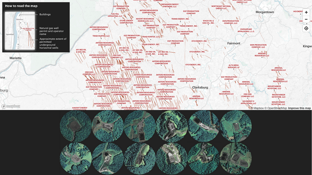
ProPublica: Visualizing natural gas wells across West Virginia
Resource extraction like mining or logging can be easy to ignore if you are not within the immediate radius of impact. And awareness of a single extraction location can still miss the larger cumulative effects or extraction activities across a landscape.
ProPublica and the Charleston Gazette-Mail visualized 1470 locations where natural gas well pads have been or could be built. With West Virginia’s mountainous terrain, land must be cleared and leveled to construct these installations. They originally decided to make this map because they found that even people who live literally right next door to well pads didn’t know where or how far the horizontal wells ran. Environmental reporter Kate Mishkin reflected:
The scale of wells and permits has definitely surprised people. I think that many people were struck by the scope of the industry, and how many horizontal wells there really are.
We wanted to make absolutely clear what the horizontal lines meant. Because the wells run underground, we wanted to express really boldly that the lines are not visible features, and that they’re not the actual paths of the wells. The lines coming out from central points are really striking in a view like this, but on the ground, these well pads are nestled up on hills, and may not always be apparent.
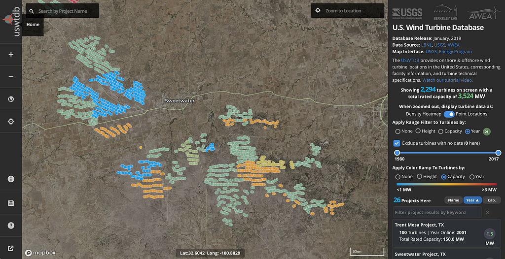
USGS: Visualizing wind turbines across the US
The transition is speeding up toward an upgraded energy infrastructure that produces less pollution. There are 58,449 wind turbines in the US, and the US Wind Turbine Database (USWTB) introduces you to each one with details on location and capacity. This dataset is the combination of open government data and previously private data, validated and updated by USWTDB partners. The USGS uses high-resolution satellite imagery to validate, verify, move, and add turbines. Since its launch in April 2018, the database, map interface, and API have seen close to 1.5 million visits.
The data have been used by state and county level planners, natural resource managers, citizens, students, and even technicians and engineers from wind energy companies themselves. The database supports analysis on topics ranging from energy grid stability, to wind energy impacts on local climate and surface temperature, radar interference, impacts of collisions with wind turbines on wildlife, public acceptance of wind energy, and changes in property values.
When the USGS built the map viewer for the data, they focused on making it fast to dynamically interact with the multiple dimensions available within the data using data-driven styling and queryRenderedFeatures to do client-side calculations. Chris Garrity, one of the developers on the project, shares some highlights:
One of the key features our users requested was dynamic turbine count and capacity calculations (tied to active filters), for visible turbines on the map. Our turbine features come from tiled vector data so we add a helper to avoid duplicates:
//Get unique features to avoid dups on tile boundaries
function getUniqueFeatures(array, pKey) {
        var existingFeatureKeys = {};
        var uniqueFeatures = array.filter(function (el) {
                if (existingFeatureKeys[el.properties[pKey]]) {
                        return false;
                } else {
                        existingFeatureKeys[el.properties[pKey]] = true;
                        return true;
                }
        });
Then we simply tie query parameters to a moveend event:
//Pass turbine counts
map.on('moveend', function () {
        var features = map.queryRenderedFeatures({
                layers: ['turbines']
        });
        if (features) {
                var uniqueFeatures = getUniqueFeatures(features, 'case_id');
                document.getElementById('turCount').innerText = uniqueFeatures.length;
        }
});
If we wanted to grab the values of a particular feature property (capacity “t_cap” below) in the same moveend event we could tie in a simple Array method to sum capacity of the features in the maps viewport:
uniqueFeatures.forEach(function(feature) {
var prop = feature.properties;
sumCap += parseInt(prop.t_cap);
});
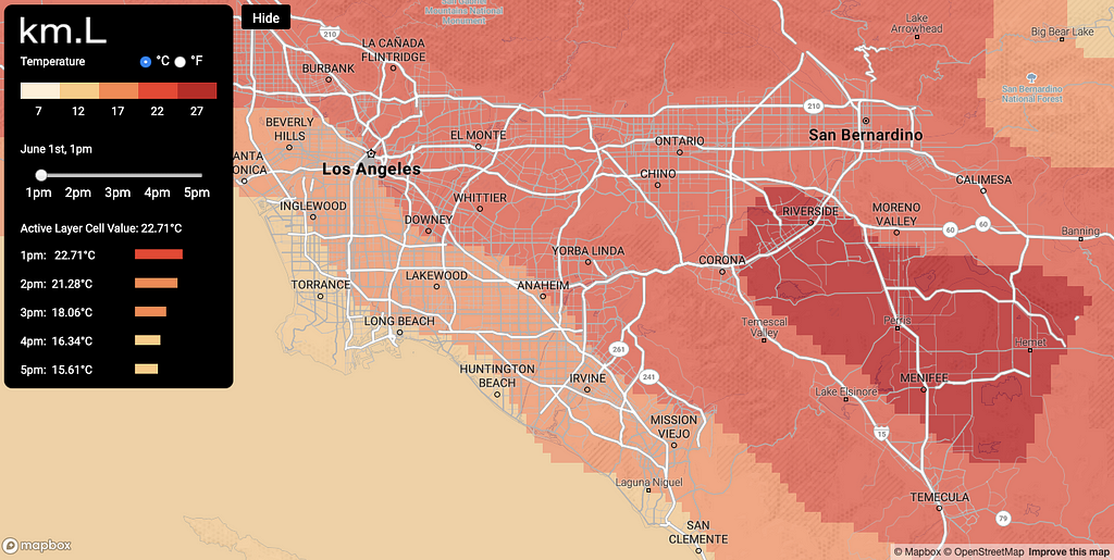
Kilometer Labs: Visualizing microclimate predictions around the world
Kilometer Labs takes the best performing physics-based global climate models and simulates, refines, and visualizes detailed predictions of temperature, wind, and other climate conditions at an unprecedented level of detail — down to the kilometer. This model helps to localize not only the impacts of climate change, but can also inform adaptation planning — for example by anticipating which communities or which vulnerable species are expected to experience environmental changes most severely at a local level.
Geographic results from climate models are often distributed as gridded data in GeoTIFF raster format. While compact, raster data can sometimes be unwieldy to process in web-based interactive maps, like the maps that Kilometer Labs builds. Their approach is to “vectorize” their raster data so it can be dynamically styled in mapbox-gl-js. The gdal_polygonize utility distributed with the GDAL library makes this step simple. The Python GDAL/OGR Cookbook goes into more detail on how to integrate polygonize into your code.
The Mapbox Community team partners with world-changing organizations and individuals using location tools to help solve major social and environmental challenges. Are you building with data to understand our changing planet? Get in touch!
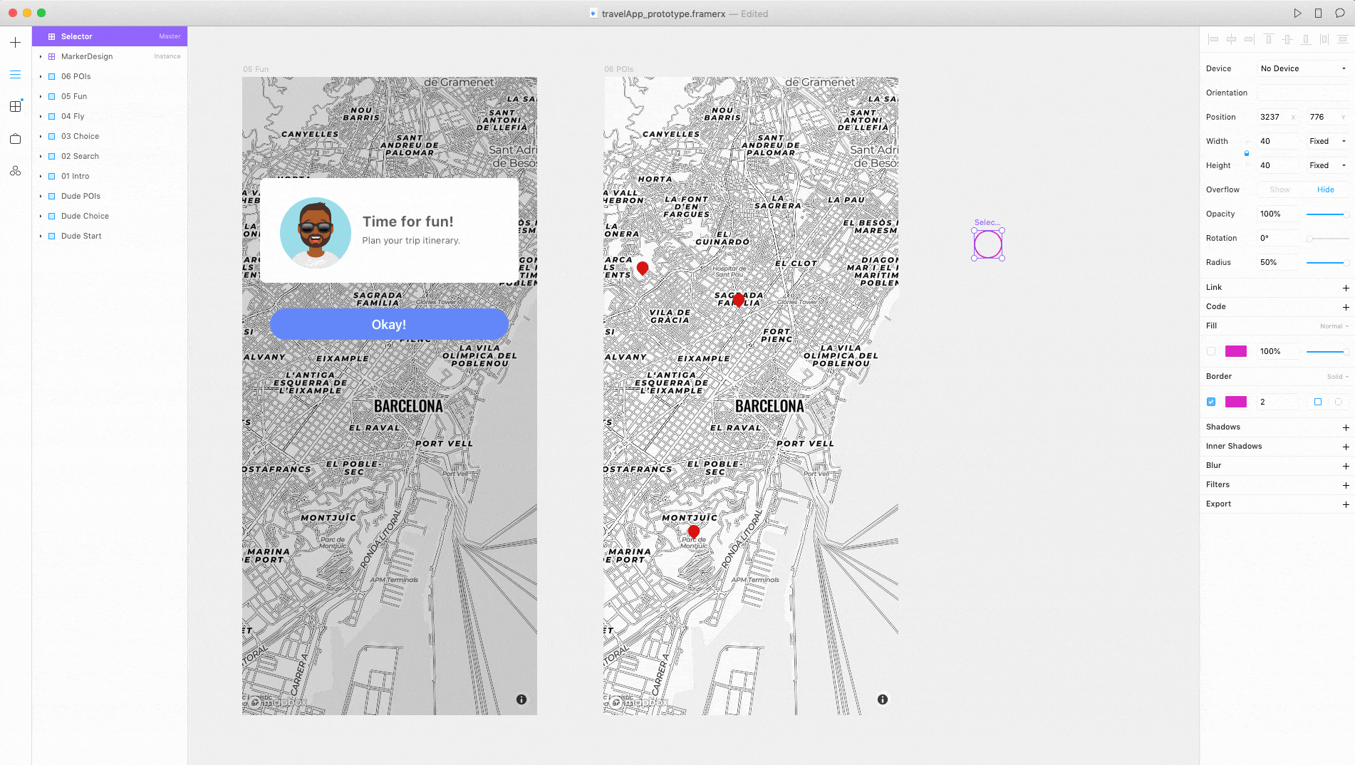
Our Framer X mapping package has now been downloaded more than 12,000 times! The Mapbox component pulls in a fully-functional map, featuring 16 different map styles. Spinning up a location-based prototype takes less than 30 minutes. In our latest launch this month we just introduced two additional components to the Mapbox package, which offers new ways to design with maps in Framer X. Below is a look at what’s new.
Amy Lee Walton leads our partnership with Framer. If you are using Framer you should sign up for our upcoming free joint webinar, with Amy Lee and Addison Schultz, Product Specialist at Framer on “Live Location Meets Power Prototypes”, happening Wednesday, May 22 at 11 am PT / 2 pm ET / 8pm CEST.
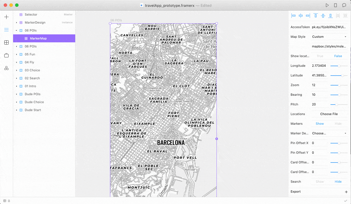
Add custom locations
The Marker Map lets you upload custom locations via JSON and add them as markers directly to the map. You can also set the popup information that shows when the user clicks the marker.
Upload custom locations and points to your prototype.
Here is what a simple marker would look like in JSON:
Marker Design in Framer X
One of the best functionalities of this component is that you can take the selector on the right edge of the Marker Map component, and attach it to something you’ve designed on the canvas. This allows you to include your own design for the marker, rather than the default red marker that appears at first.
Connect Marker Map component directly to your marker design in Framer X!
Fly around the map
We also added the fly.to Mapbox API to navigate around the map, based on a set of locations and bearings set through a code override. Check out this article if you want to learn more about the power of code overrides in Framer X. Here’s an example of what an override would look like if you set it to move between 4 different locations:
In addition to attaching the different locations through overrides, you can change the duration between the locations, and even set the map to autoplay if you want it to play right away, vs. the default onClick.
We ❤️ Framer
The Framer X Store is amazing — it’s a free marketplace, where designers and developers contribute packages made up of interactive components and design assets. It’s a community-powered resource that helps uplevel the entire design community, while giving component makers the credit they deserve. Since Framer X launched 6 months ago, over 400,000 packages have been downloaded from the public store. The variety is astounding, from animations, inputs, and grids to working media players.
We can’t wait to see what you prototype with Framer + Mapbox. Join Amy Lee and Addison from Framer for more, “Live Location Meets Power Prototypes”, happening Wednesday, May 22 at 11 am PT / 2 pm ET / 8pm CEST. And sign up here to get Mapbox updates for Framer.
In 2018, 84 million trips were taken on shared bikes and scooters. The success of micromobility is a boon for local governments who want to better understand how their citizens are moving around cities. The data generated by private mobility companies can help local governments understand how new mobility projects impact transit, how residents use different types of space, where gaps in transit exist, and more — and all of these insights can help governments build better, smarter cities for the future. This is a great thing!
However, it’s critical to ensure that end-user privacy is protected first and foremost in this treasure trove of mobility data. At Mapbox, location is the core of our business, and we’ve taken great care to protect user privacy while relying on location data to drive product improvements, and be a resource for others to understand considerations and best practices when building with sensitive user data.
Cities are beginning to take the necessary steps to create standardized reporting protocols, to share and use the data from private mobility operators. But in some cases, these protocols still need to be tweaked to protect user safety.
One example is the Mobility Data Specification, or MDS, released in September, 2018 by The Los Angeles Department of Transportation. MDS is a set of APIs that provides cities with de-identified data about dockless mobility (DM) projects (e.g. shared bikes and scooters.) Cities adopting MDS require private mobility operators to provide point-by-point routes coupled with start and end times of every trip taken.
Location data of this format poses a serious risk to rider privacy. Individual, unaggregated route records can be re-identified with ease, which can expose sensitive information about individuals.
Instead of a protocol that collects such specific user data, here are some thoughts on how cities can 1) surface key operational insights and 2) create transparency needed to track permit compliance, while preserving user privacy.
Use Aggregated Data to Prove Out Investment in Bike Lanes
Cities can surface actionable insights about new infrastructure investments by aggregating route data across road segments, vehicle types, days of the week, and hours of the day. Data points demonstrating the distribution of “total vehicle miles traveled” can be paired with compelling visualizations to help transportation planners make commonsense investments in local infrastructure.
Use Heatmaps to Site High-Impact Mobility Hubs
At their best, bike and scooter programs work to complement the current transportation network by filling in the difficult-to-reach gaps left by personal vehicles or fixed-route transit. Cities can use heatmaps to aggregate origin and destination data to identify desirable areas for mobility hubs. Origin and destination data can be a powerful aid in crafting service level agreements that ensure operators successfully service high-demand and transit-underserved parts of town.
Use Asset Tracking Dashboards to Monitor Compliance, Safety and Equity
Shared scooters and bikes need regular inspections
Scooters are notorious for their short lifespan and should receive aggressively-cadenced inspections by trained employees. Cities can use an asset tracking dashboard to show the number of broken bikes or scooters in the field in relationship to the number of available bikes or scooters. They can also ask operators to provide a timestamp of last inspection to surface infrequently maintained bikes or scooters currently in operation. This data helps cities ensure scooter and bike companies are offering safe and reliable services.
Cities can track fleet size compliance in real-time
Some cities cap number of scooters or bikes allowed in service. Cities can use a dashboard that surfaces historic and real-time numbers of available bikes or scooters in field by operator. This helps cities identify when scooter and bike companies are above or below permitted fleet size requirements.
Cities can monitor obvious parking violations in real-time
Some areas of town, like National Park Land, are off-limits to dockless vehicles. Using an operations dashboard, cities can flag out-of-bounds vehicles in real-time.
Cities can ensure equitable distribution of fleets
Being able to track available scooters and bikes in real-time allows cities and transportation authorities to monitor operator compliance with equity requirements. During JUMP’s pilot in San Francisco, the operator regularly exceeded equity requirements by ensuring over 20% of their fleet remained available in transit underserved communities.
There are many great ways that the data from micromobility companies can help improve infrastructure, mobility, and access in our cities, but it’s important that, as a group, we figure out the right way to facilitate this data transfer while maintaining users’ privacy.
Discussing the issues and challenges is an important first step. If you’re interested in learning more, we’re hosting a Micromobility Happy Hour in the Mapbox SF office on Wednesday, May 1st. We’ve got some of the top minds in the space joining us for a spirited conversation on how we can improve accessibility and adoption of micromobility technologies and use the data to improve our cities.RSVP here. (Space is limited.)
Youth Climate Strikes across Europe on March 15th as seen from Snap Map
This week, we’re highlighting projects from nine builders who are using data and maps as part of their responses to environmental issues locally and globally. Our first post looked at translating complex data to make it personal.
When it comes to successfully mobilizing a lot of people to take action to drive change, those people have to understand why their action is important.
Creating the relevance and resonance that drives individual engagement can be difficult on issues like pollution and resource consumption on a global scale. Hotter temperatures, melting ice, deforestation, species loss — these are by definition massive, diffuse. How does one person’s activity fit in?
Maps and location can help drive personal connections to vast data, and these tools are also a powerful resource for mobilizing people. From logistics to storytelling, these three projects use location in different ways to engage audiences and spur action.
Citizens of the Great Barrier Reef: Reef Tracks
Reef Tracks is the latest project of Citizens of the Great Barrier Reef. It uses satellite tags to track the movements of various reef animals — sharks, turtles, manta rays, and a whale shark, with more on the way. While Reef Tracks does facilitate data sharing among scientists, its primary intention is to bring people around the world closer to the Great Barrier Reef and participate in its protection.
In contrast to the many grim headlines about the reef, Reef Tracks takes a beautiful and hopeful approach to exploring the data of the Reef as it exists today. As developer Som Meaden explains:
I’d like to think that the balance we strike reflects the reality of the situation. The Great Barrier Reef isn’t done yet — in fact far from it, it’s still one of the most awe-inspiring places you’ll visit on earth! But it also represents one of the first potential catastrophes of climate change (and human indifference). Our content is informative, we don’t pull any punches. But it’s also always intended as a call to action, and action demands hope.
Som builds and maintains a diverse portfolio of map-based projects and campaigns — from maps that describe coral reproduction, to volunteering opportunities, to a plastic-free pledge campaign. One of his tricks? Use Mapbox Studio to design and deploy a common base style across multiple maps, with everything else formulated on the fly using Mapbox GL JS.
This allows us to easily (and visually) update common elements across all our maps, including features like the Great Barrier Reef Marine Park boundary, and key points of interest such as islands, reefs and major cities, without the need to redeploy, duplicate code, or create over-engineered components. Too easy, mate!
Greenpeace Russia: Crowd-sourced air pollution
When Greenpeace was planning a new campaign to raise awareness about how widespread air pollution is across Russia, they knew they needed a map. It had to not only communicate the distribution of the problem, but also encourage action by visualizing local air quality complaints.
They designed the map to handle a lot of very different data sources: expected sources of air pollution (like traffic congestion and industrial areas), data from existing air monitoring stations, and crowdsourced reports of poor air quality. After only 3 weeks, Greenpeace has received over 1,500 reports about air pollution from across the country.
It is an unusual map. The bright yellow icons of air quality complaints stand out like warning signs against the dark purple and black map style. Project lead, Vasily Yablokov, explains how they approached map design with engagement and emotional response in mind:
We wanted complaints to stand out — to see how many people are saying there’s a problem, that this is a big problem and not just a few people. We want the government to see that air pollution is reaching a level where they need to respond.
Youth Climate Strikes: Strike Map
From its start in September 2018 with Swedish teenager Greta Thunberg, the Youth #ClimateStrike movement is elevating the voices of young people demanding action on climate change. When the youth leaders organizing the US Youth Climate Strike on March 15th reached out to the Future Coalition for assistance with communications and operational management one of the key things that volunteers built was a new map to visualize and propel the growing number of strikes.
“Should I go?” and “Who’s going to be there?” are the fundamental questions of social engagement, and the map resoundingly answered both. The new map and site improvements were a major boost to the campaign: the number of strike registrations tripled in mere days thanks to the great visibility and the simplified event registration process. Overall, 424 student strikes took place across 45 states. The climate strikes were a huge global event, as seen from the Snap Map view at the top of this post.
Beth Robertson, one of the Future Coalition volunteers, sees the map as a key piece of the campaign’s engagement strategy.
It makes the events themselves more visually accessible when people are searching for an event to join, and the overall map helps to show the scale of the movement across the country.
The effort to build the new map also brought improvements to the campaign’s data management. Organizers can now maintain the information in a simple Google spreadsheet, making it easy to collaborate and check the data for duplications or errors.
The map updates automatically from the spreadsheet, thanks to Python code running in the cloud several times a day, as explained by developer Kimberly Nicholls in this detailed how-to post from a previous iteration of this map architecture built for MarchOn. The Climate Strike iteration is now a template that can be easily replicated for future actions.
The Mapbox Community team partners with world-changing organizations and individuals using location tools to help solve social and environmental challenges. Are you building maps for environmental campaigns? Get in touch!
“Our company’s roots began with global development projects in Afghanistan, Congo, Haiti, and the United States, so the mission of Visualize No Malaria is very close to our hearts. We built these tools to help people understand context in data so they can solve problems. It’s incredible to see people use these platforms to literally save lives.” — Eric Gundersen, Mapbox CEO
Mapbox is scaling up our partnership with Visualize No Malaria to include more detailed data layers with Enterprise Boundaries and on-premises, offline capability with Mapbox Atlas, in addition to our ongoing in-person and remote technical support and training.
This new commitment to PATH, a global organization dedicated to accelerating health equity, expands on the early success of the Visualize No Malaria initiative and was announced at the World Malaria Day 2019 event hosted by the RBM Partnership to End Malaria in partnership with the City of Paris and the French government.
A growing collaboration
Originally launched in 2015 as a collaboration between PATH, Tableau Foundation, and the Zambian Ministry of Health, the Visualize No Malaria digitaltechnologies make real-time, actionable data about malaria available to everyone from national and district-level health officials to frontline health workers. Mapbox joined the initiative as a technology partner in 2016, collaborating with the OpenStreetMap community to map millions of buildings across malaria-endemic countries and supporting the development of additional spatial data and map-based data visualizations within the Visualize No Malaria dashboards.
With this latest commitment, PATH will support national governments and regional organizations across sub-Saharan Africa to improve the use of real-time data and analytics to bolster decision-making around malaria elimination efforts. These data-informed insights allow officials to determine where and how to deploy resources to respond most effectively in fighting disease. The investment will also provide training to hundreds of frontline health workers and officials on how to use data to tackle malaria and other diseases.
Tools and data to keep ahead of disease
The combination of improved use of data with other malaria control efforts has resulted in the Zambian government reducing reported malaria cases by 85 percent and malaria-related deaths by 92 percent across a population of 1.8 million people in the country’s Southern Province.
Reducing the amount of time to see and understand health data from months to hours, health officials can now make faster decisions about the best ways to deploy a mix of interventions, including drug delivery, indoor residual spraying, bed net distribution, and other proven techniques to most effectively respond to existing cases and prevent new ones. In low-burden areas, this approach has proven to be a cost-effective way for governments to control malaria, and in high-burden areas, it could be an important differentiator in creating and sustaining steep drops in disease incidence.
“Successful malaria elimination programs require accurate data that moves faster than the disease itself — to help shorten the distance and time it takes to find and treat cases, and even to predict risk and direct resources before cases occur.” — Steve Davis, President and CEO of PATH
A dashboard monitoring responsive indoor residual spraying in Sinazongwe District, Zambia (Image credit: PATH)
The Visualize No Malaria tools and approach are currently being replicated in Senegal, which has seen a similar 60 percent drop in reported malaria cases across a northern Senegal population of 1.8 million in just two years, and the initiative is set to expand in Senegal and neighboring countries under this new commitment by partners.
“With this new commitment, we can increase the number of districts where we use the Visualize No Malaria stack and make informed, real-time decisions across the nation, as well as support our cross-border collaboration with The Gambia.” — Dr. Doudou Séne, Director of Senegal’s National Malaria Control Program
A Visualize No Malaria dashboard in Senegal (Image credit: PATH)
Building a health intelligence ecosystem
The technology partners who have joined together in this commitment represent much of the core architecture behind the Visualize No Malaria data system:
Tableau Foundation is contributing funds and software licenses that form the main foundation of the Visualize No Malaria dashboards in Tableau.
Alteryx is contributing their data science and analytics engine as well as on-site training in Africa.
Exasol’s in-memory analytics database compresses massive amounts of data and serves them up fast in low-resource, lower-bandwidth settings.
Mapbox powers the extended mapping tools and geospatial data for interactive maps within the Visualize No Malaria dashboards, as well as providing remote and on-site technical training and now testing Mapbox Atlas to support PATH’s offline mapping needs.
Want to learn more about Visualize No Malaria? Join PATH’s webinar on April 30th (9am PST) with Jonathan Drummey, PATH visualization specialist.
The new clusterProperies feature goes beyond numerical clustering to convey additional data dimensions at a high level. In this guide, we’re going to dig into the new clusterProperties feature. We’ll use the The Global Power Plant Database, which is an open source database of power plants around the world, to build clustering that captures both geographic distribution of power plants as well as fuel type. You can download the data here.
If you’re looking for a quick example, you can go to our docs. Here, we’re going to explain each step. Part 1 of this tutorial is a quick overview of how to clean, understand, and structure the data. Part 2 focuses on the basics of clusterProperties and clustering in general. Part 3 shows how to create HTML markers to visualize the properties we clustered in Part 2.
1 — The data
To visualize accurate spacial distribution on a map, your data should be “location” data. In other words, your data should contain specific geospatial information. In this particular case, the dataset is a collection of rows and each row represents one point with a latitude and a longitude and additional properties to visualize.
The first step to any data visualization process is to figure out whether the data at hand is worth visualizing. You will want to answer to basic questions such as:
What is the schema of the data and which visualization would be most appropriate?
What trends, patterns do I see in the data?
Can I get a sense of these trends and patterns with some simple pre-analysis like a histogram?
If there isn’t any immediate trends or patterns, can I still build an informational visualization using this data?
These questions aren’t exhaustive but they’re a good way to think ahead. When you’re ready for some preliminary exploration, you can pick your preferred tool to quickly scan the information in the dataset. Since NICAR, I’ve been using a tool called Visidata to get a quick overview of what I am working with. You can also use Excel or R, if you’re more comfortable with these tools.
View of the dataset in Visidata
To get a quick look at the dataset, I like to use a frequency table. In this case, using the F key, I can look at country frequency or even type of fuel frequency.
Frequency table in Visidata
For this visualization, I am interested in looking at fuel types. Based on the histogram above, the visualization should include the first 10 categories and lump the last 5 together as “others.”
Once you’re finished and have a better sense of the data, convert the CSV file into a GeoJSON file. You can serve it locally or upload it if the file is too large. Note that he format of the data source must be GeoJSON for clustering to work.
For this guide, I converted the CSV to GeoJSON using csv2geojson. Since I am serving it locally, I reduced the size of the file by getting rid of extraneous properties. All we need to visualize with clusterProperties is latitude, longitude, fuel, and optionally, country_long.
Now that the GeoJSON is ready, let’s add it to our map.
To enable clustering on the source, set the cluster property to true and the clusterRadius property to the desired radius of clustering.
If we stop here, Mapbox GL JS will add the point_count property to the GeoJSON data, which would enable the default behavior for point clustering (exposing the count of points per cluster). However, the goal here is to create a visualization showing the distribution of the different fuel types of power plants per cluster. In order to achieve this, we need to add the clusterProperties property and define the categories we want to keep track of.
In this case, we want to keep track of how many power plants are hydro, solar, wind, etc.
So, let’s create filters to define our categories. Based on the fuel type frequency table in part 1, I am going to create 11 categories.
These are decisions expressions. In plain English, they read “filter anything where fuel1 is equal to x”.
Next, we can set our clusterProperties like so:
Here, we’re basically setting up new properties named after each of the categories we created. For each type of fuel, the expression keeps a count of each point in each corresponding category.
You can now create filters based on the fuel type and can access these counts when initializing layers. You could do something like this to add circles and text:
This will show every cluster that contains at least 1 hydro plant and the radius of the circle will be determined by the number of hydro plants in the cluster. You can replace “hydro” with any other energy source to obtain similar results.
To finish, we can also create a layer for individual power plants (unclustered points).
Clustered and unclustered points for hydro plants
Note that this works well when you want to show one category at a time. This example would benefit from a series of radio buttons that you can toggle to show the different categories of power plants.
Now what if we wanted to see the ratio of power plants per cluster? This is where the power of clusteredProperties truly shines. For the next part of this tutorial, we’re going to take what we’ve built and modify it to work with custom HTML markers, which will represent our clusters and our fuel type ratios.
3 — HTML markers
With markers, you can create HTML clusters with built-in visualizations — like donut charts. Note that markers are different from circle layers. Circle layers are added using the addLayer() function and setting the type to circle. Markers are added through the Marker component, new mapboxgl.Marker(), where you can optionally pass an HTML element like so:
new mapboxgl.Marker({element: SomeHTMLElement}).setLngLat(coordinates);
Clustering with HTML markers requires a lot more manual synchronization. Every time the map view changes from panning, zooming, moving, the configuration of the clusters changes. That means that the number of points per cluster is updated based on the zoom level etc. Therefore, we have to update our markers using the updated clustered data.
Colors
Before we get into the thick of it, let’s talk colors because that’s important! I always refer back to this nifty color guide for most of my data visualization work. For this particular map, I used Color Brewer 2.0 color scheme for qualitative data. I have 11 categories + 1 fallback for the case expression used later in this example. Here is the array:
Now, let’s update our layers to accommodate our new setup. We’re going to remove the powerplant_cluster layer and the powerplant_cluster_label since the clusters will be HTML-based and we will be using markers. We’re also going to modify the powerplant_individudal/powerplant_individual_outer layer, like so:
What did we just do? Well, we updated our individual points so that they can be colored based on the type of power plant they represent. Using a case expression and decision expressions, we match each category of fuel with a color defined in the array above.
Individual points colored by category
Marker updates
We have our single points set up. Now, let’s create a function that will update our custom markers. This function will be triggered every time our data changes. As I explained earlier, every time the data changes, the number of point per cluster may change and therefore, our markers must be updated.
Custom markers
First, we need to create two objects to keep track of markers and markers on screen. This will help with performance. We don’t want to keep markers that aren’t visible or that represent outdated clusters.
let markers = {};
let markersOnScreen = {};
Next, we can write our updateMarkers() function, broken down below with comments:
So this function handles all the markers creation and keeps track of which markers should be removed or updated. We now need to code the createDonutChart() function which will return the HTML for the markers. First, let’s add a couple of new variables:
let markers = {};
let markersOnScreen = {};
// add these
let point_counts = [];
let totals;
Then, we need to keep track of our point counts in order to properly scale our donut chart SVG later down the line.
Next, we can get started on building the clusters using SVGs. Here are what our clusters look like:
Let’s create a function that takes the following arguments:
the clustered properties,
the array of point counts
This function will produce an HTML donut chart using three main elements:
an arc
an inner circle
text
To create the SVG with D3.js, we need to define a couple of key values:
All that is left to do is to connect the map to the update function. Every time we move the map, our markers will change based on the current clustering configuration.
To complete your visualization, you can add interaction to show the exact proportion of each type of plants per cluster. You should also add a key to show the matching color/fuel type pair. You can check out the final version and the code here.
Do you have questions about ClusterProperties or Mapbox GL JS in general? You can email me at lo@mapbox.com or tweet @lobenichou.