We’re honored to be invited to Tokyo this summer to keynote on the “Next Generation Maps for All.” The explosion of connected sensors, advances in AI, processing power on the edge and in the cloud, are truly making real-time maps and intelligence available for everyone. It’s stunning to consider how much has happened in mapping and location since the 2017 ICC in Washington, DC. Of course, the tools are better and more accessible, and we’re seeing that every day in journalism, advocacy, global development, business intelligence.
We’re continually making improvements to both Japanese map data and label rendering for Japanese, and I’m excited to share what’s next.
Machines can now map for us in more significant ways, and we can all be part of building the living map that every day powers the lives of individuals and the operations of the worlds biggest companies. The live map is just getting started. We’ve just partnered with Sprint as the mapping platform for their 5G IoT network, optimized for delivering information at the speed necessary for autonomous fleets operating at scale.
The power of mapping itself is becoming democratized. Not long ago, thousands of people needed to sit in front of computers drawing a road network and processing feature extraction out of the Street View imagery captured by a fleet of specialized camera equipment. Today, our Vision SDK can do that on your phone — from your camera, on your dash, sending precise contextual data back to the map in real-time, with extremely low bandwidth, while running turn-by-turn AR navigation.
I’m so excited to see what’s next. See you this summer in Tokyo.
Happy Open Data Day! Thousands of people at over 250 events around the globe are gathering to create, build with, and promote open data in government, civil society, and business. Mapbox partnered with the Open Knowledge Foundation for a second year to sponsor mini-grants for projects and events in the Open Mapping theme and we can’t wait to see what everyone builds.
Last year we saw activists in Côte d’Ivoire work on geographic data for transparency mining and oil exploration, the students at National University of Engineering in Managua mapped an inventory of informal housing construction types in OpenStreetMap, and Fogos.pt used public datasets and Mapbox to build the most popular website to track fires in Portugal. And there were more amazing efforts in Tanzania, Namibia, Denver, Rwanda, Helsinki, Poland, and Washington DC.
Here are some projects that we’re excited to follow this year:
Open Knowledge Brasil will build a database of existing dams in Brasil following Brumadinho dam disaster.
OpenStreetMap Kenya will share how open data can be created and used for urban planning and architecture.
OpenStreetMap Taiwan and Wikimedia Taiwan are hosting events to improve the geographic data for hospitals, educational institutions, and infrastructure important to women.
Code for Columbus will use the city’s new open data portal and open data from the regional planning commission to investigate social problems in the city.
Close to home for us, Mapping DC is hosting a mapathon today to improve open data on bike lanes across Washington D.C. And Code for San Francisco is hosting a full-day event on Sunday with projects and workshops from DataSF, MUNI Challenge, SF Bike Lane Breach, and ShelterTech to tackle challenges of homelessness, transit, and bicycle infrastructure using open data. We hope to see you there!
Share your projects with #OpenDataDay and #odd19, and reach out to the Community team for support on your open data projects.
Open Data Day 2019 was originally published in Points of interest on Medium, where people are continuing the conversation by highlighting and responding to this story.
Kittyhawk, a full-stack platform for commercial drone operations, is helping UAV companies take to the skies while remaining FAA complaint with their new tool, Dynamic Airspace™.
Dynamic Airspace™ helps users navigate the complex rules and regulations of aviation with customized maps of customer-specific airspace based on their location and specific needs. It personalizes the flight and regulation experience by enabling each company to look at the airspace they’re flying in, see authorizations, track the locations of their drones, view annotations, and explore the points of interest relevant to each company.
To celebrate the launch of Dynamic Airspace™, we sat down with Jon Hegranes, CEO of Kittyhawk, to hear more about how they’re building with Mapbox.
First off, can you tell us a little more about Dynamic Airspace™ and what you’re most excited about with this launch?
With Dynamic Airspace, we’ve combined patent pending airspace technology with Kittyhawk’s existing tools to make airspace maps dynamic. For the first time, we’ve made airspace unique and tailored to individual operators and enterprise data sets. We can now give real-time awareness to whether or not a drone flight is compliant or needs further authorization.
How do users interact with the map in Dynamic Airspace™?
The map is the center for everything in Dynamic Airspace™. Once a user puts Dynamic Airspace™ into action across their drone program, each map layer immediately adds valuable situation awareness for their operations and their teams. Every layer of the map is segmented based on the various compliance they need to review in their controlled airspace or LAANC authorizations. In addition to all the critical airspace layers that they need to use for planning and flying safely in the national airspace — from special use airspace to UAS facility maps.
Which Mapbox tools are you using to build Dynamic Airspace™ and other Kittyhawk products? What features of our tools did you find most useful?
Some of our primary KPIs are the number of authorizations and the number of flights that happen in Kittyhawk, and Mapbox helps us make those features and workflows more useful to customers. More directly, data integrity and performance/speed are essential factors for drone operations, and the performance of the latest Mapbox SDKs made development and performance of these increasingly complex maps fast.
We’re using Mapbox across our platform on web, Android, and iOS. For our mobile applications, we use Mapbox Mobile SDKs, and in the Dynamic Airspace™ app, we’re using the Tilequery API to determine what advisories are around a requested location. Having one source for all of our data guarantees that we are consistent across all platforms.
Why did you choose Mapbox? What were your most significant needs?
When Kittyhawk first launched on iOS, we started with base Apple maps, which was fine for basic flight logging and planning, but we ran into issues when we wanted to customize and adjust the map. We also wanted to unify our solution and map development across, web, iOS, and Android. Mapbox enabled us to bring the same data and experience to our customers on any platform.
We were drawn to Mapbox initially because of how developer friendly is to get started. Excellent documentation, code samples, and a developer community enabled us to make the switch seamlessly. From then on out, our challenge has been to take full advantage of the Mapbox platform. We’ve done a lot of development around our Dynamic Airspace™ product for drones, including our FAA-Approved LAANC applications, but we’re still scratching the surface of what’s possible on Mapbox.
What’s next for Dynamic Airspace™?
We’re excited to share that as of this week the FAA chose our airspace tools as the sole provider for their B4UFly application, and will be leveraging the power of Dynamic Airspace™ for the new and improved app.
We’re also introducing LAANC-as-a-layer, to help our users see current and upcoming authorizations on their map on any device where they access Kittyhawk — including Android, iOS, and the Kittyhawk web dashboard. We’ll also be introducing a whole host of layers soon including COAs, waiver, missions, flights, and UTM data. In the future, we also want to help customers define areas of operation with details around buildings, facilities, and critical infrastructure to give their operations new ways to view airspace when planning, flying, streaming, or reporting.
Want to start flying with Kittyhawk or Dynamic Airspace? Find out more. If you’re ready to start creating your own tools or projects, sign up to start building with Mapbox.
Fly fine free was originally published in Points of interest on Medium, where people are continuing the conversation by highlighting and responding to this story.
Migration Trail is an interactive experience that uses a map, data visualization, and text to follow the journeys of two fictional migrants traveling to Europe, over ten days, in real-time. Creator Alison Killing is speaking at SXSW on Saturday, March 9th about storytelling using maps and data. We caught up with Alison to learn more about how and why she built Migration Trail.
What inspired you to create Migration Trail? In 2013 and into 2014 there was a sharp increase in the number of refugees crossing the Mediterranean on overcrowded, unseaworthy boats, trying to reach southern Europe. There were a number of shipwrecks and capsizings where large numbers of people died. This was clearly an urgent story and yet, while there was some excellent reporting of the issue, this story wasn’t getting anything like the coverage it seemed to demand. I created Migration Trail to find a new way to tell this story using maps, and developed it as a real-time experience to make it urgent and immediate for audiences.
Whose stories are these? The two migrants in Migration Trail are fictional characters, but they are based on very real experiences and true stories. We couldn’t tell real stories as they were happening because that would put those people in danger, so we had to tell these stories as reconstructions. We decided to create fictional characters to give us more freedom to tell a range of stories, from a wider range of people. The voices of the characters were written by professional writers from Nigeria, Lebanon, and Afghanistan which we then produced as instant message feeds that the audience could follow as the story unfolded — either on the website or on their phones in Facebook Messenger.
Zoom level is a key structuring device in the Migration Trail experience. As you zoom in, new data adds depth to the characters’ journeys — including the potential availability of public wifi in Athens, Greece (shown here). Migration Trail, 2017.
We also conducted extensive research in the field, including traveling the routes themselves. In 2015, I traveled from the Greek island of Lesbos, where many migrants were arriving into Europe, through Greece, the Balkans, Hungary, Austria, and Germany, to the Netherlands. In 2016, I went to Turkey, Bulgaria, and Greece following the closure of the humanitarian corridor through the Balkans, and also spent two weeks on a rescue boat in international waters in the southern Mediterranean. In 2017, I started in Sicily and traveled through Italy before crossing the border into France. Along the way, I did interviews with migrants, volunteers, local government, border police, and NGO workers and this provided much of the information necessary to create realistic stories.
Migration Trail includes a series of data visualizations that help to place the individual journeys in context. This map shows the relative ‘strength’ of different passports around the world, measured in the amount of visa-free travel they afford their holder. Migration Trail, 2017.
Why did you decide to use interactive maps to share these stories? One of our biggest challenges was how to explain such a complex issue, with the huge amount of information that we had collected, in a way that was understandable and relatable. Presenting the story of migration to Europe as an interactive map experience allows people to visually and spatially ‘join the dots’ of the stories they have heard. The map and the journey provide a framework for understanding how different issues related to migration in Europe — from Libyan people smugglers to Hungarian border policing, and camp evictions in France — are part of the same wider story. Zoom levels allowed us to show different types of information. As you zoom in on the character’s location you get more personal data, like how far they could continue to travel before their phone battery ran out, or where they could find wifi nearby, since internet access is so crucial to people on the move. Zooming out, you start to see data that puts their journey into context, like the locations of border walls or current flights over Europe (which refugees typically have no access to). We also had layers showing statistics, such as the numbers of people traveling to different countries and the likelihood of having their asylum claims granted.
What is one of your favorite aspects of the design of Migration Trail? We wanted the experience to feel very dynamic to draw people into the narrative and give a sense of time passing as you follow the characters’ journeys. To achieve this within a map, we created five custom styles in Mapbox Studio so that we could have the colors of the map change over the course of the day, getting gradually darker in the evening and then light again with the dawn the next day. It was also very helpful to be able to style datasets based on zoom level — we use opacity controls to have data like border wall locations or search and rescue zones fade in and out based on their relevance at a given ‘level’ of the story. We also used leaflet.js to add other dynamic layers, such as wind and shipping traffic.
The colours of the map change over the course of the day and night, using 5 custom map styles. Migration Trail, 2017.
What’s next for Migration Trail? We would like to tell more migration stories using this format and are looking for co-producers to work with to make that happen. This is a format that could also be used to tell other stories where you have change taking place over a large geographic area, whether that is following a scientific expedition to the Amazon, mapping changing ice coverage in the Arctic, or tracking animal migrations. We’d like to find partners to work on more of these sorts of projects.
How can people engage more with Migration Trail? We hope to run the full Migration Trail experience, complete with the Facebook Messenger feeds, again in the near future. If you’d like to keep up with our work and be notified of the next ‘live’ experience, you can sign up for our newsletter. We also made a podcast series following real-life migrants over the course of two years as they left their homes, traveled to Europe and tried to settle. It explores wider issues about borders, immigration, and asylum.
Alison Killing is currently working on a number of projects related to data security and surveillance using maps and location analysis, including automating satellite imagery analysis for monitoring human rights issues and authoring a chapter on maps and geolocation for the Citizen Investigation Toolkit, a guide to open source investigations by the Tactical Technology Collective. Follow her on Twitter, and catch her session at SXSW to learn more about Migration Trail, how it was designed and built, and lessons for telling stories using maps and data.
Oregon State University helps students amplify storytelling and research with web maps
Mapbox Support Engineer, Rafa Gutierrez recently led four sessions on creating web maps with Mapbox for the map-loving beavers of Oregon State University. We asked Ginny Katz, OSU Doctoral Student and Graduate Research Assistant to tell us more about what’s happening at the OSU GeoViz Lab.
By: Ginny Katz
On February 4th, or “Mapbox Monday” as it came to be known, we invited guest speaker Rafa Gutierrez, Support Engineer at Mapbox, to four different campus events to promote that ‘art of the possible’ with the latest in digital mapping tools. The sessions drew a diverse OSU crowd: geographers, geologists, applied engineers, land cover imagery researchers, epidemiologists, and many other interested geo-data users. Hosted by the OSU Cartography and Geovisualization Lab—aka The GeoViz Lab—these free events are a small part of a new emphasis of open-source web cartography at Oregon State University, led Assistant Professor and Humanistic Geographer, Dr. Bo Zhao.
What’s a web map, you say? It’s a digital map on a website, or embedded into a webpage like an online news story. Often web maps are interactive, meaning you can explore the map at various locations and zoom levels and add in features like pop-ups, custom data, layers you can turn on and off, animations, 3D effects, and more. Web maps are an excellent tool for academics to use to share their research with the public in understandable and meaningful ways.
Cartographers, GIS professionals, data scientists, and journalists are increasingly seeking accessible ways to create data visualizations and interactive tools outside or alongside traditional publications or maps, in order to reach more audiences on the web. This is why Dr. Zhao’s web mapping courses are becoming more popular with students and professionals within the geography department and many other areas of the university. As a supporter of accessible technology and the open-source community, Dr. Zhao offers his lectures and examples on GitHub and encourages his students to choose open-source programs for every aspect of project creation.
Students and faculty from traditionally non-computer science backgrounds come for an eleven-week crash course in web-mapping, front-end programming, and cartographic design and ultimately integrating humanities into digital storytelling. This approach to map design and building encourages students to explore how cartography and web maps can impact people and their decisions. In the mapping course, student projects are typically based on topics that live at the intersection of human and environmental interaction.
Mapbox Support Engineer Rafa Gutierrez shows OSU students different ways to visualize data. Bottom left, Ginny and Rafa.
This is where Rafa comes in. He was the main attraction in Mapbox Monday’s four events. I teamed up with him in my capacity as The GeoViz Lab student representative, to offer an opportunity for students to learn from a Mapbox expert, to create awareness in the OSU community about an open-source option for web-based data display, and to connect interested researchers directly to a Mapbox resource.
One such connection was with NASA Globe Observer scientist and affiliate professor, Dr. Peder Nelson: “It was a great intro workshop where I was able to create my first MapBox map that includes LandTrendr polygons of change which I then used in deciding where to collect GLOBE Observer photos.”
Thanks to the Mapbox Community team for working with instructors and students across disciplines to connect the classroom to the latest tools Mapbox has to offer. The continued intersection of tech and academic projects is important for the future of web maps and map-creating researchers. The GeoViz Lab is excited about our partnership with the Mapbox Community team and continuing to explore applications of these tools to further geospatial research and scientific storytelling.
The Mapbox Community team is working to inspire and celebrate student projects by offering support on Mapbox tools and bringing the world of web maps into your classrooms and projects. Are you an instructor or student interested in using Mapbox tools? Learn more about how Mapbox can support you.
Tomorrow we’re testifying on US privacy reform to the Senate Judiciary Committee. Tom Lee, an engineer by background who now runs Public Policy at Mapbox, will present to members of the committee.
We will be joined by representatives from the private and public sector. Tom’s prepared testimony was just submitted this morning. Read it in full below.
We’re in the business of selling maps, not information about the people using them. Tom’s testimony will share how we work to minimize the information we collect, anonymize what we do collect, and require customers to let users opt out.
Privacy regulations must fit companies of all sizes and protect customers of all backgrounds. We’re honored to include these perspectives in our testimony.
Panel I Mr. Will DeVries Senior Privacy Counsel Google, Inc. Mountain View, CA
Mr. Alastair MacTaggart Chairman Californians for Consumer Privacy Sacramento, CA
Mr. David Hoffman Director of Security Policy and Global Privacy Officer Intel Santa Clara, CA
Mr. Gabriel Weinberg CEO and Founder DuckDuckGo Paoli, PA
Mr. Tom Lee Policy Lead Mapbox Washington, DC
Panel II Ms. Roslyn Layton Visiting Scholar American Enterprise Institute Washington, DC
Ms. Michelle Richardson Director Privacy and Data Project Center for Democracy and Technology Washington, DC
Professor Jane Bambauer Professor of Law University of Arizona James E. Rogers College of Law Tucson, AZ
Testimony of Thomas Lee (Mapbox) before the Senate Judiciary Committee:
Chairman Graham, Ranking Member Feinstein, and members of the committee, thank you for the opportunity to appear before you. My name is Tom Lee. I’m an engineer by training and I now lead policy at Mapbox. Today I’d like to talk about how our company approaches privacy, and how privacy reform should approach smaller companies like ours.
We make maps. Our customers are developers. From weather forecasts to messaging tools to major news sites, you’ve probably used our maps. In total, we serve over 520 million monthly active users.
Our users benefit from our maps, and we benefit from their use. By collecting GPS data we make our maps more accurate, detect traffic jams, and give better directions. We built these features knowing that we had a responsibility to put user privacy first. We work to minimize the information we collect. We anonymize what we do collect. We require customers to let users opt out. We encrypt data in transit and at rest. We apply strong access control policies. And we only use the data to make our products better. We’re in the business of selling maps, not information about the individuals using them.
Our success proves that you can build a valuable business and protect user privacy at the same time. We are glad to see growing attention to this issue from lawmakers in this body, in state legislatures, and around the world. We think it’s time for some rules of the road — common-sense ethical standards for anyone that asks users to trust them with personal data.
New regulations inevitably carry costs and risks, especially for smaller businesses like ours, which aren’t among the names we’re all used to seeing in headlines about privacy. I’d like to highlight some issues that deserve attention as you consider how to craft reform without harming competitiveness or innovation.
First, the burden imposed by a proliferation of varying privacy standards is real. Our small but mighty legal team has to handle customer contracts, patents, employee policies, vendor agreements, and scores of other issues. Proceeding through the GDPR compliance process cost us hundreds of hours of effort initially, and continues to introduce additional time and complexity as we negotiate deals with customers. Startups can not afford to multiply that cost by dozens of additional jurisdictions — especially if some of those future regulatory regimes prove to be in conflict with one another.
We believe that our nation’s privacy laws should be strong and that they should be unified: we favor a single national standard. Avoiding a patchwork of state rules will not only help smaller businesses like ours, but will give Americans assurances that don’t change when they cross a state border.
Second, a jumble of state privacy laws risks creating loopholes, oversights, and errors. It’s easy to see why when you consider how much of the conversation on privacy has focused on the tech giants whose apps are used directly by billions of end users. The California Consumer Privacy Act (CCPA) is a good example of a law that contains many good ideas, but fails to fully imagine businesses like Mapbox. Some of our customers run vehicle delivery fleets, and they use our technology to monitor how efficiently those deliveries are being made. Under the CCPA, the drivers in those fleets could request data about their employers’ operations, even if they’ve since left to work for a competitor. Exposing trade secrets isn’t what the CCPA intended, and we’re hopeful that this problem can be fixed. But we worry that similar oversights will be inevitable if state laws proliferate in the absence of a clear federal standard.
Third, poorly-designed reform could entrench big business and harm smaller companies. Unlike some of our competitors, we don’t own a major mobile operating system. We collect anonymous data when people use maps in our customers’ apps. The platform owners can collect data at a much lower level than this. Reform that fails to adequately protect secure and ethical data collection like ours risks creating uncertainty among our customers and a chilling effect. If that happens, the accuracy of our maps and driving directions will suffer. That would make it much harder to compete with those platform owners.
Finally, some well-meaning reforms could put users at greater risk by forcing the collection of more user data. Data export and deletion requirements, in particular, often fail to envision businesses like ours. We rarely have a direct relationship with end users. We don’t know their names, emails, phone numbers or other personal details. All we collect is anonymized data; and metadata like IP addresses, which are part of any internet request. But many privacy reform efforts, including the CCPA and GDPR, name IP addresses as personal information, and include data export and deletion provisions. This combination opens the possibility of requests filed by identity thieves, vandals, and abusers.To reliably detect illegitimate requests we might need to collect much more personal information about users, putting us and them at greater risk. It would be ironic if privacy reform led to more collection of personal data rather than less.
I know some of these concerns are technical and specific. I mention these details only to make a larger point. We agree that Americans deserve stronger privacy guarantees. But the details are critically important, and it will be easy to get them wrong. This work needs to be pursued in a unified and careful manner, in a way that minimizes the opportunities for mistakes. Businesses subject to new rules will deserve detailed guidance about how to comply, and the people depending on those rules will deserve a system with the flexibility to respond to new problems in the future.
We think the work of privacy reform can bring real benefits to Americans, and we’re eager to do whatever we can to support it. I thank you for the opportunity to appear before you today, and look forward to any questions you might have.
It’s no secret that the in-car navigation experience is pretty bad. For years, drivers have ignored the navigation in their dash opting for the one on their phones. It has just been a flat-out better experience: better user interface, faster search, more up-to-date maps, and more accurate traffic data. In-car navigation, based primarily on embedded navigation with data stored in the vehicle, cannot compete with cloud-based services.
That’s starting to change. Auto OEMs now realize they need to offer a better experience or cede the market to Google. As Google is now taking direct aim at the in-car experience, the option of a sub-par experience is no longer tenable.
At Mapbox, our maps are already used by leaders across the automotive industry, including Mobileye, Samsung, NNG, and Porsche. While each implementation is unique, our automotive strategy leverages three essential pillars to drive solutions that allow automotive companies to bring competitive solutions to market:
Responsive navigation based on cloud-based services
Platform for powering dynamic data updates
Custom UX that lets OEMs leverage their unique brand and data.
After years of working with a broad developer base and designing amazing UX experiences, updating maps based on the sheer volume of dynamic data from our 500 million MAUs, we’re in a position to move the market.
Navigation based on cloud-based services
The leading OEMs are responding to this need to shift to cloud-based services. This is most apparent with out-of-date maps, but it hits the whole experience. Leading designers are rethinking the driving experience with a view to create something new. They’re moving away from generic experiences and leveraging the brand’s knowledge of the driver and unique data assets only available to the OEM to create an experience as customized to the driver as the car itself.
The goal for Porsche is to use its cars’ navigation feature as a way to make exploring the world on four wheels more fun and engaging — and thus make driving more experience than chore. Mapbox’s software is useful here because it lets users build their own kinds of maps. Designers from the two companies are working together to explore new ways of using in-car maps, making them more than tools for getting from one place to another as efficiently as possible.
With Porsche, we’re pulling tech from across our platform — the Vision SDK for Augmented Reality Navigation, the Maps SDK for Unity for 3D route previews, the Navigation SDK and the Maps SDK for directions and sharing routes socially with others, and Mapbox Studio to design a fully custom look and feel.
“We connected with Porsche over this challenge, and the opportunity to reimagine navigation in a way that surprises and delights — a human machine interface that is efficiently designed for drivers, navigating the curves and scenery of the world’s most thrilling drives.” — Brennan Boblett, Director of Product Design: Automotive & Navigation at Mapbox
Platform for powering dynamic data updates
Consumers expect that their navigation will include the best up-to-the-minute routing and ETAs based on the real-time road networks and traffic. Achieving this requires a move from traditional mapping methods to a live map, where maps and traffic data are built in near real-time with inputs from millions of endpoint sensors.
Historical mapping models relied on survey-based mapping: changes were detected, surveyed by company employees, and validated/updated through long data pipelines that could result in 12–18 month lags in data updates. Further, surveying is limited by the number of surveyors, a model that can’t scale in a rapidly changing world with escalating expectations.
That’s just for the “static” road data. For dynamic data like traffic flows or road congestion, the more sensors reporting live flow data, the better the coverage and the more up-to-date the traffic data. Most automotive applications don’t report back movement data at all and can’t be used to create live traffic data. And those that do are so sparse that traffic models lean heavily on interpolating between infrequent probes to build a model. It’s OK for freeways but can’t cover surface streets. Dynamic data needs high probe volumes.
Mapbox built that platform, getting probe data back from over a half billion endpoints around the world, creating a bigger network of sensors measuring live conditions than the rest of the automobile industry combined. That means that we can see traffic conditions as they change as well as the evolution of the road network over time. Those changes are incorporated into our platform and served back out to navigation apps to provide the most up-to-date navigation experience.
We’re driving that volume further with new partnerships like the one we have with NNG. NNG will now incorporate our APIs and map data into their flagship navigation engine, currently live in 20 million vehicles worldwide. As one of the leading automotive navigation software developers, NNG is used in more than 30 car brands and 7 out of 10 car manufacturers around the world. We’re aligning on a GTM plan through luxury makers and will have exciting news to share this year. The volumes from that partnership, combined with other telemetry from our half billion endpoints worldwide drive a massive pipeline of location telemetry. We can then tap that data to maintain and improve the road networks and create the most accurate live traffic data on the planet.
Unique UX
We allow OEMs to create custom experiences that emphasize that data and brand. Auto OEMs can build strong relationships with drivers and leverage their proprietary data from their sensors in the cars, creating customer/brand connection to offer a better user experience.
The Samsung and HARMAN presentations at CES especially stood out; these teams build production software and they’ve picked Mapbox because of the superior UX and faster build times. Samsung Digital Cockpit is all powered by Mapbox. This was the best cockpit showpiece at CES and hugely impactful within the OEM buyers we are targeting. The speed of integration showed how we are winning in auto: Team Samsung added in Mapbox maps in under 4 weeks.
Time to Change
Automotive navigation is not a new market. The earliest systems date to over 25 years ago. Yet, 2019 may be the most dynamic year this market has ever seen. It’s necessary if Automotive OEMs want to meet customer expectations. The good news is that the technology that supports that change is available from Mapbox. We welcome the chance to have that conversation with you.
Today, Tom Lee, who leads Policy at Mapbox, testified to the Senate Judiciary Committee on privacy.
It was an honor to watch Tom stand up in front of the Senators and explain how Mapbox is in the business of selling maps, not information about the people using them.
Our success proves that you can grow a business and protect user privacy. A strong national privacy standard should do the same: Uphold the responsibility to put user privacy first while enabling secure, ethical data collection which adds value for users and builders.
This was the core of our message to the Senate Judiciary Committee in testimony at “GDPR & CCPA: Opt-ins, Consumer Control, and the Impact on Competition and Innovation.” It’s an honor to put our story alongside testimony from Google, Intel, and others and to speak on behalf of our community of employees and users, for whom getting questions like this right is a priority.
We work to minimize the information we collect. We anonymize what we do collect, and take additional steps to prevent re-identification. We require customers to let users opt out. We encrypt data in transit and at rest. We apply strong access control policies. And we only use the data to make our products better. Our users benefit from our maps, and we benefit from their use. Offering good privacy practices is the right thing to do. And it’s also good for business.
New regulations inevitably carry costs and risks, especially for smaller businesses. Getting big issues like privacy on solid ground now is imperative to continue growing and serving our users — more than 520 million people per month, globally. We believe that our nation’s privacy laws should be strong and that they should be unified: we favor a single national standard. A jumble of state privacy laws risks creating loopholes, oversights, and errors.
Along with the respect for user privacy built into the core of our products, we have a responsibility to shape the dialogue around these issues with stories gained from our experience. I hope we can help set a high bar for the future of privacy regulation in America.
Usually, when a tech company representative is answering questions about privacy from a senator in a congressional hearing and time runs out, they’re relieved. But yesterday, the company was Mapbox, the representative was me, and I was sincerely disappointed when the clock ran out on an important exchange.
Senator Mazie Hirono asked each of the witnesses about opt-in data permissions — which by default would prevent any data sharing and collection unless users take specific action. She supported opt-in on the theory that most people simply wouldn’t view their settings and would never turn on data sharing. It’s not hard to see why that might seem appealing, as we heard senators from both parties express their skepticism (well deserved, in many cases) about current data collection practices.
I started to share that a take-it-or-leave-it approach to opt-in doesn’t actually solve the problem. We’ve already seen what that looks like as companies start to comply with the EU’s GDPR privacy rules: the dialog boxes are more prominent, but everyone still clicks through them as automatically as any pre-GDPR terms of service. Users are still agreeing to fine print they don’t understand, giving companies who-knows-what blanket data permissions.
I wasn’t able to share that such an approach would substantially limit Mapbox’s ability to improve our core products using limited, anonymized data. I was the last speaker and Senator Hirono’s time was up.
The exchange shows why the specific details matter when drafting privacy legislation reform, why not all data collection is alike, and why Mapbox was in such an interesting position yesterday sitting next to giants like Google and Intel in that Senate hearing room.
We’ve prioritized the privacy of our users from the beginning, even in the absence of privacy legislation. We collect only anonymized data, minimize and protect what we do collect, and only use it to add value back to our users — to improve the quality of our maps.
The way Mapbox collects and uses data, and the data we have access to, is very different than how a company like Google — as a mobile operating system, web browser, email service, and application provider — is able to collect and use data. The data we receive from applications built with our SDKs and APIs is less than the applications themselves have access to, which is less than what the operating system can access.
As a company that has been closely considering user privacy from the beginning, we absolutely support a strong, unified national standard on privacy. And it was highly encouraging to see so much alignment from all present: senators, privacy advocates, and tech companies.
At the same time, the focus among the senators in the room was clearly on the biggest companies and personal data used in advertisements. Neither of those applies to Mapbox. We have more than half a billion monthly active users — Mapbox isn’t small, exactly. But in that room, I was representing the little guy: the fast-growing startups that have to prioritize their products and users.
So it was strange to feel the need to raise these nuanced points which might otherwise sound like hedging or undermining of such an effort. But the nuance matters and Mapbox’s success shows that you can protect user privacy while growing a business. A strong privacy standard can and should uphold the responsibility to put user privacy first while enabling secure, ethical data collection which adds value for users and builders.
What it’s like to testify was originally published in Points of interest on Medium, where people are continuing the conversation by highlighting and responding to this story.
While designing maps and navigation experience for auto, I realized: A trip doesn’t end after navigating to your destination. There is always a dance upon arrival as you fumble to search for parking in the navigation app or do multiple loops around the destination to find available spots on the fly. Navigation systems should think ahead by filtering for available parking near your destination. When the car is within a specified distance from the destination, the navigation system waits for the car to come to a stop (at a stop light, etc.) and a pop-up should notify the driver of nearby recommendations to park and charge.
Interacting with the pop-up switches the view over to frame the area around the destination, with available parking lots and charging spots highlighted. With that, the driver could easily glance at the pricing and hours and quickly make a decision on which to route to. The location chosen would become the new route destination, and the driver just toggles back to the turn-by-turn navigation mode after their selection is made.
This experience would be a picture-in-picture, where you switch to investigate your options, commit, and then get back to driving. By filtering the choices down to the top recommendations nearby, we can keep the experience super focused and less distracting.
We are about to launch the Public Beta of the Vision SDK — making it available for all developers. We’re letting a few more people in before we go live — just email vision@mapbox.com, let me know why you are excited and I’ll add you to this list. The first 100 responses will get added.
The Vision SDK processes imagery directly on mobile and embedded devices, so any connected camera becomes a second set of eyes for your car. The neural networks run AI-powered image processing at super low power, so it runs on phones and other IoT devices.
We just added 3 key new features:
Safety alerts
WiFi dashcam tethering for to users that want to keep their phones close-at-hand
Linux support allowing automotive and other embedded developers to run Vision on custom hardware
Sneak peek of safety alerts
We detect pedestrians, cyclists, and other vehicles in a driver’s path. Developers use these detections to send custom alerts to drivers using the Vision Safety module. For example, use sign detection to send drivers alerts when they exceed the speed limit, or distance measurements to warn a driver about tailgating. The safety features of the Vision SDK are especially useful for fleet companies — fleet operators can use Vision to detect road incidents and automatically document them with supporting images or video.
Create safety alerts using the safety module in the Vision SDK
Layer augmented reality on top of your navigation experience
Augmented reality tools in the Vision AR module project 3D turn-by-turn directions onto the road ahead. In the new release, you can place other objects in the environment, such as information on points of interest (POI), parking availability, or even custom data sets. Place these objects based on geocoded information (such as POI pins), or by using detection and segmentation information from the Vision SDK.
Layer augmented reality navigation and objects on top of the road ahead
More on mapbox.com/vision. For mobile platforms (iOS or Android), Vision is free for up to 100 monthly active users, so you can start prototyping right away. Full pricing information will be provided at launch.
The coolest launch at SXSW is Foursquare’s Hypertrending, a real-time view of what places are trending. Here is a live view of what is happening now in Austin. The feature maps where people are in the city and what places are popular. The Top 100 list view ranks popular places and events which are updated based on the number of people hanging out in those venues.
For now, Hypertrending is only available in Austin until March 21st. Anyone can view what’s Hypertrending in Austin through Foursquare Swarm. Just shake the app to bring it up.
All data is anonymized and aggregated, so Hypertrending reveals what places are cool but doesn’t reveal or track the individuals in the panel. It only shows phones stopped at specific places, not their movements between them and Foursquare even filtered out sensitive places like home or apartments, religious centers, divorce lawyers offices and more.
Dennis Crowley has a great post on the importance of location data and explains why they’re revealing a demo of Hypertrending:
“Location data is some of the most sensitive data there is. And we’re aware that Hypertrending walks a fine line between being “creepy” and “cool” […] We are limiting access to it because *we know* it’s provocative. It’s also our belief that before something like our Hypertrending demo changes the game, we should try to give everyone a chance to get their head around the rules. So we are looking to get your thoughts and feedback on Hypertrending as it relates to the larger conversation around the need for transparency, thoughtful leadership, and ethical behavior from technology companies.”
I love how Foursquare is bringing the location privacy conversation directly to users and asking for their input. The team has a long history in being super transparent and leading the conversation of ethics in location tech.
We often take the stance of less is more during turn-by-turn guidance use cases. That means dialing back the map to the essential data points and only contextualizing the ones that are relevant to the current route like turns and lane guidance for example.
I’ve been testing this idea out in the example below. As the car approaches the turn, the camera frames maneuver from a non-pitched perspective for clarity and resolution to the unique geometry at the areas of required action. In this example, we removed all street labels and 3D buildings too, for an ultra-clean and focused driving experience.
We’re thinking about building out this experience into plugins for our Navigation SDK. What do you think? Let us know on Twitter or get in touch with my team to talk more.
Location is Personal is a monthly newsletter by Mapbox, from the desks of Lo Bénichou and Amy Lee Walton. We’re exploring how the human experience shapes the spatial experience. In honor of Women’s History Month, we’re digging into the concept of feminist cartography and how its principles can promote change and inclusion.
Love this newsletter? We’ll send it to you every month if you sign up now. Go ahead, we’ll wait.
We’ve spent Women’s History Month feeling inspired by the impact women have had in the fields of data, cartography, urban planning, and the spaces around us. For over a century, women have used data and maps to champion inclusive and equitable spaces in both the physical and digital world. Women like Yeshimabeit Milner, the founder of Data 4 Black Lives, Florence Kelley, the activist who mapped demographics of Chicago to push for change, feminist author Rebecca Solnit, whose unconventional atlases explore cities through the eyes of its inhabitants, and Annita Lucchesi, a cartographer mapping missing and murdered indigenous women and girls in the United States and Canada. These women — and many more — explore data and location by breaking away from the traditional methods which often fail to reflect our realities.
“Wage Map” from Hull-House Maps and Papers, visuals by Florence Kelley and Jane Adams. Harvard University — Schlesinger Library on the History of Women in America
Traditionally, cartography and data analysis combines the scientific method, technical processes, and craft to model our spatial reality within shapes, borders, and intersections. This boils our virtual footprints down into living, crowd-sourced collections of points, lines, and polygons, but discards our biographies and experiences, which contribute significantly to the spaces we carve out and inhabit.
Enter feminist theory. Feminist theory in cartography, data analysis, and visualizations tackles issues like power dynamics, inequality, intersectionality, identities, and ethics. It does not mean that every issue needs to be women or gender-centric. Meghan Kelly, a cartographer and Ph.D. student at the University of Wisconsin-Madison, explains that anything, from the map-making process to the context of the map itself, can be feminist. Much in line with the concept of this newsletter, feminist cartography argues that location isn’t neutral and cartographers and data scientists aren’t disembodied objective creators. In other words, the maps we create can shape reality as much as they can represent it.
“Maps are active; they actively construct knowledge, they exercise power and they can be a powerful means of promoting social change.” — Jeremy Crampton and John Krygier in An Introduction to Critical Cartography
This may be the first time you’ve heard of feminist cartography, but you’ve likely seen its application before. For example, back when Lo was working at YR Media (Formerly Youth Radio), their students decided they wanted to map what gentrification in West Oakland felt like to them. This was their first Mapbox project and they called it West Side Stories. Or when, during a teaching residency, Amy Lee led Maryland Institute College of Art students through an interactive mapping project defined by their individual perceptions and experiences.
There are so many other examples we could dig into. Migration Trailfrom Alison Killing visualizes the struggles and hopes of migrants across the globe. MIT Media Lab’s Atlas of Inequality is a map that details micro-level of segregation. Mimi Onuoha built a collection of missing datasets of the blank spots that exist in spaces that are otherwise data-saturated. All of these projects push the boundaries of traditional cartography or data gathering.
Why does it matter? Neutrality and objectivity are hot topics. While there is value in the scientific method, as much as there is value in the journalistic process of fact-checking, it is critical to examine the context in which these principles were established. We do not live in a vacuum. The locations we live in, our identities, our relationships, our social status are all embedded in norms that are beyond the reach of objectivity. These projects exist to challenge the generalizations and oversimplifications that divide, discriminate, and dismiss. Location and data are not neutral and neither is the world we live in.
Tag someone (or yourself!) you think challenges the status quo through feminist cartography or data visualization and share with #locationispersonal.
Catherine D’Ignazio is a scholar, artist/designer and software developer who focuses on data literacy, feminist technology, andcivic engagement. She is writing a book about feminist approaches to data with Lauren Klein and working with the Public Lab to explore the possibilities for journalistic storytelling with DIY environmental sensors.
Allie Rowan is a Directions engineer and also one of our Gender Minority ERG leads. In her free time, Allie enjoys reading fantasy and sci-fi, baking bread, drinking overpriced craft brews, and going on walks with her dog, Ziggy Stardust.
Bersabel Tadesse is our Director of Product for Maps. She runs a team responsible for the various products under Mapbox’s Maps division. Outside of Mapbox, Bersabel’s passions are traveling, music, her Yorkshire Terrier/Poodle mix Louis, and Manchester United.
Arya Popescu
Arya Popescu is part of the Security Team and works across the organization to ensure the security of Mapbox-ers. She is also one of our Uncharted (LGBTQAAI) ERG leads. Outside of Mapbox, Arya has a passion for sound and game design and is always working on some project or other.
We’ve partnered with Zenrin, the leading provider of Japanese map data since 1948, to bring enhanced map data to our services for Japan.
New Japan maps are available in private beta. Compare with OpenStreetMap on the left.
Zenrin has more than 1,000 surveyors and 70 years of experience mapping Japan. Their data covers 99% of all Japanese roads and neighborhoods. This has improved our coverage in Japan of smaller towns, urban streets and buildings, alleys, pathways, and addresses with labels and annotations in Japanese and English.
All new data is highlighted in red. Yeah, it’s the entire map.
By integrating Zenrin data into our living map platform, we’re able to provide real-time traffic and dynamic change detection in Japan. Every day, we collect over 300 million miles of anonymized trip data and process millions of live street-side images with Vision to identify missing streets, isolate precise traffic problems, and build new and continuously updated datasets.
We’ve also enhanced the localization of our maps. Mapbox GL now includes GL rendering for Japanese glyphs, global Japanese labels, bilingual labels, and vertical label orientation.
Our new Japan maps are available through a private beta. For access, email me at ben@mapbox.com. We’d love to hear about what you’re building.
Instant footage and updates on incidents happening around you, sent to your phone. Trending now; “Man with Knife,” and “Three Turkeys Blocking Road.”
“What if you took a police scanner, Twitter and a neighborhood watch group, and combined them on your smartphone? That’s a bit like what the app Citizen is doing.” — KQED
KQED Peter Arcuni nailed why the Citizen App is so cool. Seriously. You know the app is popular when a guy is saved from a fire in his home, not from a smoke detector, but an alert in the app.
“Citizen is empowering everyday people to participate in their own safety.” — Citizen, via NYT
And it's kind of great to know your neighborhood:
Turkeys: They’ll go wherever they damn well please.
This weekend Citizen launched in the Greater Los Angeles, in the cities of LA, Glendale, Culver City, Beverly Hills, Burbank, San Fernando, Inglewood, and Marina del Rey. In addition to LA, Citizen in operation in New York City, the San Francisco Bay Area, and Baltimore, Maryland. Citizen’s opening in Baltimore was the most successful new market activation in company history — with 3% of Baltimore coming online within a couple of weeks. Citizen is available for free on both iOS and Android platforms.
Tomorrow we’re testifying on US privacy reform to the Senate Judiciary Committee. Tom Lee, an engineer by background who now runs Public Policy at Mapbox, will present to members of the committee.
We will be joined by representatives from the private and public sector. Tom’s prepared testimony was just submitted this morning. Read it in full below.
We’re in the business of selling maps, not information about the people using them. Tom’s testimony will share how we work to minimize the information we collect, anonymize what we do collect, and require customers to let users opt out.
Privacy regulations must fit companies of all sizes and protect customers of all backgrounds. We’re honored to include these perspectives in our testimony.
Panel I Mr. Will DeVries Senior Privacy Counsel Google, Inc. Mountain View, CA
Mr. Alastair MacTaggart Chairman Californians for Consumer Privacy Sacramento, CA
Mr. David Hoffman Director of Security Policy and Global Privacy Officer Intel Santa Clara, CA
Mr. Gabriel Weinberg CEO and Founder DuckDuckGo Paoli, PA
Mr. Tom Lee Policy Lead Mapbox Washington, DC
Panel II Ms. Roslyn Layton Visiting Scholar American Enterprise Institute Washington, DC
Ms. Michelle Richardson Director Privacy and Data Project Center for Democracy and Technology Washington, DC
Professor Jane Bambauer Professor of Law University of Arizona James E. Rogers College of Law Tucson, AZ
Testimony of Thomas Lee (Mapbox) before the Senate Judiciary Committee:
Chairman Graham, Ranking Member Feinstein, and members of the committee, thank you for the opportunity to appear before you. My name is Tom Lee. I’m an engineer by training and I now lead policy at Mapbox. Today I’d like to talk about how our company approaches privacy, and how privacy reform should approach smaller companies like ours.
We make maps. Our customers are developers. From weather forecasts to messaging tools to major news sites, you’ve probably used our maps. In total, we serve over 520 million monthly active users.
Our users benefit from our maps, and we benefit from their use. By collecting GPS data we make our maps more accurate, detect traffic jams, and give better directions. We built these features knowing that we had a responsibility to put user privacy first. We work to minimize the information we collect. We anonymize what we do collect. We require customers to let users opt out. We encrypt data in transit and at rest. We apply strong access control policies. And we only use the data to make our products better. We’re in the business of selling maps, not information about the individuals using them.
Our success proves that you can build a valuable business and protect user privacy at the same time. We are glad to see growing attention to this issue from lawmakers in this body, in state legislatures, and around the world. We think it’s time for some rules of the road — common-sense ethical standards for anyone that asks users to trust them with personal data.
New regulations inevitably carry costs and risks, especially for smaller businesses like ours, which aren’t among the names we’re all used to seeing in headlines about privacy. I’d like to highlight some issues that deserve attention as you consider how to craft reform without harming competitiveness or innovation.
First, the burden imposed by a proliferation of varying privacy standards is real. Our small but mighty legal team has to handle customer contracts, patents, employee policies, vendor agreements, and scores of other issues. Proceeding through the GDPR compliance process cost us hundreds of hours of effort initially, and continues to introduce additional time and complexity as we negotiate deals with customers. Startups can not afford to multiply that cost by dozens of additional jurisdictions — especially if some of those future regulatory regimes prove to be in conflict with one another.
We believe that our nation’s privacy laws should be strong and that they should be unified: we favor a single national standard. Avoiding a patchwork of state rules will not only help smaller businesses like ours, but will give Americans assurances that don’t change when they cross a state border.
Second, a jumble of state privacy laws risks creating loopholes, oversights, and errors. It’s easy to see why when you consider how much of the conversation on privacy has focused on the tech giants whose apps are used directly by billions of end users. The California Consumer Privacy Act (CCPA) is a good example of a law that contains many good ideas, but fails to fully imagine businesses like Mapbox. Some of our customers run vehicle delivery fleets, and they use our technology to monitor how efficiently those deliveries are being made. Under the CCPA, the drivers in those fleets could request data about their employers’ operations, even if they’ve since left to work for a competitor. Exposing trade secrets isn’t what the CCPA intended, and we’re hopeful that this problem can be fixed. But we worry that similar oversights will be inevitable if state laws proliferate in the absence of a clear federal standard.
Third, poorly-designed reform could entrench big business and harm smaller companies. Unlike some of our competitors, we don’t own a major mobile operating system. We collect anonymous data when people use maps in our customers’ apps. The platform owners can collect data at a much lower level than this. Reform that fails to adequately protect secure and ethical data collection like ours risks creating uncertainty among our customers and a chilling effect. If that happens, the accuracy of our maps and driving directions will suffer. That would make it much harder to compete with those platform owners.
Finally, some well-meaning reforms could put users at greater risk by forcing the collection of more user data. Data export and deletion requirements, in particular, often fail to envision businesses like ours. We rarely have a direct relationship with end users. We don’t know their names, emails, phone numbers or other personal details. All we collect is anonymized data; and metadata like IP addresses, which are part of any internet request. But many privacy reform efforts, including the CCPA and GDPR, name IP addresses as personal information, and include data export and deletion provisions. This combination opens the possibility of requests filed by identity thieves, vandals, and abusers.To reliably detect illegitimate requests we might need to collect much more personal information about users, putting us and them at greater risk. It would be ironic if privacy reform led to more collection of personal data rather than less.
I know some of these concerns are technical and specific. I mention these details only to make a larger point. We agree that Americans deserve stronger privacy guarantees. But the details are critically important, and it will be easy to get them wrong. This work needs to be pursued in a unified and careful manner, in a way that minimizes the opportunities for mistakes. Businesses subject to new rules will deserve detailed guidance about how to comply, and the people depending on those rules will deserve a system with the flexibility to respond to new problems in the future.
We think the work of privacy reform can bring real benefits to Americans, and we’re eager to do whatever we can to support it. I thank you for the opportunity to appear before you today, and look forward to any questions you might have.
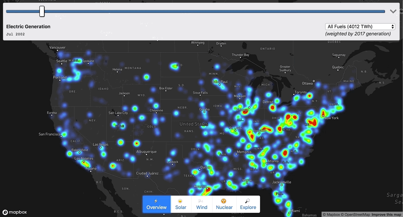
Chris Loer built https://electricitytransition.com to visualize 17 years of shifting electricity generation in the U.S. He originally shared this how-to post on his blog.
This project grew out of my longstanding interest in energy transitions. The world urgently needs to shift away from fossil fuels, and we need to do it faster than any previous transition — but our existing energy infrastructure is gargantuan and difficult to understand. I wanted to find a way to tie quantitative energy generation data to time and place, in order to make sense of changing trends. So I started looking for interesting datasets at data.gov, and quickly found a treasure trove of public data maintained by the US Energy Information Administration. When I found Form EIA-923, with monthly electricity generation data for every single power plant in the US, I thought “OK, let’s put this on a map”.
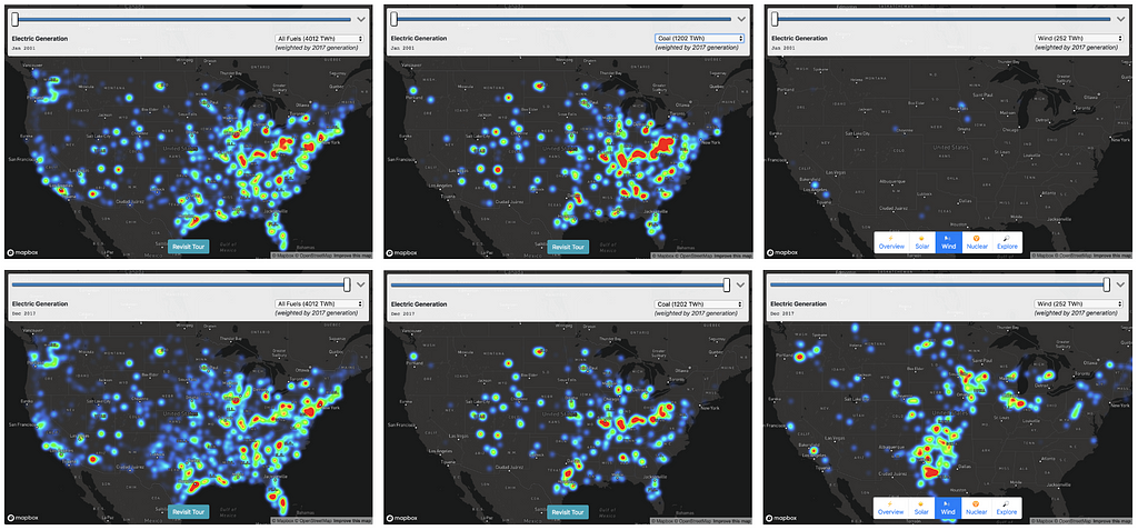
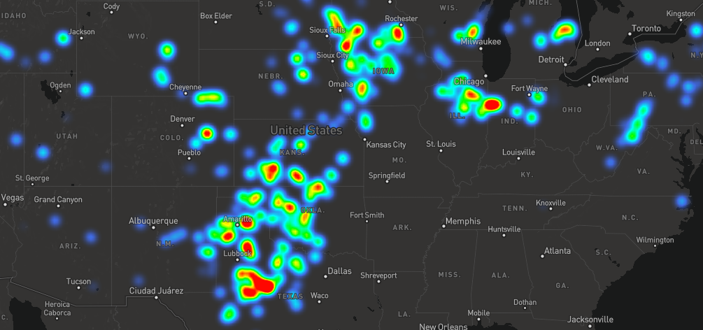
68 petawatt hours of electricity generation, by source, year, and location. Left: Total US electricity production, 2001 (top) and 2017 (bottom). Middle: Coal electricity production, 2001 and 2017. Right: Wind energy production, 2001 and 2017. Source: electricitytransition.com
It was a massive amount of data — monthly generating data for tens of thousands of plants, ranging from tiny co-generation plants attached to factories to giant coal and nuclear power stations. To make the data intelligible, I decided to make a heatmap using Mapbox GL, with the “weight” of each plant set relative to its power output.
I also scaled the heatmap-intensity and heatmap-radius based on (1) the zoom level, and (2) the current fuel type. Without re-scaling the radius and intensity, the heatmap would either be over- or under-saturated when moving between fuel types (e.g. “gas” would be oversaturated relative to “solar”). To calculate the intensity weighting for each fuel type, I used the aggregate generation information I collected in Step 2.
var intensityRatio = totalGeneration /
                     fuelTypeWeighting[fuelSelect.value];
map.setPaintProperty('plant-generation', 'heatmap-intensity',
[
  "interpolate",
  [ "exponential", 2 ], // Exponential intensity curve matches
  [ "zoom" ],           //  exponential zoom curve
  0,                    // At zoom 0:
  intensityRatio,       // Start with the base intensity
  10,                   // By zoom 10:
  10 * intensityRatio   // Reach maximum intensity
]);
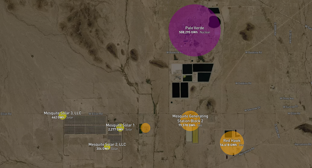
Labeled Circles (high zoom)
My goal was to make it intuitive to transition from looking at national/regional generation patterns to looking at the details of the actual infrastructure on the ground. I tried to accomplish this with a progressive transition as zoom increases:
Fade in the satellite layer
Fade out the heatmap while scaling up individual circles to represent plants.
Color encodes fuel type, size encodes monthly generation, and label encodes name, type, and total generation over the 17 years of data.
Step 4: Telling a Story
At this point, I had a lot of fun exploring the map and finding interesting patterns, but I wanted to add a narrative element so I drafted up a list of stories I felt the map could tell:
The decline of Coal — The biggest story in CO2-reduction.
The rise of Gas — The twin of the decline of coal, and a staggering infrastructure build-out. Digging into individual plant data, I was surprised by how many coal-to-gas plant conversions showed up.
The rise of Solar — Sunny and future-focused California is no surprise here, but did you know North Carolina had such a big solar industry?
The rise of Wind — Dominated by “red” states, and a hopeful reminder that if we get the technology and economics right, energy transition doesn’t have to be a partisan issue.
The seasonality of Hydro — and its emerging potential as a “battery” for intermittent sources (although with monthly data, pumped hydro storage just looks like a small and boring negative value)
The stagnation of Nuclear — The rise of solar and wind is inspiring, but discussions of carbon-free energy too often miss a sense of scale. Nuclear power still dominates our existing carbon-free energy production, and it’s the central technology used by the only countries that have already transitioned to carbon-free electricity, such as Sweden and France.
I explored the map on my own to look for “scenes” that matched those stories, and then encoded those scenes into animations. Once I tried looking at all of these scenes and their accompanying text from the viewport of my phone, I realized I had to strip the story down to its bare minimum to make it intelligible ✂️ 🔪 😬.
I also got a painful reminder that I am color-blind and a terrible web designer. I settled on using Bootstrap to get something “good enough”.
Step 5: Performance (GeoJSON → MBTiles)
Up to this point I was working with a 27 MB GeoJSON file, which was fine for testing, but way too big for a finished product. So I took a little detour in order to turn the GeoJSON into a tileset I could host with Mapbox. To make low zoom tiles fit within the 500KB per-tile limit, I had to cluster nearby plants.
My first attempt used Tippecanoe, using clustering arguments that looked something like:
This basically said “make a cluster out of any plants that are within 4 pixels of each other on this tile, and aggregate the child generation amount for each month”. This was pretty easy, and very fast, but I ran into two problems:
Tippecanoe implements clustering by finding adjacent points on a Hilbert Curve. This is really efficient on large datasets, but it gave me less control over how clusters get created. Specifically, I wanted clusters to tend to center on the largest plant in the cluster, so that the collective weight of the heatmap would look similar before and after clustering.
If I clustered plants with different fuel types, I wanted to calculate separate “aggregate” generation properties per-fuel-type, but Tippecanoe’s “sum” aggregation operator didn’t give me a way to do that.
At this point, I experimented using Supercluster on the client side to do the same sort of clustering:
This got me the results I wanted, but it was all done on the client side, and I wanted to make an MBTiles set I could upload to Mapbox for hosting. At this point my detour got a little out of hand and I implemented Supertiler, which uses Supercluster to cluster tiles, then uses SQLite to write each resulting tile into the MBTiles database format.
Once I finally had my clustered tiles, it was a cinch to upload the tileset to Mapbox Studio:
When I started playing around with the hosted tileset at low zooms, I realized that switching to a new data source was not that much more expensive than just applying a new fuel filter to an existing tile (either approach requires regenerating all the tiles on screen, the only difference is that switching to a new data source may require new tiles to download if they’re not already locally cached). Supertiler made it easy to generate a custom tileset for each fuel type, with the advantage of much smaller individual tiles.
I also realized through experiment that continually adjusting circle-radiusduring the animation was also triggering expensive re-layout of all the label text, since they both came from the same source (and Mapbox GL generates one set of tiles per source). I split the plant names into yet another source to solve this problem. Note that this trick only works for layers that you add via “runtime styling” — if I had added a layer with a separate source via Mapbox Studio, I believe it would have automatically “composited” the source, undoing my optimization.
You can see the code (including all of my foibles) on GitHub.
Chris is a father and a US Navy spouse. He currently lives in San Diego but is moving to Japan. When not chasing children, he aspires to be an energy nerd. Chris previously worked on Mapbox GL and its surrounding ecosystem, with a focus on expanding its typographic and multilingual capabilities. Prior to working with Mapbox, Chris spent a decade at the security and endpoint management company BigFix (and after acquisition, IBM). He also created the VoteUp iOS and Android apps.
We’re excited to personally welcome you to GovSummit, a day to bring together the best minds in the public and private sector and celebrate the workforce that delivers critical services in our government and surrounding communities.
As we’ve watched our team work tirelessly to make GovSummit happen, what strikes us is the diversity of people we’re bringing together. The day will include leaders from federal government, the open source community, state & local government, NGOs, and defense — all with different challenges and different visions wanting to work together.
We’ve put together an incredible lineup of leaders in the space who are building scrappy, finding a way, and answering the question of “where?” to reveal new ways to solve hard problems. We’ll dive into that question examining everything from how to build an open source census, to why location accuracy matters for first responders, to how Jose Andres’ World Central Kitchen team is providing food in disasters. And, of course, we’re ending the day with a party and barbecue at Hill Country.
It all happens tomorrow. It’s time to lift up the people and critical services teams creating the future of the public sector through grit and commitment to service. We’ll see you tomorrow at Woolly Mammoth.
If you can’t make it in person, follow the conversation on Twitter with the hashtag #GovSummitDC, and we’ll be posting videos from the event shortly after.
Welcome to GovSummit was originally published in Points of interest on Medium, where people are continuing the conversation by highlighting and responding to this story.
Sign up for Uber Visualization Night in San Francisco — This Wednesday, March 27th, we’re presenting on the Vision SDK. I’ll be walking through our Vision pipeline, from training the neural networks, to running them on edge devices, to powering live map updates.
We’ll talk about how working with live data is crucial for keeping an increasingly fast-moving world connected and oriented — from our roots working with GPS probe data to today — and how leveraging distributed cameras allows us to add a myriad of dimensions to the living map. The combination of new technologies in AI and AR enable exciting new possibilities for enriching the navigation experience as well as improving mapping infrastructure for all.
The Vision SDK classifies road boundaries, lane markings, curbs, crosswalks, traffic signs, and more. Real-time interpretation of the road brings value to drivers contemporaneously, but this data is also used to update the map live to ensure the most up-to-date information. Looking forward to seeing you on Wednesday night!
Our public beta of the Vision SDK is coming soon! At launch, any developer with a free mapbox.com account will be able to start building Vision applications that can run on billions of connected devices. Visit www.mapbox.com/vision to sign up and get notified on launch day!
Uber visualization night was originally published in Points of interest on Medium, where people are continuing the conversation by highlighting and responding to this story.