Quantcast
Channel: maps for developers - Medium
Viewing all 2294 articles
Browse latest View live

Mapbox Visual for Power BI upgraded

$
0
0

Now generally available in the Microsoft Office Store

By: Sam Gehret

New release alert — the Mapbox Visual for Power BI, a plugin to use our visualization tools directly inside Microsoft Power BI, is now available.

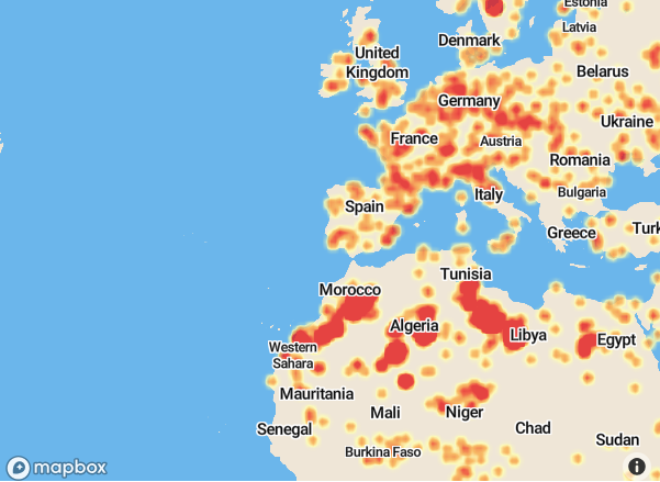
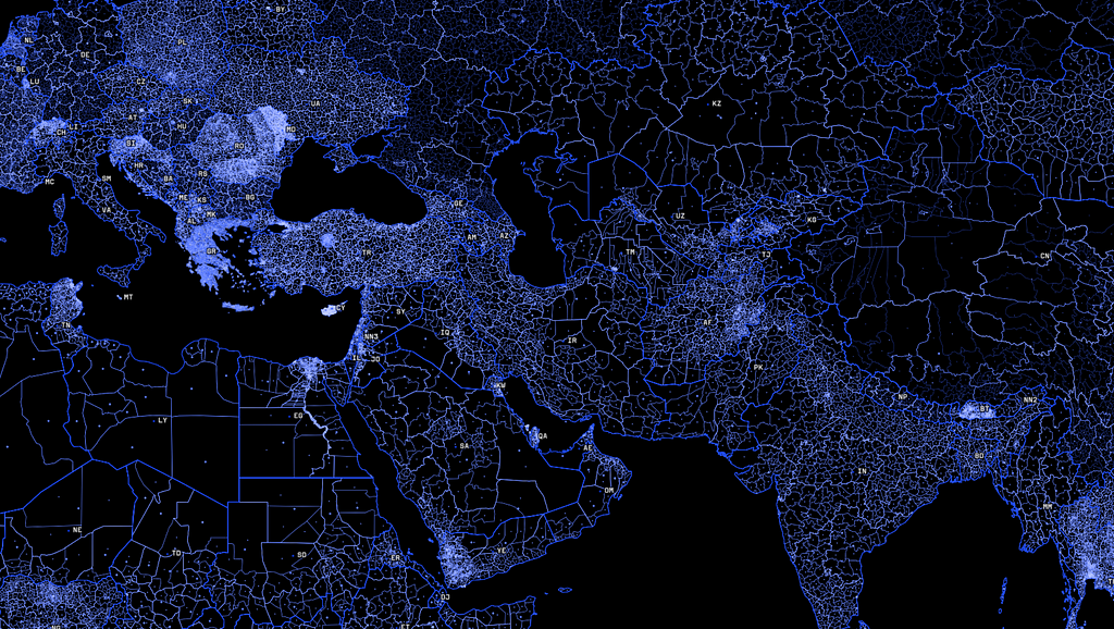
In March we launched the Mapbox Visual for Power BI Preview, which included features like heatmaps, cluster aggregations, and custom map styles. Power BI users created some compelling visualizations with the preview:

We asked for your input on what we should build into the plugin next, and — wow did we get feedback! The new version now incorporates many of the features you requested. Here’s a rundown of some of the top requests that made it into this release:

Support for Safari, IE11, and Edge

Our top requested feature was support for more browsers and devices. We now support most major browsers including Safari, IE11, and Edge. You’ll now have the same experience viewing dashboards in Power BI Desktop as you do on iOS Devices.

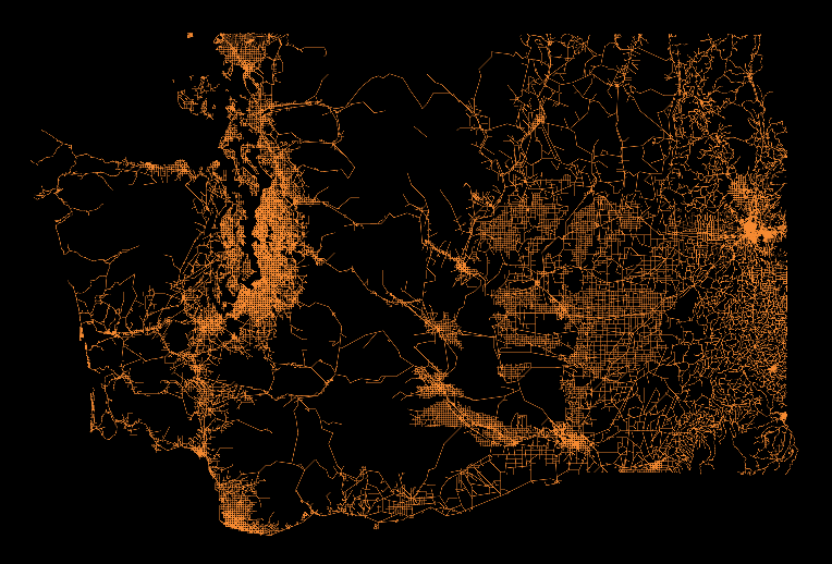
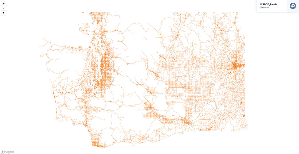
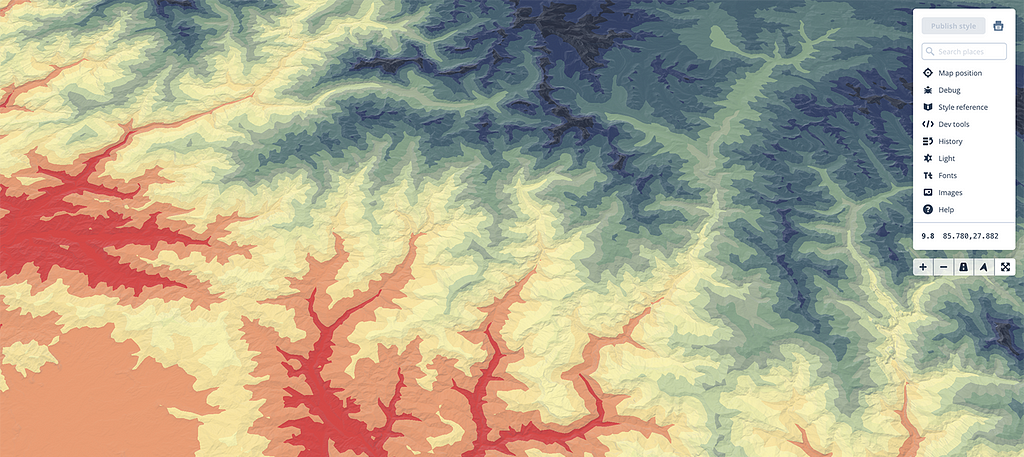
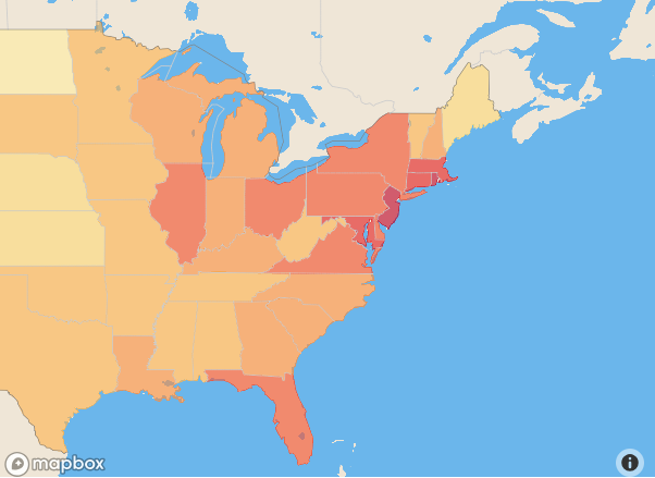
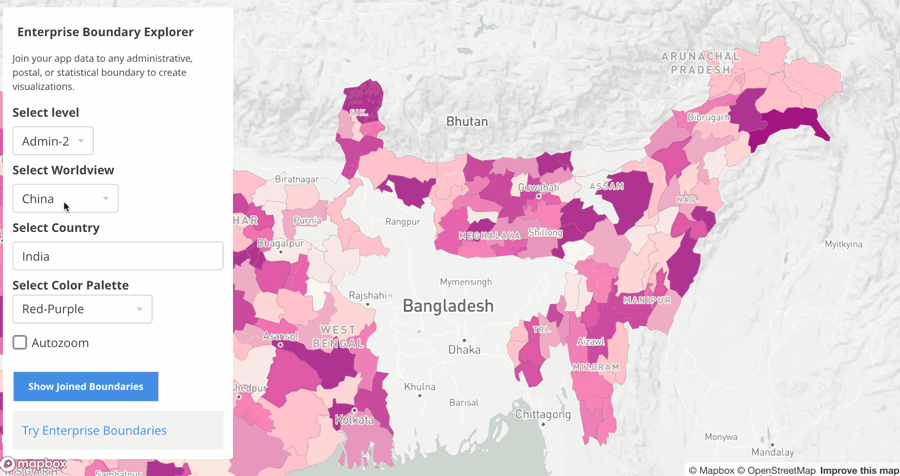
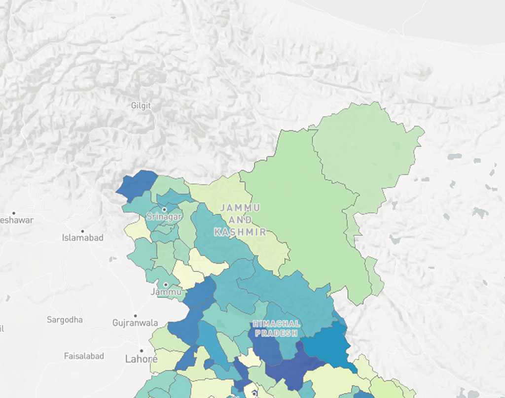
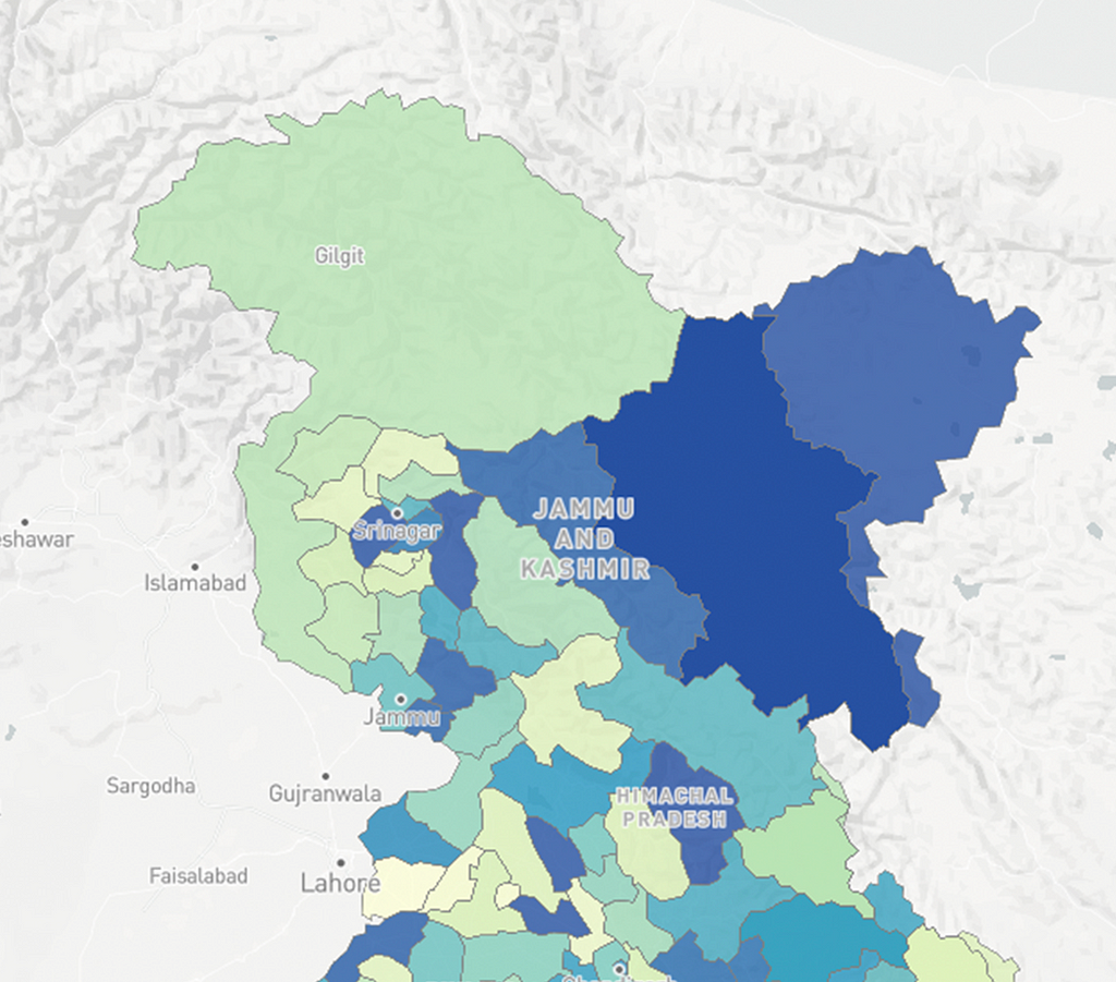
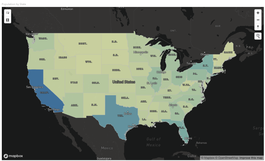
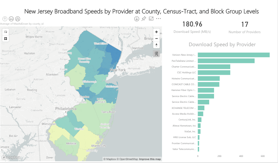
Support for choropleth maps and drilling

You’re now able to add choropleth (fill) layers to multiple layers in your map and then drill down between them.
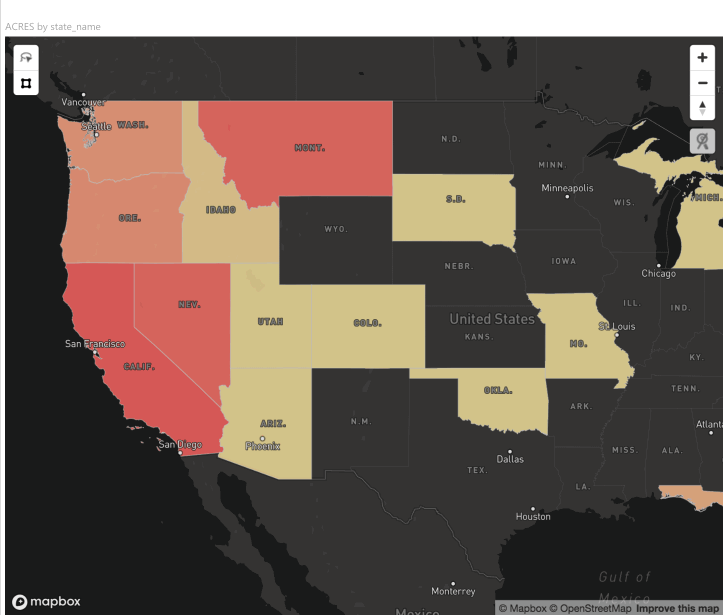
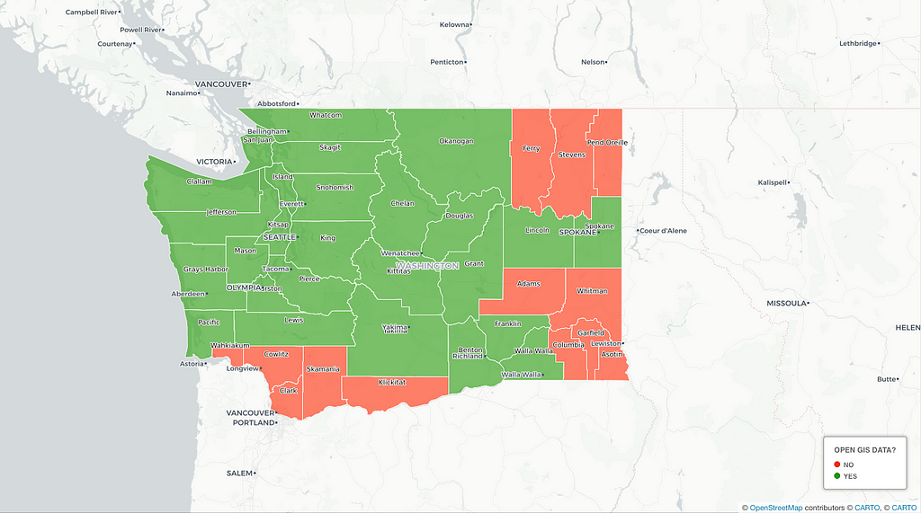
Custom boundaries

The new plugin also ships with boundary definitions for countries of the world, US States, and US postal codes. Administrative and postal boundaries for over 200 countries are available upon request. Use open source boundary definitions by uploading files to https://www.mapbox.com/studio/tilesets/ and connecting to your Mapbox visualization in Power BI.

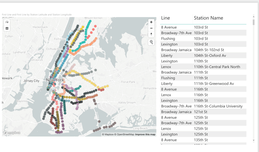
Lasso selection and data wrangling

Community members asked for more tools to make it easier to handle large datasets. So we’ve added our new Lasso tool. Use the lasso to select and analyze the data points which are relevant to you.

Cross-highlighting and filtering

Making selections on the map will now drive the other visualizations on the dashboard. Trace geographies and watch dashboards react in a flash to your new parameters.

Getting started

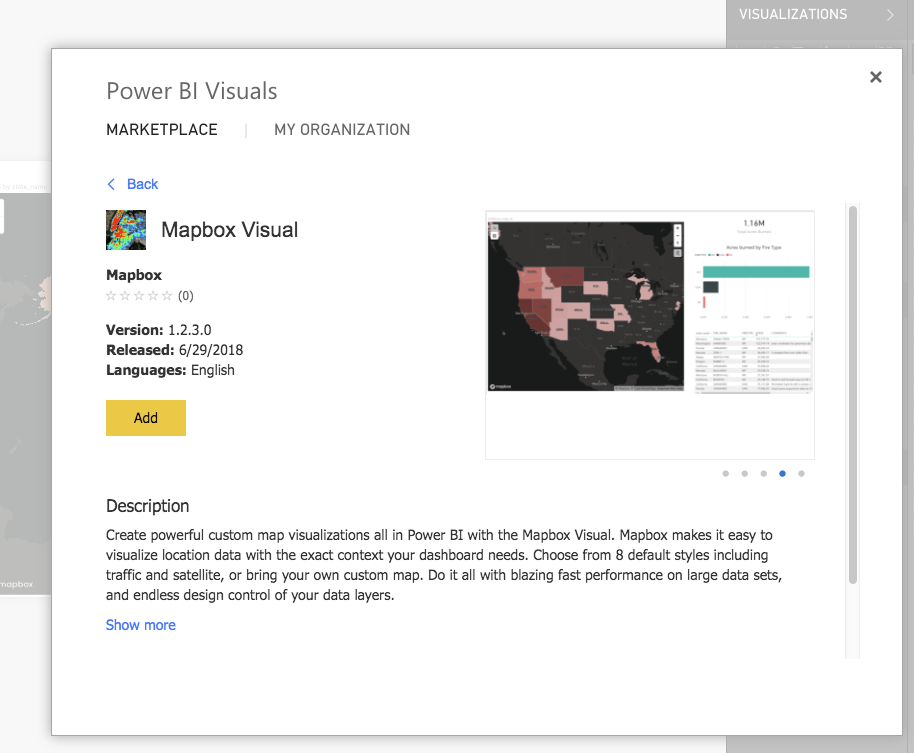
To start using the Mapbox Visual for Power BI, you’ll need to get a Mapbox account and a Power BI account. Grab the Mapbox Visual for Power BI from the Microsoft Office Store. Just click “add from marketplace” and search “Mapbox”.

If you’re a business interested in a more customized business intelligence solution, drop us a line.

Sam Gehret


Mapbox Visual for Power BI upgraded was originally published in Points of interest on Medium, where people are continuing the conversation by highlighting and responding to this story.


Get outside with the Washington Trails Association

$
0
0

By: Sam Fader

From the North Cascades to Mount St. Helens, from the Hoh Rainforest to the Snake River, the state of Washington is a hiker’s paradise year-round. Millions of people — including myself — use Washington Trails Association’s site to find the perfect trail and plan their hikes. This year, WTA launched a new version of their Hike Finder map (built with GL JS) to help hikers enjoy and advocate for Washington’s natural beauty. I caught up with Loren Drummond, Digital Content Manager at WTA, to learn more about their implementation.

Why are maps important to WTA and your members?

As a nonprofit organization, WTA works to reduce barriers between people and the trails, with a broader goal of supporting the protection of trails and wild lands. People will protect and champion the places they love to hike, from local parks to remote wilderness. Maps are often the first step a hiker takes on their journey towards becoming a steward for public lands. We have thousands of trails in Washington, running across so many different kinds of public lands — within cities, on county lands, in state parks, on national forests and parks. The Hike Finder map gives hikers a visual way to explore the possibilities.

What inspired the new map?

As more people discover the joys and benefits of hiking, we’ve seen a small number of popular trails experience a dramatic spike in visitation. We wanted to make it easier for hikers to discover alternative trails in their favorite areas and plan their hikes safely. Mapbox tools enabled us to add interactivity and improved map layers that make under-used trails easier to find.

We also wanted more control of topographic layers, and more accurate maps of national forest roads and land management boundaries — experimenting with Mapbox tools let us do this. We integrated a layer showing active wildfire perimeters to alert hikers of potential wildfire hazards when planning a trip.

How do your users like the new map?

An incredible volunteer built our original Hike Finder map, and it is one of the most popular resources on our website — we’ve heard nothing but rave reviews. The new map is now more mobile friendly, and we’re finding that people are spending about 14% longer on the page. I think a number of new features on the map encourage exploration, which in turn helps surface trails and natural features that may have been overlooked before.

How was the experience of building your map?

Donations from our members make all of our work possible, so we’re careful when we invest in technology. We want to make choices that will have the most significant impact. There are so many cool things we can do with Mapbox, but we need to stay focused on features that can affect the most change.

It has been great working with Mapbox because the team shares our goals and values. And individuals at Mapbox have also invested a ton of time into supporting us — we’d especially like to thank Sam Matthews, who is also a WTA member and volunteer, for mentoring our team through this process.

What’s next?

Maps and visualizations are powerful tools, and we’re just beginning to scratch the surface. We want to play around with storytelling visualizations to support our advocacy campaigns like our Lost Trails Found campaign. As people use our Hike Finder map to explore the statewide trail system, we also want them to call on policymakers to adequately fund trail access and maintenance.

We’re excited to continue improving the mobile experience for users, especially when they move out of cell range and want to continue having access to maps offline. Down the line, we’ve got some ideas around how we can improve the trip planning tools, too.

Check out the WTA’s Hike Finder map. If you find a new favorite trail, remember to be a good steward and pack out what you packed in. Enjoy the map and want to learn more? Visit our Community page.

Sam Fader


Get outside with the Washington Trails Association was originally published in Points of interest on Medium, where people are continuing the conversation by highlighting and responding to this story.

Space data & maps power LawnGuru’s logistics operations

$
0
0

How satellites, maps, and navigation APIs can help you mow your lawn

By: Rob Altenhaus

LawnGuru, the on-demand landscaping service, uses high-res Mapbox Satellite imagery to give users a bird’s eye view of their property. Customers can then trace their lawns, driveways, and property boundaries on web or mobile and get an instant quote on lawn maintenance, gardening, snow removal, and more.

Internally, the team of 12 uses our Geocoding API and Maps SDKs for iOS and Android to create dashboards for business intelligence, visualize new job requests, map existing service routes, track their assets in real time, and send alerts based on geofenced locations. But it doesn’t stop there — LawnGuru wants to add live traffic and turn-by-turn directions, courtesy of our Navigation SDK, to give landscaping companies a seamless experience between accepting a job request and navigating to the location.

When asked why LawnGuru chose to work with Mapbox, Co-Founder Skye Durrant responded:

Working with the people at Mapbox has been an absolute joy. It’s obvious that they’re investing in their users’ success. This resonates across both sales and support. Our previous maps provider (Google) was the complete opposite when it came to communication; it was impossible to speak to anyone. Our dev team has found the documentation easy to follow and up to date. If they ever reach a wall, the Mapbox support team is quick to respond.

Co-founders Skye and Brandon originally started their own lawn care franchise but realized managing the company often came at the expense of the user experience. In 2015, they created LawnGuru as a way to focus on both improving the businesses of local service providers and creating a transformational experience for their users.

Maps are essential to our business. We use Mapbox across our website, web app, native apps and our internal tools for sales, support, and business intelligence.

With their scalable infrastructure and repeatable wins, LawnGuru has quickly expanded beyond their hometown of Detroit. You can now use LawnGuru in major metropolitan markets including Atlanta, Baltimore/DC, Chicago, Cleveland, Houston, and Philadelphia.

Want to see if you can optimize your business with our tools? Get in touch with our sales team to find out.

Rob Altenhaus


Space data & maps power LawnGuru’s logistics operations was originally published in Points of interest on Medium, where people are continuing the conversation by highlighting and responding to this story.

Take the scenic route with our new Bring Your Own Route feature

$
0
0

By: Jay Cox-Chapman

If you’re driving from Asheville, North Carolina, to Knoxville, Tennessee, the fastest route is via Interstate 40. However, if you’re on a motorcycle, the coolest route, by far, is via the Tail of the Dragon in Deals Gap, North Carolina — 318 curves in 11 miles. It’s a famous ride, one that’s on the bucket list for many motorcyclists.

In most turn-by-turn apps, it’s difficult to pull up this course because it’s not the most efficient route. With our new “Bring Your Own Route (BYOR)” feature included in our Navigation SDK, you can now plot custom routes like the Tail of the Dragon and get turn-by-turn voice, text, and banner instructions along the way — right in your app.

As is, our turn-by-turn Directions API directs your users on the fastest route from Point A to Point B, with accurate ETAs from our real-time traffic. BYOR uses our Map Matching API and Navigation SDK for iOS and Android to let you define specific turn-by-turn routes for your users.

Whether it’s the Tail of the Dragon or its sister path the Cherohala Skyway, BYOR allows you to set the course without sacrificing the navigation tools your users depend on. Download the Mapbox Navigation SDKs for iOS and Android to start trying BYOR today. Reach out to learn more about custom routes for turn-by-turn navigation.

Jay Cox-Chapman


Take the scenic route with our new Bring Your Own Route feature was originally published in Points of interest on Medium, where people are continuing the conversation by highlighting and responding to this story.

door2door — Visualizing rideshare operations in real-time

$
0
0

By: Courtney McGuire

door2door, the on-demand transportation tool for cities and corporations, uses Mapbox to make public transportation more accessible for everyone. Cities and transport operators rely on door2door’s transit maps, powered by GL JS, to visualize the quality and availability of public transportation and implement city or corporate-run rideshare services.

door2door visualizes historical transit data to reveal where the traditional fixed routes of bus and rail are not meeting the commuter’s needs.

The mobility analytics tool uses the colors green, yellow and red to indicate which areas of Berlin are easily accessible and which are not.

Their algorithm for on-demand fleets connects drivers and passengers automatically and their dispatch tool lets cities and operators understand how rideshare fleets are moving in real-time, too. Dispatchers can monitor each driver’s ride on the map and passengers can see in their app when a driver will arrive.

These real-time data visualizations offer cities and operators economical and eco-friendly on-demand services for public transportation and ridshare fleets. Reach out to our team to learn more about the technology behind rideshare operations, real-time asset tracking, and smart city initiatives.

Courtney McGuire


door2door — Visualizing rideshare operations in real-time was originally published in Points of interest on Medium, where people are continuing the conversation by highlighting and responding to this story.

240 million cars equipped with Apple CarPlay

$
0
0

By: Larry Wang

Apple announced that when iOS 12 is released, drivers with CarPlay-enabled vehicles will be able to use the directions app of their choice in their dashboards. Meaning developers will soon be able to control the driver experience for their users on millions of new devices. Available on more than 400 models across 50 brands already, CarPlay will be one of the most popular ways that drivers will interact with their vehicles. By the end of 2018, 40 million cars on the road will have CarPlay, and that number is expected to increase to 240 million vehicles by 2023.

This year alone, CarPlay will ship on more than 20 million new vehicles, according to research by Strategy Analytics. The number of shipments is expected to increase to almost 50 million cars per year by 2023 (half of the roughly 100 million vehicles shipped per year).

Early demonstration of CarPlay integration.

Opening up CarPlay to third parties will allow you to use our Maps and Navigation SDKs to create a driver-first experience across devices. Take advantage of our real-time traffic, daytime/nighttime optimized styles, turn-by-turn navigation in 16 languages, custom instructions, personalized routes, and more on in-dash, touch-enabled screens. We’re rolling out private beta access to our CarPlay integration; email me at larry@mapbox.com if you are looking for early access.

Larry Wang

To learn more about Strategy Analytics, contact sharper@strategyanalytics.com.


240 million cars equipped with Apple CarPlay was originally published in Points of interest on Medium, where people are continuing the conversation by highlighting and responding to this story.

Enhance geofencing with global boundary data

$
0
0

By: Amy Ghate

With our geofencing toolkit, track where your assets are in relation to country, state, county, census block, zip code, or statistical boundaries. Logistics operations can now monitor when their assets move across customized boundaries, pulled from our global boundary dataset — everything from provinces in Canada to administrative districts in Beijing.

If you’re building a logistics dashboard for a fleet of delivery vehicles operating across Southern California, for example, it’s easy to set up a geofence and build out a simple set of rules to help you track each vehicle. Each time one of your assets reports its location, you’ll receive structured metadata about where your asset is. Use that metadata to write custom rules and take action if rules break.

Let’s jump into the code — if your vehicle is in Los Angeles County at longitude 35.0551562 and latitude -118.1751554, ask for metadata about this location with a request like this:

https://api.mapbox.com/v4/mapbox.enterprise-boundaries-a2-v1/tilequery/-118.1550191,34.6534237.json?access_token=your_token_here

Then, you’ll receive metadata like this, which confirms the vehicle is still in Los Angeles:

{
"name": "Los Angeles",
"parent_0": "US",
"parent_1": "USA106",
"level": "a2",
"parent_2": "",
"name_ascii": "",
"parent_4": "",
"parent_3": "",
"bounds": [-118.945, 33.705, -117.646, 34.823],
"z_min": 2,
"country_code": "US"
}

If you receive a ping that the vehicle has moved to longitude -118.1751554 and latitude 35.0551562 , request metadata through a query like:

https://api.mapbox.com/v4/mapbox.enterprise-boundaries-a2-v1/tilequery/-118.1751554,35.0551562.json?access_token=your_token_here

And you’ll receive metadata similar to the one below, which indicates that the vehicle has moved to Kern County:

{
"name": "Kern",
"parent_0": "US",
"parent_1": "USA106",
"level": "a2",
"parent_2": "",
"name_ascii": "",
"parent_4": "",
"parent_3": "",
"bounds": [-120.194, 34.791, -117.616, 35.798],
"z_min": 2,
"country_code": "US"
}

Now that the county name is Kern, your application will recognize that a geofence has been broken and can take further action, like using Twilio to call or SMS message your driver.

Interested in using Mapbox to enhance your asset tracking and geofencing? Contact our sales team and mention this blog post.

Amy Ghate


Enhance geofencing with global boundary data was originally published in Points of interest on Medium, where people are continuing the conversation by highlighting and responding to this story.

Ordnance Survey launches vector maps for Great Britain

$
0
0

By: Angelina Calderon

Founded in 1791, Ordnance Survey is Britain’s mapping agency. They make the most up-to-date and accurate maps of the country and help governments, companies and individuals be more effective with geospatial information. They recently launched OS Open Zoomstack and OS Open Data to help developers build compelling location applications for Britain with new vector styles and open data powered by our maps APIs and GL JS.

Under the hood

Ordnance Survey uses our platform to host their own map tiles and data, custom styles, developer-ready maps, and consumer applications like OS Maps — a popular outdoors service in Great Britain. Hosting gives them the flexibility to deliver complex, Britain-specific, location data as tiles and custom maps to their users.

From Cartographic Designer, Charley Glynn:

The vector tiles have been well received and will help our customers integrate OS data into their web and mobile applications — especially important for our Geovation start-ups. An area that I believe is on the brink of large growth in GB […] you will see that Mapbox GL JS has quickly become our library of choice.

OS Open Zoomstack makes elements of OS open data available as one map, in one file to be used for GIS, web, mobile, or offline use. It’s designed to make OS map data more accessible and easier to use in mobile applications, as well as being customizable.

Along with OS Open Zoomstack, OS Open Data provides developers with a modular design system for building map applications with custom styles. These styles are available to plug-and-play for comprehensive location experiences with boundary lines, building heights, descriptive terms to identify bridges and other forms of infrastructure, and highway networks for route planning.

Try it out!

Developers can take advantage of OS Open Zoomstack now. Head to their website to sign up for a free trial and take a look at the documentation and guidelines you need to get started.

Want to host custom data with us for your customers? Contact our sales team.

Angelina Calderon


Ordnance Survey launches vector maps for Great Britain was originally published in Points of interest on Medium, where people are continuing the conversation by highlighting and responding to this story.


How we went carbon neutral

$
0
0

…or how we reaffirmed (and calculated) our green commitment

By: Mikel Maron

Over the last two years, we grew from a small team of just over 100 to one with over 400 employees…and our carbon footprint grew, too. In 2016 and 2017 alone, we flew over 8 million miles, rode over 86,000 miles in rideshares, used over 217.05 MWh of energy to power our offices, and a significant amount for our servers. To balance out our impact, we purchase carbon offsets and renewable energy credits from Terrapass, a company that funds projects that help reduce greenhouse gases. Terrapass funds projects that expand wind farms and build anaerobic digesters to transform methane into electricity.

Pulling carbon emissions data together isn’t easy — I needed to spend some time crunching the numbers to figure out our exact carbon footprint. In the end, it proved to be a mixture of science, hard data, art, and classic “good-enough” estimates. Here’s a look at how we did it.

Step 1: Gather data from your vendors

First, I gathered as much data as possible on travel bookings, car share, office electricity, and server usage.

We use Egencia to book corporate travel, and their administrative dashboard can produce a report on our total mileage — 4.5 million air miles in 2017. We have two large offices in DC and SF (nearly 40% of our miles werebetween these cities), and smaller offices around the world. It’s important that we spend a lot of time meeting our customers and user community, so we travel a lot. Our CEO traveled over 300,000 miles last year.

Mapbox flights in 2017 click the image to check out interactive version.

For carshare, we have both Lyft and Uber corporate accounts for the team’s business travel. Uber currently provides total mileage, but Lyft does not.

With four offices we run ourselves, all with different electricity providers and billing systems, and several co-working spaces, gathering our electricity usage in megawatt hours (MWh) wasn’t straightforward. For some offices, I gathered our bills for the entire year; and for others, I could only get a single bill for the entire building, including other tenants.

Mapbox server infrastructure runs on AWS, who is working towards 100% renewables. As part of its pilot carbon footprint program, the AWS sustainability team calculated the estimated CO2 emissions generated by our server utilization. This took into account our specific usage, the regions where those servers were running, and the mix of energy sources they utilize.

Step 2: Make estimates

This is where the art comes in. I made some assumptions to help us get our estimated emissions close enough for the purpose of offsetting.

From the vendor calculations, I could only access 2017 information (not 2016 information), creating a big data gap. I opted to make an estimate based on growth of people at the company. At end of 2016, Mapbox had 193 people in total, and by Dec 31, 2017, we grew to 325. So for flights, assuming a similar number of miles flown per employee, I used this ratio to approximate our air miles in 2016. Total: 8,083,967.6.

I didn’t have Lyft mileage, but I did know the total money spent on both carshare companies. So I made the assumption that there was a similar $/mile ratio as Uber, and took the ratio of the dollar amounts we spend to estimate Lyft miles.

In our SF office, I only received electrical use information for one billing period, for the entire building. I divided by the number of floors to get an approximation, and then multiplied by 12 to calculate the entire year’s of energy usage.

Step 3: Calculate carbon dioxide emissions

To estimate the amount of carbon dioxide emitted (C02e) for flights and rideshare, I used the straightforward Terrapass carbon footprint calculator.

For flights, I entered the total air miles traveled, with an even split of short, medium, and long-haul flights, which Terrapass then uses to calculate metric tons of C02e — 1,383 for Mapbox flights. There are numerous factors you’d need to get a precise amount, if ever possible: the type of aircraft and condition of the engines, the exact route taken, atmospheric conditions, the number of seats filled on the flight. Short haul flights are less efficient than long-haul flights, due to greater fuel usage on takeoff and landing. All of which is to say, the 1,383 metric tons of estimated CO2 emissions is an art, but I’m confident it is close enough to meet our commitment.

For carshare, I used the Terrapass fleet calculator. The 86,364.16 miles driven by carshare, emitted 33 mT. Assumed that these trips were in standard gasoline vehicles, and submitted the distance as total mileage on one vehicle. The exact amount would have varied based on the vehicle type and condition, traffic speeds, and other factors.

Step 4: Purchase offsets

The most straightforward step. There are lots of options for purchasing offsets and renewable energy credits. Armed with our total numbers of C02e and MWh, we decided to purchase from Terrapass, who won us over with their online calculator, DIY purchase interface, certification system, and great reviews.

Make the commitment!

It requires a bit of work, but we encourage other businesses to aim to be carbon neutral, and calculate and offset your carbon emissions. Find support in networks like ClimateAction.tech, who wrote the excellent field guide to sustainability for employees. Reach out to our community team @mapbox on Twitter with your story of going carbon neutral.

Mikel Maron


How we went carbon neutral was originally published in Points of interest on Medium, where people are continuing the conversation by highlighting and responding to this story.

Designing for Mobile AR

$
0
0

By: Morgane Santos

Since the release of ARKit last year, our team has been obsessed with how location can help Augmented Reality reach its true potential, going beyond just gaming to changing the way users explore and connect with the world. I’ll be honest though, when we started our team members were still experimenting with building for mobile AR.

We’ve learned a lot since then, and with the launch of our AR Team and our new React Native AR SDK and Scene Kit SDK, we thought it was only fitting to share a little bit of what we uncovered.

The Basics: What is Augmented Reality?

Augmented Reality (AR) is the experience of having the real world “augmented” with some digital overlay. For example, an AR app on a phone may show the real world (through the camera feed) with a digital object placed into the scene.

AR relies heavily on cameras and computer vision to “see” the real world. This experience is different from Virtual Reality (VR), where users wear a headset that only displays an entirely digital world.

AR on the left; VR on the right

There are two main types of AR: tabletop and world-scale. Tabletop AR constrains the experience to your local space and is something you can see all at once, like a 3D map on a table. World-scale AR uses GPS and other location data to make the experience specific to where you currently are, and changes as you move through the world (like directions that update and guide you through a city).

Tabletop AR on the left; World-scale AR on the right

Considerations and constraints

AR is an overlay onto the real world, so you don’t need to create an entire scene yourself as you would with VR. Instead, you can create a handful of objects that can be added to the world while taking advantage of the background and lighting that already exist — meaning you can focus entirely on the main elements of your AR app without having to worry about the backdrop.

However, these objects need to make sense within the world. They may need to appear to lie flat on a horizontal surface or take up an appropriate amount of space. With world-scale AR, you’ll probably need to show something at a specific latitude-longitude, and so you’ll need to have the experience properly calibrated. Objects that don’t quite align with the world will look jarringly out of place, so remember to test often on a device!

For example, we’ve found that if we’re placing an AR map on a desk, it needs to fit within the dimensions of the desk but not be too tiny either — about laptop-sized. If we place it on the floor, it can be larger and still look reasonable.

Starting and calibrating an AR session

For a session to work, the camera on your device needs to be able to get a good look at the surroundings. Just like when you take a panoramic picture, initiating a session in AR requires deliberate, steady movement with a good view of where you’re trying to place the scene.

For most of your users, this will probably be their first time experiencing AR. Guiding them through this calibration is important — encourage them to start a session in a well-lit environment, and then move their phones steadily to scan the area.

If the app is having trouble calibrating, suggest scanning a different area with better lighting or more feature points. Feature points are how the camera detects distinct features in an environment. Combined with device movement, this helps the AR app determine distance and how to best position AR objects.

Once your users calibrate the scene, it may still need to be adjusted. We’ve learned to add a few extra controls in our demos to help users adjust the scenes to look right for them. Users can rotate or scale AR maps after they’ve placed them in the scene. Even if the automatic placement works well, we’ve noticed that people still like to make minor adjustments. This interactivity is what ultimately makes AR feel engaging!

Interaction design

So what does interaction design in AR look like? AR interactions can be similar to traditional 2D mobile interactions: tapping on a screen is still a valid way to interact with something. Additionally, you can use any device movement (as detected by the gyroscope or accelerometer, for example) for interaction design. AR allows people to control the “camera” completely and therefore how they engage with a scene. What happens if they tilt their phone, or shake it, or move towards something? These are all new areas to explore.

Camera control also means users will be able to look at your AR objects from all angles. While it’s rare for people to want to look under a 3D map, we do add sidewalls and a bottom plane to our maps, so they look fully 3D, no matter how you’re viewing them.

Here, we’re allowing new interaction paradigms, and we also need to teach them to users. Don’t assume anything is obvious or intuitive. Most mobile experiences don’t allow such a significant degree of control, so people often don’t expect to be able to move their device or engage with 3D objects in new ways.

Handling UI and text

UI elements can be simple text labels, 2D icons, or 3D objects themselves. In general, it’s better to avoid large amounts of text or jargon. We’ve found that people tend to be excited to jump right into the AR experience and lots of introductory text can feel like an unnecessary hurdle. Any text you do add will have to account for any possible background (you can’t control where a camera is facing, after all). Consider adding a background color under any text labels to ensure it’s always readable.

3D objects can also be helpful here. Think about the difference between the following:

  • a label that says “Scan your surroundings”
  • a 2D illustration of a hand holding a phone
  • a 3D model of a hand holding a phone that moves as the device moves

We started prototyping with the label, but we ended up with the 3D model. Not only does it avoid the issue of jargon, but it’s also just more fun. While 3D UI elements are not always necessary, or beneficial, they can help underscore the potential of 3D by offering feedback when the device moves or by showing people what to do in a more literal way.

Thinking ahead

AR is still a new field with a lot to be discovered. While all these tips are a good way to get started, don’t hesitate to experiment and see what rules you can break. Get started with our any of our AR SDKs, and show us what you’re building using #builtwithmapbox.

Morgane Santos


Designing for Mobile AR was originally published in Points of interest on Medium, where people are continuing the conversation by highlighting and responding to this story.

Adobe Lightroom: Mapping your photos

$
0
0

By: Paul Goodman

Adobe Lightroom CC automatically adds location information to every photo you take with your phone and GPS-enabled cameras. After geotagging the images, Lightroom drops each one onto a map so you can immediately see where you took each picture. The process happens automatically, in the background, so you can import and edit your photos while Adobe uses our maps to figure out the name of the place and generate a thumbnail of the map in the right location.

Using our Geocoding API in permanent mode, Adobe tags the images with the location information and stores that data as part of each photo’s metadata. With each photo tagged, you can then use Lightroom to search across all your images for photos from a location, like Paris:

Want to learn more about geotagging, permanent metadata, and other ways to add location data to digital assets? Reach out to our team.

Paul Goodman


Adobe Lightroom: Mapping your photos was originally published in Points of interest on Medium, where people are continuing the conversation by highlighting and responding to this story.

How I built it: mapping every road in Washington state

$
0
0

By: Jinal Foflia

Clifford Snow is on a mission to personally add the most up-to-date road data (including rural logging roads) of Washington state to OpenStreetMap. Clifford started contributing to OpenStreetMap in 2011 after seeing a presentation by Hurricane Coast at LinuxfestNW in Bellingham, Washington. I wanted to learn more about the project’s origins and the map’s technical framework, so I sat down with him to hear his story and chat about his work.

What inspired you to develop the project?

Heavily trafficked roads in major US metropolitan areas are usually maintained regularly and in good shape in OpenStreetMap. The conditions of rural roads in the US are a different story. In Washington state, for example, some of them are still in the same condition as when they were imported into maps from TIGER data. With this project I wanted to provide the OSM mapping community with more up-to-date, comprehensive, basemaps for tracing road data.

What datasets did you use to build the map?

A majority of counties in Washington State like Island County, Whatcom County, and my own Skagit County opened up their road data. This allowed me to trace roads and capture street names. As I expanded to more and more counties I ran into a roadblock: not all Washington Counties make open data available. I created a webmap showing which counties in Washington State have open data.

A CARTO map shows the status of open road data across counties in Washington State.

At times, providing open data is cost prohibitive for a small county, while other counties choose to monetize their data. Thankfully, I found a workaround using the Washington State Department of Transportation (WSDOT) open datasets of local and state roads.

Washington State is home to thousands of miles of logging roads. I relied on USFS data to record logging roads, and it was a massive dataset. Before this project, I never used Mapbox but I knew many Mapbox-ers from my work on previous OpenStreetMap projects and thought it may be a good solution.

Mapbox made it easy for me to get the road network maps online and could scale to handle a larger load than I could from my home Geoserver.

Can you walk us through how you built the map?

I started by plotting out how to upload the large datasets onto the Mapbox server. The data I had resided in my PostGIS server. I needed to convert it to an MBTile and upload it to Mapbox. Getting it into an MBTile wasn’t hard. Uploading it because of the size was much more difficult for me. Fortunately, Mapboxer Sam Mathews helped out, pointing me to a script to help with the process. I built a shell script wrapper to help out.

Once I figured that out, I plowed ahead and began to build the basemap layer. Here’s how I did it:

  1. First I loaded the shapefile into PostGIS, using PostGIS to filter and simplify the data. The state’s data contained many fields that were not needed since I was only looking for street and highway names.
  2. I used QGIS to load the PostGIS data to save the data as a geojson. Loading into QGIS gave me a nice visual of the data to make sure it looks correct.
  3. Tippecanoe helped me convert the geojson into an MBTile file for the upload to Mapbox.
  4. The Mapbox-upload script was used to send the data up to Mapbox.
  5. Once the MBTiles were accepted, which takes a while with a large file size, I used the Mapbox Studio editor to create the road style.
  6. Then, I published the style in Studio. Mapbox Studio made it easy to create styles at different zoom levels.
  7. Finally, I add the newly published basemap layer to the OpenStreetMap Wiki. JOSM adds entries directly into the list of images available. This step involves creating (or copying in my case) the boundary of the area the data covers, adding the URL and icon to displayed in JOSM. I’m optimistic that the iD editor will allow adding custom overlays in the near-future.
Road custom style was built in Studio

What’s next for the project? Are there other Mapbox features you plan to explore?

I’d really like to see open road data from the states displayed as a basemap in our editors. That is going to require scripting to grab the data, normalizing it, convert it to MBTiles and then uploading to Mapbox. One obstacle I envision is getting updates at different times.

I plan to start working on this project this fall.

Explore the full basemap layer, and start adding OSM data to your own mapping project — read our guide.

Jinal Foflia


How I built it: mapping every road in Washington state was originally published in Points of interest on Medium, where people are continuing the conversation by highlighting and responding to this story.

Clear the fog with Zenly

$
0
0

By: Bersabel Tadesse

Zenly, the real-time location sharing app for friends, recently released their new Footsteps feature, built with our fast-rendering vector maps. When you open it, you see a colorful fog over the map. As you walk around the real world with Zenly in your pocket, the fog dissolves around you on the map, just like the player maps we’ve seen in Warcraft and similar games.

Continue using the app and you can see your daily routine play out on the map, just like it does on Zenly’s main map. You’ll see 3D icons floating above the locations you visit most often, like your home or office.

We built some special components and combined them with a variety of technology we were already using to create Footsteps. The result is a product, map, and visualization our users have never seen before. Footsteps is a carefully crafted, real-time mapping technology underpinned by data science algorithms that deliver a personalized user experience.
— Laurent Cerveau, CTO Zenly.

Zenly’s location tech works in real time to uncover the map as you cover more ground. Zenly’s location tracking runs in the background, updating automatically as you check out new neighborhoods and take road trips. The more you explore, the higher you rank, letting you compete with your friends for a spot on the leaderboard.

Check out Zenly in the app store or log into Mapbox Studio to build your own visualizations!

Bersabel Tadesse


Clear the fog with Zenly was originally published in Points of interest on Medium, where people are continuing the conversation by highlighting and responding to this story.

Moji Weather: Crowd-sourced weather maps for China

$
0
0

By: Chris Wu

Moji Weather, the largest social weather app in China with 500M+ downloads, now uses Mapbox Streets Chinese for iOS and Android to power their daily forecasts. Moji Weather is a social, crowd-sourced app generating real-time weather data from its user base around the world. Beyond just sharing pictures of their environment, users can also share how the weather makes them feel, which is important for those sensitive to migraines or those with allergies.

The app also features an index that advises users how to dress for the day, how prominent UV rays are in the area, and whether or not it’s a good day for fishing or sports.

Now, Moji users have access to super detailed Air Quality Index (AQI) and radar maps. The AQI map generates real-time AQI markers throughout China at various zoom levels; the radar map takes advantage of our vector maps to display clean stutter-free radar visualizations.

Our Chinese government-certified maps are hosted on servers both inside and outside China, guaranteeing blazing fast loading times wherever you are. Contact our China team if you are interested in using our maps in China.

Chris Wu


Moji Weather: Crowd-sourced weather maps for China was originally published in Points of interest on Medium, where people are continuing the conversation by highlighting and responding to this story.

And the winners are…

$
0
0

A look at our favorite entries and winners of the World Map Cup

By: Erin Quinn

Just like the World Cup, our first World Map Cup competition was impressive. We’re not going to lie though; it was more exciting to see you level up your mapping skills each round than it was to watch the actual World Cup. You shared everything from the travel of your teams, to the history of how their journey to the World Cup, to an interactive soccer game with Unity.

Here at Mapbox, we love following along with your process & sharing your feedback with the teams building the tools involved. And wow, do y’all love to learn new skills!

Finally, I would like to say thank Mapbox for creating this really fun and exciting competition. I was waiting frantically each day a new challenge was released! It’s important to note that just like how the World Cup has brought nations together, the #worldmapcup has brought together the skills of modern day cartographers. I have learnt some new skills and had fun whilst doing this #Thankyou. — Tom Stathman, Geo-visualizing the Fifa World Cup with Mapbox
Doing this challenge end to end has exposed me to the stack solution that Mapbox provides for Web GL. With this, the realisation that creating your own maps needn’t be overly complicated, and you can set any narrative you wish to drive your application. This challenge has wet my appetite for future ones, and my own exploration into their Unity solution to create some games to muck about with. I look forward to see what new features they release in the future! — Rory O’Flaherty, A Beginner’s Journey to Visualizing the World Cup, Utilizing Mapbox

But we know you’re dying to know the winners, so without further ado let me introduce your first World Map Cup champions:

Grand Prize

Yi Xu

Yi participated in every challenge we’ve ever shared — from #weekendmaphacks to #worldmapcup. But, he blew us away with his stunning story map illustrating the history of the Iceland team and their first time qualifying for the World Cup.

As Grand Prize winner, Yi will receive a DJI Mavic Drone, one custom, commissioned topographic map from Overview.design, the Guide to Map Design, and of course, Mapbox swag. 🎉

Explore his winning map on Medium and stay tuned for some wicked new maps once Yi gets his drone up!

Runner-Up

Gustavo Youngberg

We loved Gustavo’s head to head map of the world cup. Having used Mapbox for work, he took this as his chance to “let loose and build something different,” and he knocked it out of the park with his dual map setup showing a slideshow of Mexico’s map. Take a look; we promise you’ll like it just as much as we did.

For their excellent project, Gustavo will receive a custom commissioned map from Overview.Design, The Guide to Map Design, and Mapbox swag.

Third Place — It’s a tie!

Kevin McGovern

Kevin’s World Cup Team Journeys visualization made great use of two popular open source tools from Uber’s data viz team, deck.gl and react-map-gl. We love that Kevin used open data and a python notebook to highlight “just how intense [tournament] travel can be,” showing how far teams traveled for World Cup qualifying. Explore his map to find out more about how he built it!

Jonathan Witcoski

Jonathan Witcoski is documenting how he’s been learning to build with Mapbox & Unity day-by-day, and his used World Map Cup to show his progress. He created a detailed walkthrough of how to make a rolling ball game with a world cup inspired design is a terrific culmination of skills. Take a look at his thorough documentation to build your own or start building with our Maps for Unity SDK.

Both Kevin and Jonathan will take home a custom topographic map form Overview Design, Mapbox Swag, and of course, bragging rights.

Thanks to everyone who participated in our World Map Cup! Want your chance to compete to win? Join the Explore Outdoor competition for August — Week 1 is already out, but there’s still time to sign up!

Erin Quinn


And the winners are… was originally published in Points of interest on Medium, where people are continuing the conversation by highlighting and responding to this story.


Ready to respond

$
0
0

How NOAA uses Mapbox to provide crucial context in an emergency

By: John Dombzalski

As we head into the peak of hurricane season, emergency response teams and agencies are making sure they have everything in place to respond quickly. For NOAA, that means being ready to visualize the potential reach of a storm and assess it’s impact at a moments notice.

NOAA’s Remote Sensing Division (RSD) collects aerial imagery of coast lines before and after a storm. Using field survey techniques, photogrammetric methods, and fixed wing aircrafts they provide the imagery and information needed to assess damaged areas and give analysts, auditors, and the public a comprehensive view of the extent of the damage, allowing them to respond quickly to needs.

During the 2017 hurricane season, North America was inundated with back-to-back hurricanes throughout the Caribbean, Gulf of Mexico, and Southeastern United States. People all over the nation viewed RSD’s maps to plan evacuations and see the storm damage from a safe distance. With the sudden increase in interest, our architecture was able to rapidly scale and meet user demand without interruption.

NOAA also helps people see a storm before it hits. Last year, they wanted to provide the contextual information needed to plan evacuations, but also show live storm radar. Our team helped custom style their maps by showing them how to throw their labels on top of storm radar, and how to turn off layers they did not need — helping their map show just the right amount of information.

With the Mapbox Maps API and design tool, Studio, NOAA was able to incorporate performant and scalable vector maps, while having complete control and customization of how those maps look and feel.

Want to view the impact of last year’s hurricanes for yourself? Take a look at the impact of Hurricane Harvey and Hurricane Irma. If you need help hosting imagery or rapidly scaling, get in touch with our team.

John Dombzalski


Ready to respond was originally published in Points of interest on Medium, where people are continuing the conversation by highlighting and responding to this story.

Our Studio manual gets a makeover

$
0
0

A new set of examples to help you get started with Studio

By: Colleen McGinnis

When I first got started I thought I would need a bunch of programming knowledge, but that wasn’t the case. I used the Mapbox GL javascript library and you can get started right off the webpage. Following the ‘Get Started’ link from the Mapbox home page gets you all the code you need to make a basic web map right away. They also provide a bunch of easy to follow examples and detailed API documentation, to get your map doing really cool stuff in very little time.
— Jesse Wegner, Exploring With Mapbox

We’ve heard consistently from our community that documentation, examples, and tutorials are helpful in understanding how to get our maps into your app, and we agree. So we’re releasing our revamped Studio Manual — it walks you through each section of Studio, our map design tool, and explains the workflows you need to build a custom map for your project.

The updated Mapbox Studio Manual.

We also added a new examples section with seven ways to use Studio. As you’re learning, you can now add each example to your account to allow you to see the techniques we’re talking about in action. Our favorite ones include:

Add 3D buildings to your map

Click image to read the manual.

Create a choropleth map

Click image to read the manual.

Style a heatmap layer

Click image to read the manual

Dig into more examples at mapbox.com/studio-manual/overview/. And we’re always looking to add more, so if you have any suggestions, please tweet your suggestions @Mapbox using #mapboxstudiomanual.

Colleen McGinnis


Our Studio manual gets a makeover was originally published in Points of interest on Medium, where people are continuing the conversation by highlighting and responding to this story.

3D Weather with SceneKit: aka Karl the Fog in AR

$
0
0

By: Jim Martin

Weather is all about volumes of air interacting, and weather forecasting happens with 3D simulations. However, those forecasts are often sliced into 2D snapshots at different altitudes for display on a flat map, and it means you’re missing a lot of crucial details. We worked with The Weather Company to show how SceneKit and ARKit can provide a better understanding of 3D weather patterns.

Left: NASA Satellite Imagery | Right: Our volumetric clouds

How we built it

To get started, we turned to San Francisco’s famous “Karl the fog” and cloud cover are our test-case for 3D weather visualization. We wanted to make sure we had a benchmark for our final result, so used the weather pattern in the satellite imagery above as we built. Finally, we had three goals that when combined, give us an interactive 3D version of these impressive satellite images:

  1. Use real data
  2. Visualize weather effects realistically
  3. Make the app performant enough for mobile AR

Data sources

First, we needed to find an image source for cloud cover to power our visualization. NOAA maintains a public source of imagery from the GOES-16 (Geostationary Operational Environmental Satellites) that covers the entire United States. Explore some of their amazing imagery, updated dozens of times a day.

Even better, RealEarth provides raster tiles of GOES-16 imagery. It isn’t a scalable data source, but it’s quick to add a tileset as a layer using our Maps SDK for iOS, so we used this as the source of ground truth for our clouds.

Rendering 3D volumes from map styles in SceneKit

To create performant 3D visuals from our imagery, we used a rendering method called “ray marching.” With this method, we can create 3D volumes from 2D map data by capturing how ‘opaque’ different regions of the map are in our map style.

We go from a 2D style (raster or vector) to a 3D volume using a custom shader.

To implement ray marching in SceneKit, we created a shader program using Metal. For every pixel rendered in the final image, the shader creates a ray that ‘marches’ through the scene, starting at the camera. As the ray moves, it accumulates color from the map view at that position in space. The idea is to use our map’s opacity and color to control where volumes appear, their height, and thickness. Brighter colors on the map mean more dense clouds at that position in the volume:

Sampling the 2D map at each step to determine the ‘cloudiness’ at each pixel.

You can see how we implemented this concept by downloading our sample project, and check out Metalkit.org if you’re interested in learning more about the fundamentals of creating custom shaders on iOS.

Visualizing other datasets

Our examples showed clouds over San Francisco, but anything you can see in a Mapbox style can be used to create these volumes. Check out some other examples of this method in action:

Left: Hurricane off the coast of Hawai | Right: Forecasted air quality around the Ferguson fires

Download the Mapbox SceneKit SDK, or try out the source code for our volumetric weather visualizations. If you want hands-on help, join our 3D visualizations with SceneKit live session coming up on August 23rd or participate in our Explore Outdoors challenge to show off your new skills and win amazing prizes.

Jim Martin


3D Weather with SceneKit: aka Karl the Fog in AR was originally published in Points of interest on Medium, where people are continuing the conversation by highlighting and responding to this story.

Minimo: data visualization map

$
0
0

By: Nat Slaughter

Minimo, our latest custom map style, is a visually simple and elegant designer map that “fades” into the background, and allows your overlaying data to sing.

I created Minimo with data visualization in mind, so it features a minimal style with building icons to accentuate place label hierarchy, stippling and line patterns to provide texture, and emphasized rail and ferry modes, in addition to the road network.

I based the stylesheet for Minimo on our Basic map template, which uses minimal style layers for a highly performant map viewing experience.

Try it out!

Minimo is free and ready to be used in your Mapbox Studio account, just click the link to add and start visualizing your next project. Show us how you’re using it by tweeting your projects @Mapbox with the hashtag #builtwithmapbox.

Nathaniel Slaughter


Minimo: data visualization map was originally published in Points of interest on Medium, where people are continuing the conversation by highlighting and responding to this story.

Drill-down into your data at any level with Mapbox Enterprise Boundaries

$
0
0
Administrative polygon layer in Enterprise Boundaries.

By: Chloe Krawczyk

For data visualization, context matters. But, with an ever-changing world, it’s difficult to deliver straightforward, accurate, and up-to-date maps, while also being able to drill-down and understand big location data. That’s why we’ve meticulously reviewed every single country in the world to provide a refreshed set of administrative, postal, and statistical polygons ranging from local municipal jurisdictions to international borders. All of this is running on our latest version of Enterprise Boundaries, released today.

Choose from India, China, and International worldviews to suit your customer’s needs.

Typically, companies that work with boundary data have entire teams responsible for making boundary data usable. With Enterprise Boundaries, we did the work for you. You can add Enterprise Boundaries onto your existing basemaps and style them in Studio; join your data to boundaries using our data-join technique; or build dashboards with Atlas, our on-premise solution — all with just a few lines of code.

Before, we consistently heard customer feedback requesting more detailed polygons for their maps to perform granular data analysis quickly. Now, with MicroStrategy Geospatial Services, our customers can leverage the entire Mapbox platform, and are thrilled they can drill down into data from the country level all the way down to municipalities and quickly glean insights from billions of data points.”— Jose Nocedal, Vice President — Group Product Owner at MicroStrategy

In this release, we’ve also added:

  • Support for localized worldviews: Borders in certain countries may be ambiguous or outright disputed. That’s why we’re giving you full control over which worldview you show specific users. Use runtime styling to alter the map’s worldview on the fly by matching your map labels to a default language or device location as your users move across global boundaries.
Left: The India/Pakistan border as specified in the International worldview | Right: The India/Pakistan border as specified in the India worldview
  • Expertly detailed: Our polygons are incredibly detailed and precisely edge-matched by our cartography team. All boundaries within a hierarchy matched precisely to their parent polygons for pixel-perfect map visualizations that help your customers understand their data.
  • Fast maps: As always, we serve boundaries on vector tiles, so they quickly visualize your data at any level of detail on our web, mobile, or desktop SDKs. Zooming through data is smooth even with thousands of polygons, giving your customers the ability to interact with their data in new ways.

Explore our product page to find out more. Or if you ready to get started mapping with Enterprise Boundaries, reach out to our team.

Chloe Krawczyk


Drill-down into your data at any level with Mapbox Enterprise Boundaries was originally published in Points of interest on Medium, where people are continuing the conversation by highlighting and responding to this story.

Viewing all 2294 articles
Browse latest View live